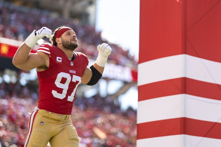
The college football season began more than a month ago. But for many fans, it’s not really college football if the Big Ten Conference — home of such storied programs as Ohio State, Michigan and Penn State — isn’t playing. So with the conference elders deciding in August to postpone their 2020 season due to coronavirus concerns, it looked like this would be a year without the Big Ten, which for college football is like a year without Santa Claus.
But now the Big Ten — or just the B1G, as it likes to call itself — is back! After deciding that games can be played safely after all, the conference will belatedly launch its season this weekend. That means Michigan and Ohio State fans can happily go back to hating each other’s guts (among other B1G rivalry storylines), and all is now right with the world, or at least with a little corner of it, pandemic or not.
That makes this a good time to do a ranking of Big Ten uniforms. Before you scroll down to see where your favorite team ended up on our list, here are a few things to keep in mind:
- All judging has been done by the Uni Watch Power Rankings Executive Committee, which has a membership of one and freely admits its biases. The committee is rather fond of classic typefaces and the color green, for example, but is less enthusiastic about the color purple and design “innovations” that just feel like gimmicks. If you don’t share the committee’s preferences,
then you’re totally hopeless and it’s a wonder you can even dress yourself in the morningthat’s fine — the whole point of a project like this one is that it’s fun to argue and disagree. - Each team has been ranked on the basis of its primary home and road uniforms (a somewhat subjective notion for a few of the schools that tend to mix and match their helmets, jerseys and pants instead of settling on a default look), with alternate and one-off uniforms not factored into the calculations.
- The standards for B1G rankings are a little different than they’d be for other conferences. B1G schools are mostly old-school programs in cold-weather locations (particularly this year, due to the late start), so there’s a certain look and feel to a B1G uniform. A wacky or newfangled look that might work in, say, the Pac-12 (hello, Oregon!) just wouldn’t feel right in the Big Ten.
Where applicable, we’ve also included info regarding new uniforms, patches and so on that some of the schools will be wearing this season.
Okay, enough preliminaries. Ready, set, argue!

1. Ohio State
If you’re a fan of one of the other B1G schools, your feelings for Ohio State may veer somewhere between hatred and intense hatred. But if you can perform the necessary emotional gymnastics to separate your aesthetic instincts from your rooting interests, even the most hardened Michigan or Wisconsin fan would have to admit that the Buckeyes look pretty damn sharp out there. From the silver helmet to the silver britches (technically gray, but they complement the helmet so nicely that they essentially look silver), it’s an outstanding uniform set. And the little buckeye merit decals are the cherry on top. Chef’s kiss!
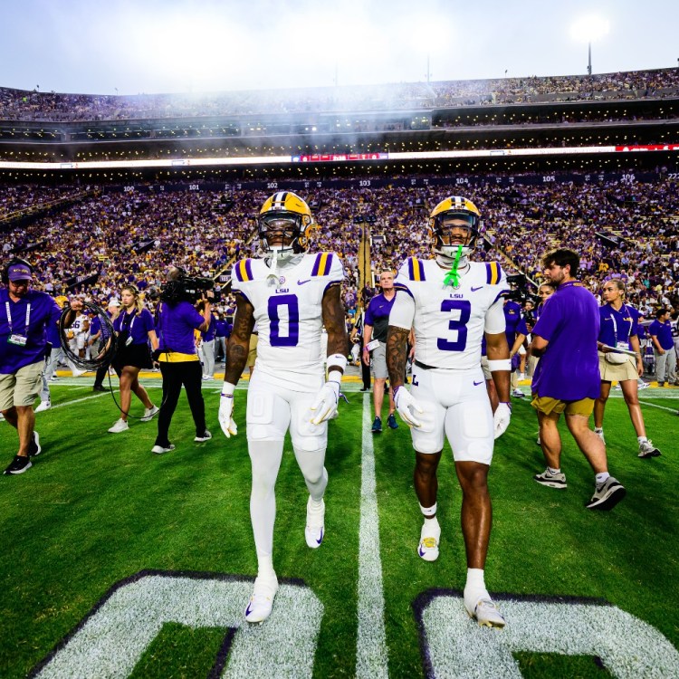
New for 2020: With the NCAA now having approved No. 0 as a legal uni number, the Buckeyes have decided that it will be assigned each year to a player who epitomizes the spirit of former OSU player and eventual pro and college hall of famer Bob Willis. The first such player to wear No. 0 — or, as Ohio State will call it, the block O — will be defensive lineman Jonathon Cooper (additional info here):
2. Nebraska
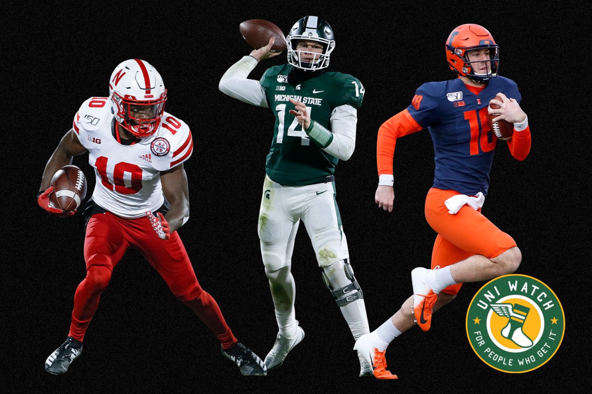
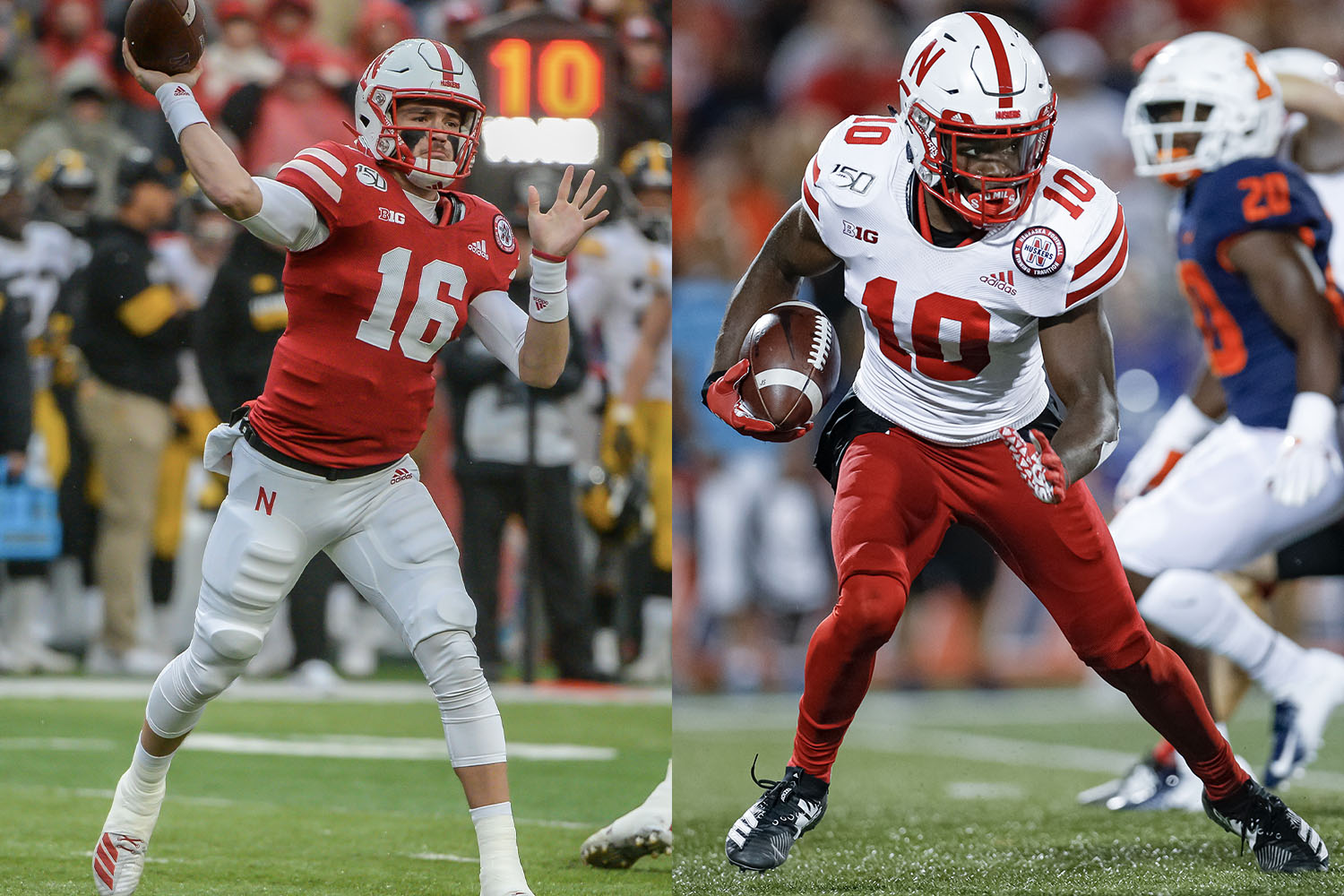
Nebraska’s on-field performance may not be anything to get excited about in recent years, but their uniforms are still the epitome of what an autumn Saturday should look like. Nothing fancy, no extraneous bells or whistles — just a classic design that looks like the dictionary definition of “football uniform.” And thanks to the great red pants, the Cornhuskers look as sharp on the road as they do at home.
New for 2020: Nebraska has had several “Blackshirts” alternate uniforms in recent years (the nickname refers to how defensive starters in the 1960s got to wear black practice jerseys). This year’s edition actually features a white shirt but black pants. Judging by the teaser video that the team recently posted, it will likely be worn for the game against Wisconsin on Halloween:
3. Michigan
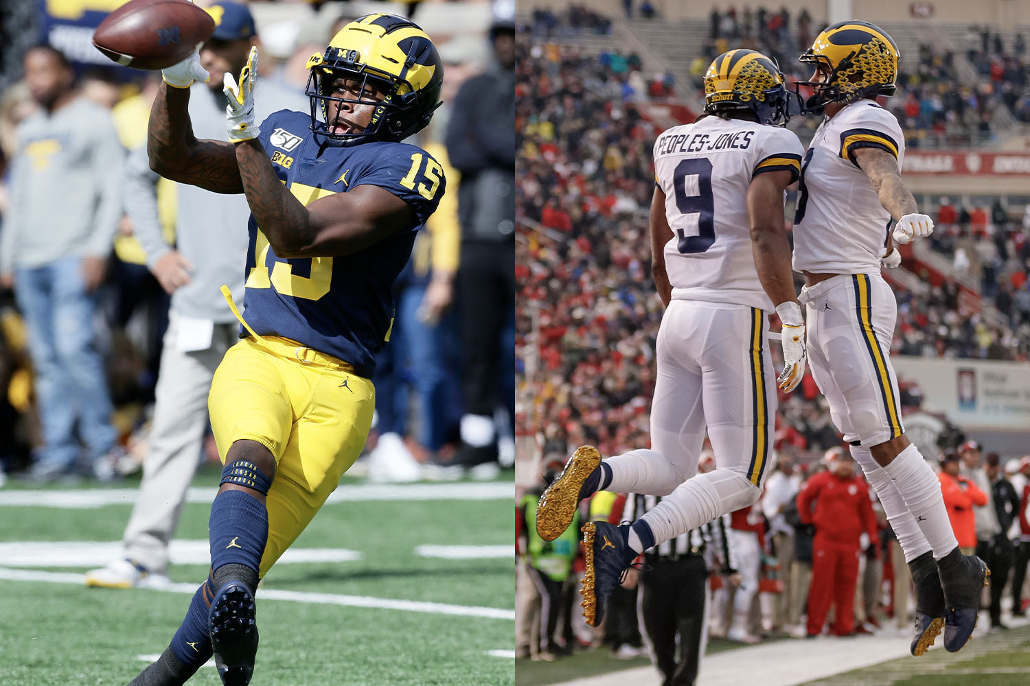
The helmet is iconic, the color scheme is sheer perfection, and the home uniform is as strong as anything else in the conference. But the white-over-white road uni just doesn’t feel right for the Wolverines — bring back the maize road pants! Also, the judging panel was obliged to deduct a few points for the branding malpractice of putting a basketball player on a football uniform.
New for 2020: The Wolverines are adding a rear-helmet decal to promote racial justice. It shows a raised fist in six different skin tones:
In addition, players will have the option of wearing an assortment of approved slogans. Additional info here.
4. Penn State
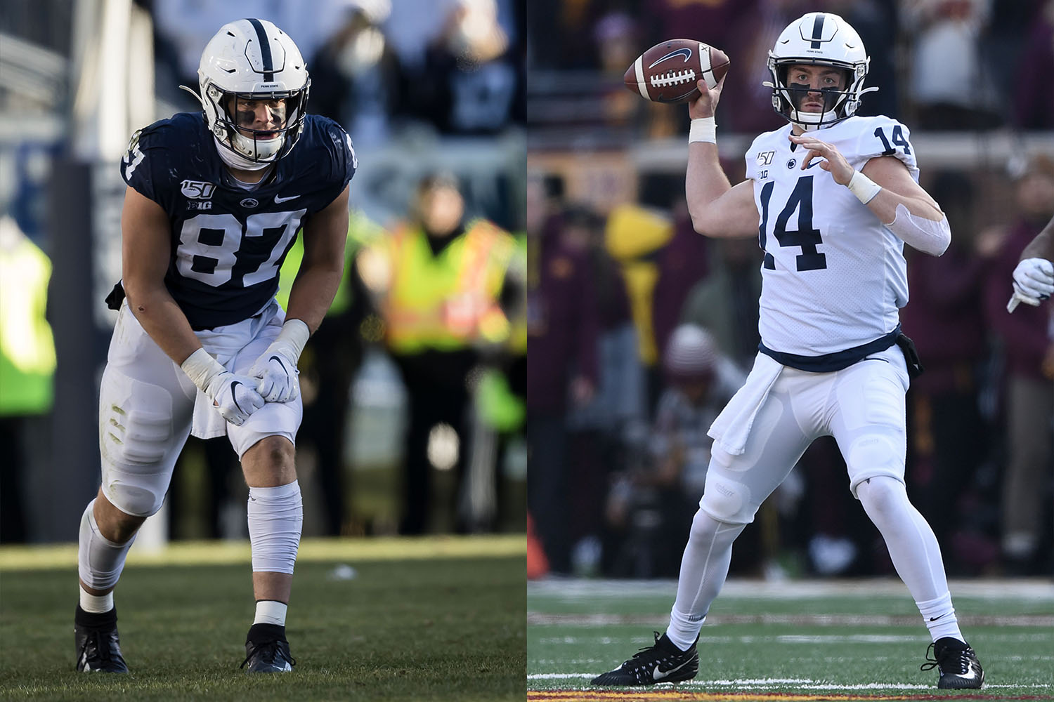
The definitive minimalist football uniform. Could they jazz it up in various ways by adding a helmet logo or an accent color, maybe some sleeve striping? Sure they could. Hell, it might even look better, at least in a vacuum. But it wouldn’t be Penn State. Oceans may rise, mountains may topple, black holes may devour us all, but this will remain the Nittany Lions’ basic look forever. And that’s not such a bad thing.
New for 2020: The Nittany Lions are adding a racial-unity jersey patch, and are also wearing the same logo as a rear-helmet decal:
Also: With No. 0 approved for on-field use, Penn State has decided that the number will be assigned to an outstanding special teams player. The inaugural hero of zero will be safety Jonathan Sutherland.
5. Minnesota
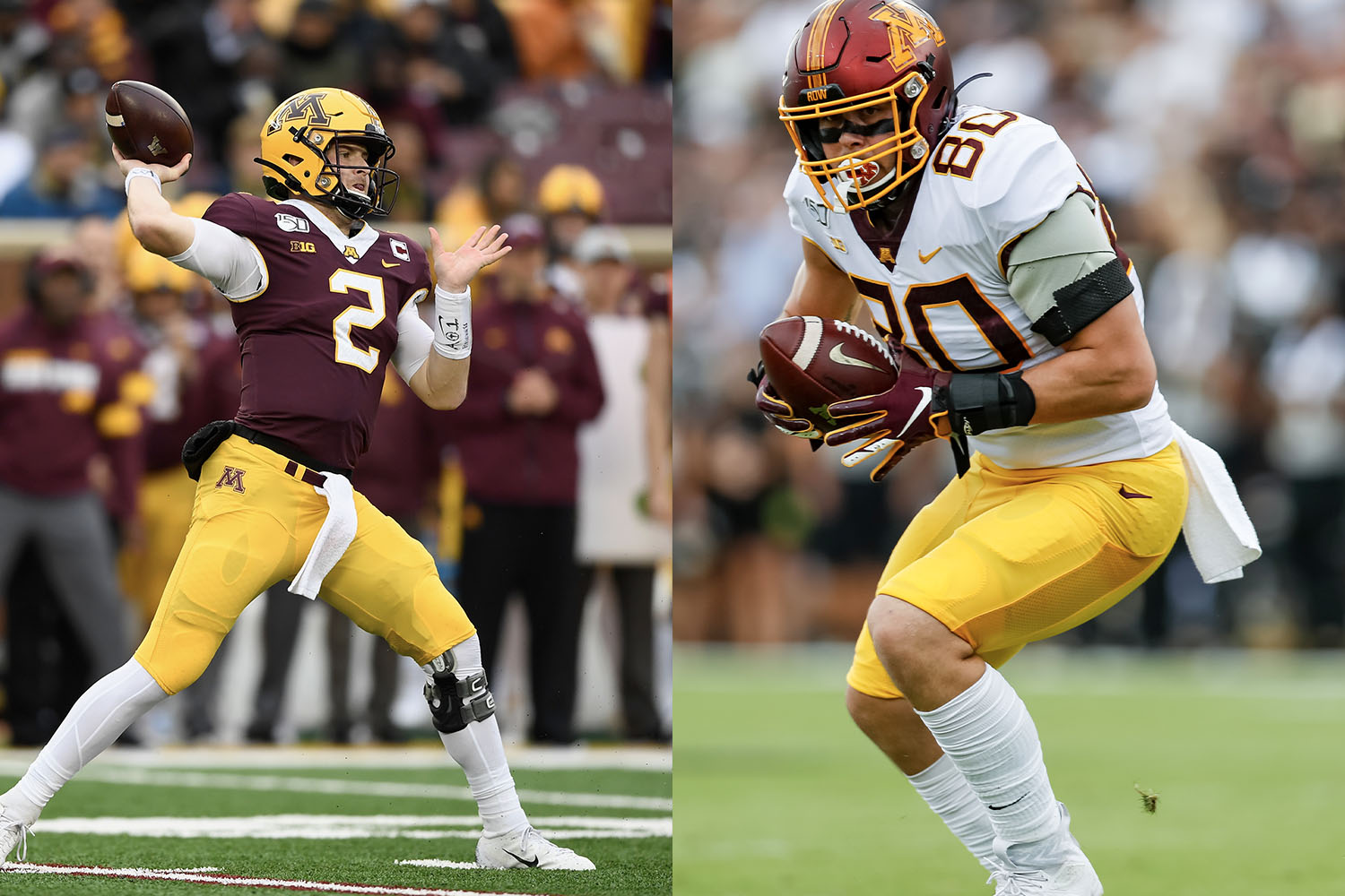
The Gophers have a lot of things going for them. For starters, they’re called the Gophers! Perfect name for a college football team (plus it makes for a great cartoon mascot character). Gotta love that color combo, too. The oddly shaped “M” helmet logo is simple but endearingly eccentric, and the helmet stripe is much better now that it no longer has that embarrassing oar paddle. Very solid stuff, and they’d rank even higher if not for their completely annoying number font.
New for 2020: With No. 0 now a legal for on-field use, wide receiver Rashod Bateman is wearing that number to symbolize “zero tolerance for racism” (additional info here):
6. Iowa
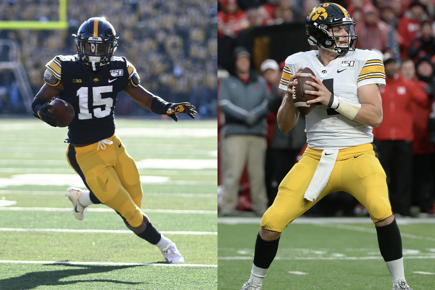
One of the immutable laws of the uni-verse is that you’re not allowed to talk about Iowa’s uniforms without mentioning the “ANF” helmet decal (which stands, of course, for “America Needs Farmers“) or that the school’s uni design was copied from the NFL’s Pittsburgh Steelers because Iowa coach Hayden Fry wanted his squad to “look like winners.” Those are both good storylines, and the Hawkeyes generally look solid on any given Saturday, but it’s a bit of a shame that they’re shackled to a knockoff look. Come on, guys — let go of the Steelers connection and come up with a unique style of your own.
New for 2020: Speaking of Hayden Fry, he died last December, so Iowa has added a memorial sleeve patch for him:
It’s an interesting move, because sleeve memorials are fairly rare in football (chest patches or rear-helmet decals are more common), so Iowa is breaking the mold a bit here. Good for them.
7. Rutgers
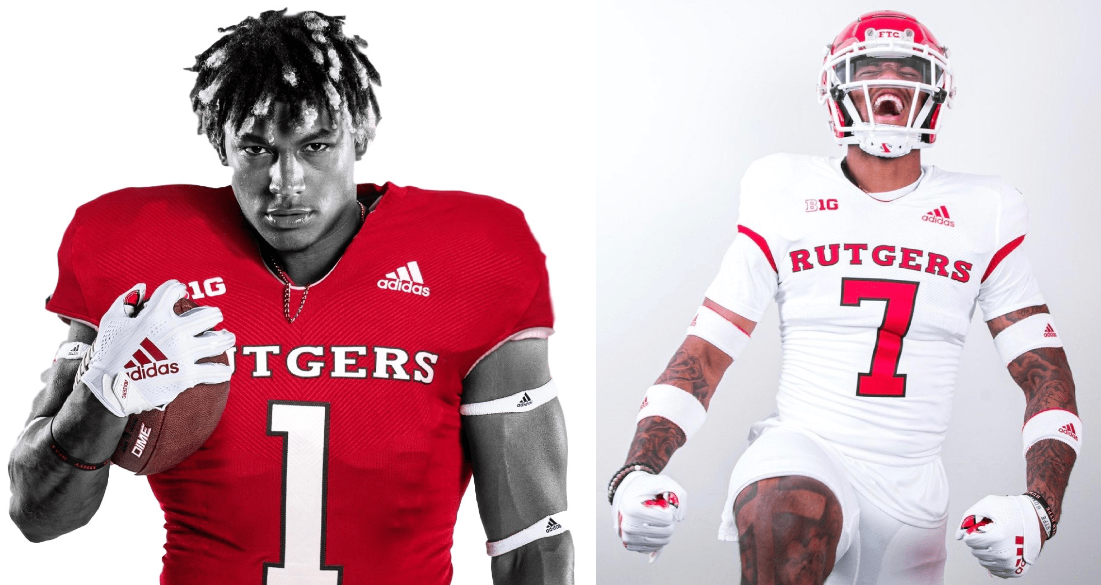
Rutgers is the one Big Ten school getting a full-scale makeover this season. With former coach Greg Schiano, who coached the Scarlet Knights from 2001 through 2011, returning to the fold this year, the school is reviving the uni set worn during his first coaching stint. There’s nothing particularly groundbreaking about the design, but the font for the chest lettering and uni numbers is just distinctive enough to help this set stand out from all of the conference’s other red/white schools.
New for 2020: See above.
8. Indiana
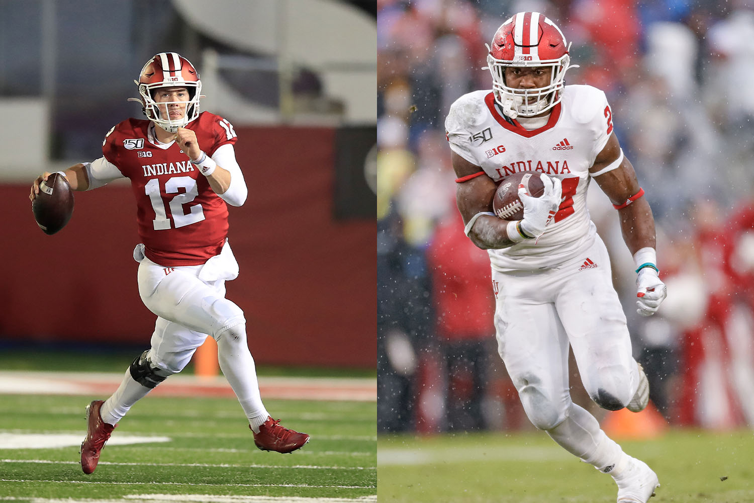
Anyone else think the white stripes on the Hoosiers’ helmets are a bit too thick? They feel too weighty compared to so many of the other uniform elements (the “IU” helmet logo, the white facemask, the chest lettering, etc.). Maybe a single centered stripe would be better? Or if there were matching stripes on pants and/or the sleeves?
If this all sounds like a lot of fuss over two simple white stripes, that’s because there isn’t much else to say about Indiana’s uniforms, which are simple and basic but somehow don’t quite feel iconic like Nebraska’s or Penn State’s. It’s just your basic B1G uniform set — no more, no less.
New for 2020: The Hoosiers are adding a social justice logo to their uniforms. It’ll be worn as a jersey patch and also as a rear-helmet decal (additional info here):
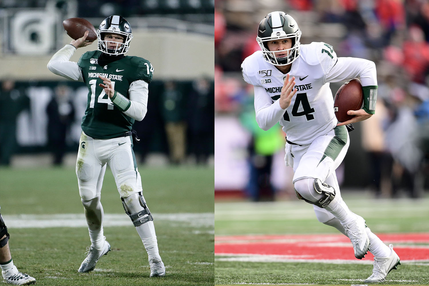
9. Michigan State
Green is an underused color on the gridiron, and is also your friendly uniform columnist’s favorite color. So why don’t the Spartans rank higher on this list? Too many small details that feel just a little bit off: the Nikefied number font with its annoying little indents, the absurdly shaped pants striping, the tapered helmet stripe (always a bad idea). Individually, none of these would be a dealbreaker. Collectively, though, they take enough of a toll to drag MSU down to the middle of the uniform pack. (And it’s a good thing this list isn’t factoring alternate uniforms into the rankings, or else State would have some serious problems.)
New for 2020: No announced changes for State, but they’ve unveiled their uniform combo — green jersey over white pants — for Saturday’s season-opening game against Rutgers:
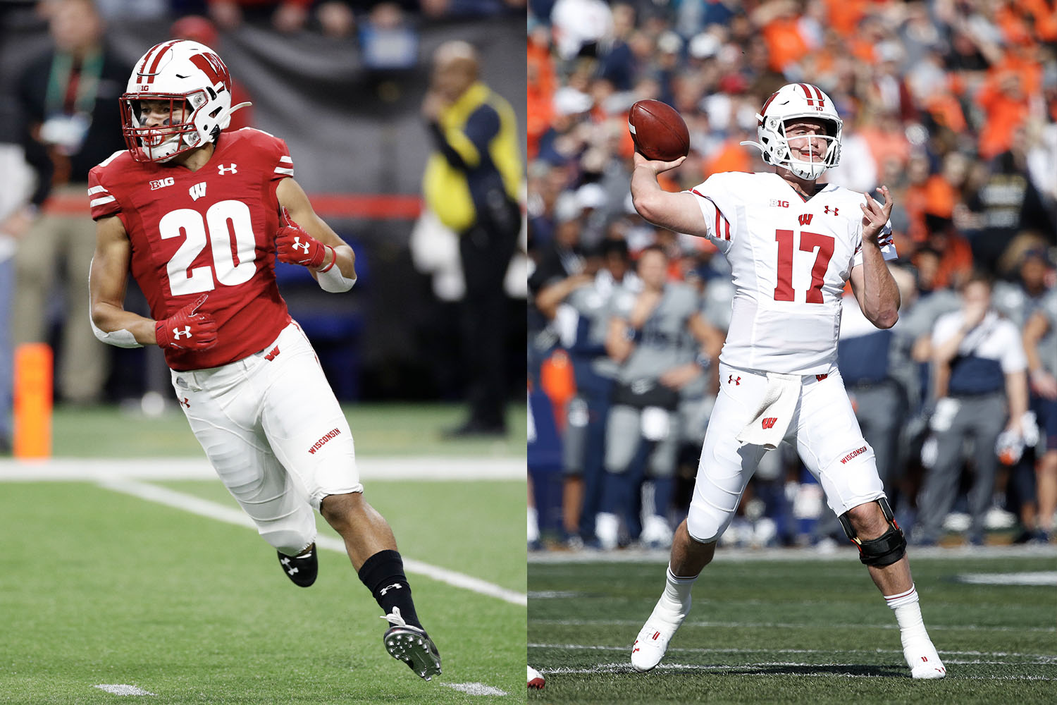
10. Wisconsin
The Big Ten is full of teams wearing red and white, so why do the Badgers rank lower than Nebraska, Rutgers and Indiana? First, while some people like the school’s “motion W” helmet logo, the feeling here at Uni Watch HQ has always been that it’s a bit too goofy-looking cartoon-ish. The same could also be said of the school’s current number font, which feels almost clown-like. The unfortunate wordmark on the left pant leg results in additional points being deducted. And finally, the arrows embedded in the sleeve and pants striping probably seemed clever when Under Armour came up with them (they supposedly refer to the state’s official motto, “Forward”), but they come off as a gimmicky distraction in real life. (On the plus side, however, Indiana could learn something from Wisconsin’s thinner helmet stripes.)
New for 2020: All Wisconsin teams, including the football squad, are adding a black “W” logo this season to support racial justice (additional info here):
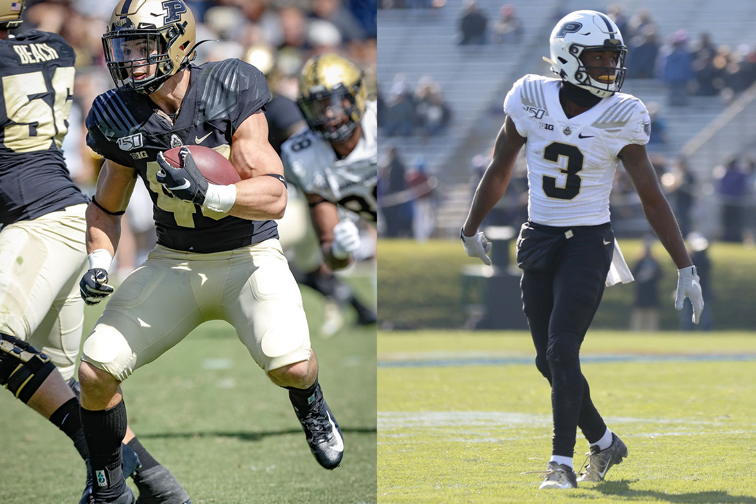
11. Purdue
In theory, this should be one of the best-looking, most distinctive teams in the conference, especially since no other B1G schools wear gold as a team color. Instead, the Boilermakers rank near the bottom of the pack, mainly because of the cowcatcher graphics on the jersey shoulders. For starters, a cowcatcher goes at the very front of a locomotive, so putting them on the shoulders doesn’t make sense. More importantly, these stripes don’t even look like cowcatchers! They look more like claws, or whiskers, or some sort of faux-badass superhero costume. That type of silliness might work for Oregon, but not in the Big Ten.
New for 2020: The Boilermakers are adding an “MJB” rear-helmet memorial decal for former athletic director Morgan Burke, who passed away in June:
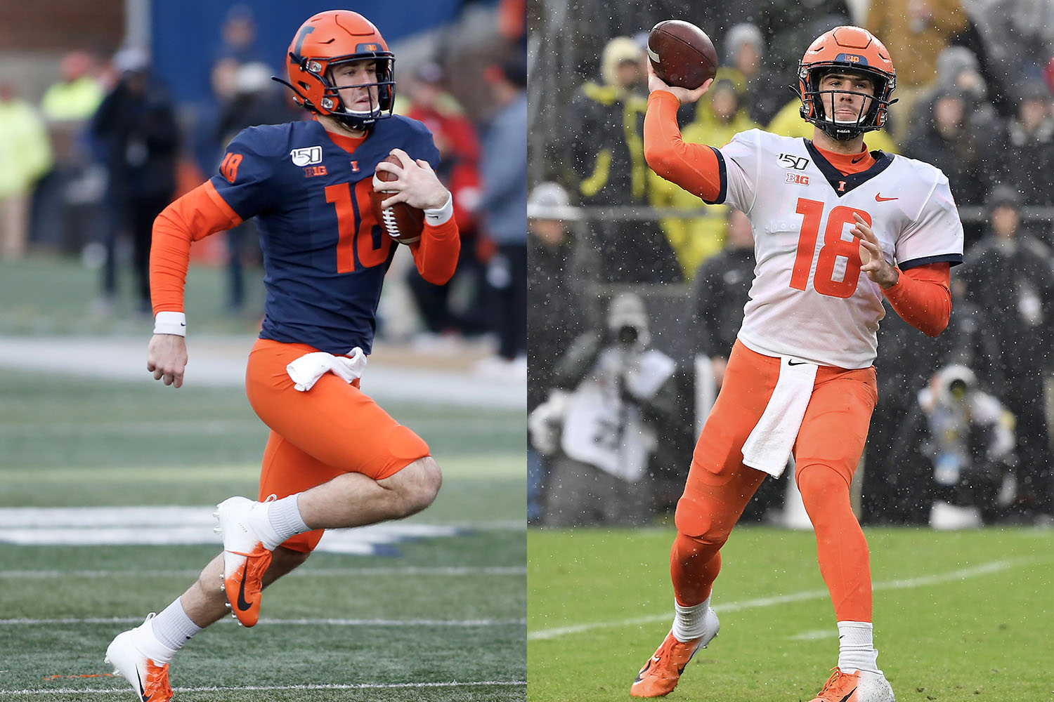
12. Illinois
The Illini have had some excellent uniforms at various periods in their history. Unfortunately, this is not one of those periods. The orange numbers on the navy home jersey create a vibrating effect (get some white outlining in there, stat!), and even the numerals on the road jersey would benefit from some navy outlining. The number font doesn’t feel right, either.
New for 2020: For the Friday-night season opener against Wisconsin, the Illini are advocating for social justice by turning their “I” helmet logo black and adding a raised-fist decal on the back of the helmet (additional info here):
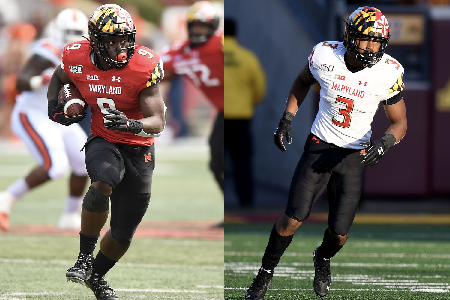
13. Maryland
Maryland blew everyone’s minds in 2011 with their state flag-based uniforms. The audaciousness of the new look, combined with a season-opening Labor Day win against Miami, made the Terps the talk of the college football world, with many observers predicting that the innovative uni program would give the Terps an Oregon-esque recruiting boost. Nearly a decade later, it hasn’t quite worked out that way, as Maryland has gone 41-70 in the flag-based uni era (and a pitiful 20-56 in conference games), which brings up a uniform truism worth repeating: If you dress like a clown and win, you like like a winner; but if you dress like a clown and lose, you just look like a clown.
New for 2020: No announced changes.
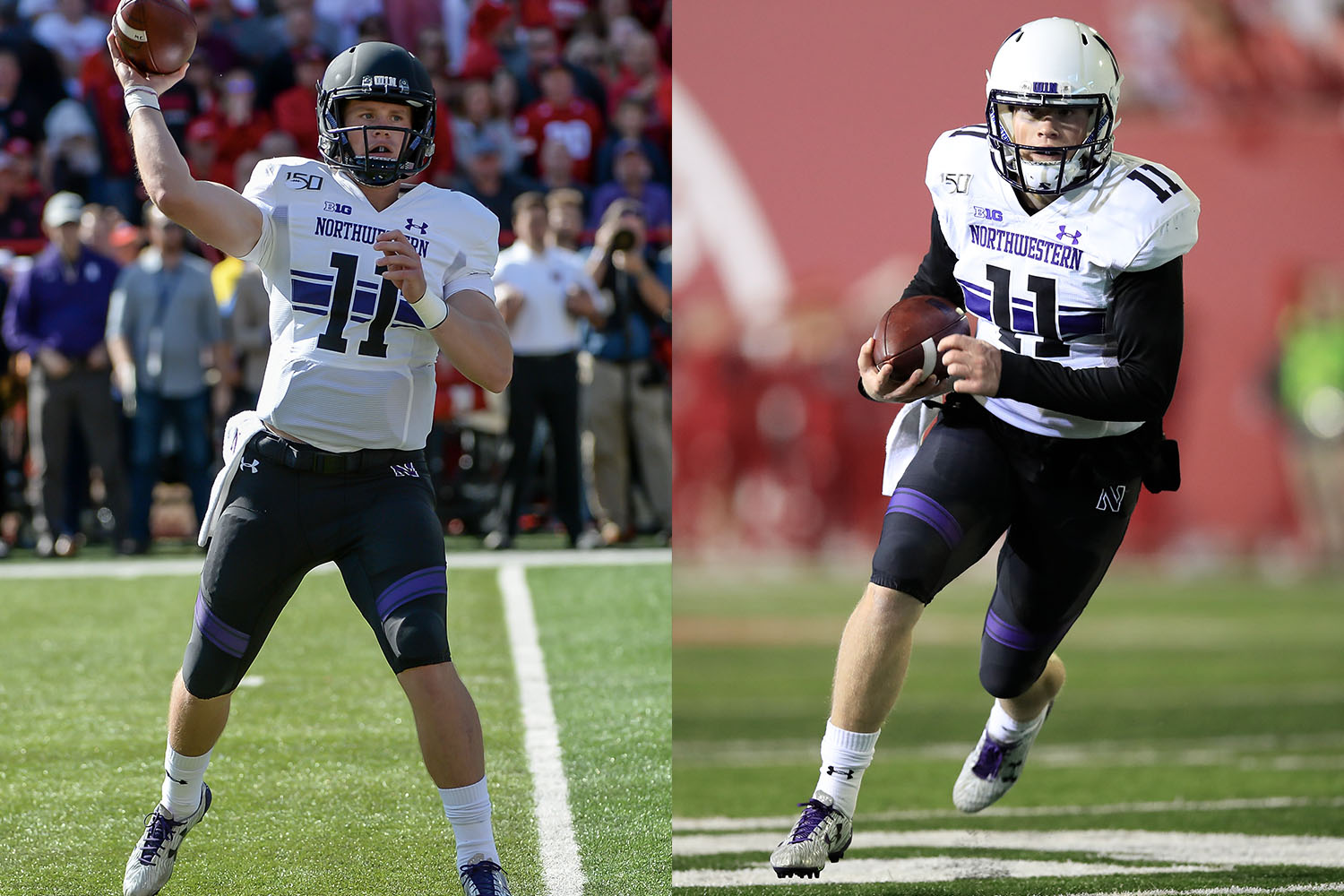
14. Northwestern
These rankings are supposed to be based on a team’s primary uniform combos. But for Northwestern, it’s hard to say what that even is. Are the helmets purple, black or white? Is the primary colored jersey black or purple? And let’s not even talk about the pants, with that silly thigh striping. What a mess.
New for 2020: No announced changes. But if want to keep track of Northwestern’s byzantine number of uniform combinations, here’s a good breakdown of the school’s record in each uni combo since 2012.
And there we are. Do you agree with all of that? Of course you don’t. Let the bickering commence!
Paul Lukas wishes all Big Ten players, staff members, and fans a healthy and safe football season. If you like this article, you’ll probably like Lukas’ Uni Watch Blog, plus you can follow him on Twitter and Facebook and sign up for his mailing list so you won’t miss any of his future InsideHook columns. Want to learn about his Uni Watch Membership Program, check out his Uni Watch merchandise, or just ask him a question? Contact him here.
Whether you’re looking to get into shape, or just get out of a funk, The Charge has got you covered. Sign up for our new wellness newsletter today.
