Pandemic or no pandemic, the NFL season is currently on track to kick off in early September. And from a uniform standpoint, it promises to be a doozy of a year, because a whopping eight teams — that’s 25% of the league’s 32 clubs — have new uniform sets for 2020.
With so many new designs in the mix, it’s time for a new edition of the Uni Watch NFL Power Rankings, the definitive team-by-team assessment of current pro gridiron attire.
Before we get started, a few notes:
- All judging has been done by the Uni Watch Power Rankings Executive Committee, which has a membership of one and freely admits its biases. The committee is rather fond of striped socks and the color green, for example, but is less enthusiastic about gimmicky number fonts and same-colored jerseys and pants. If you don’t share the committee’s preferences,
then you’re totally hopeless and it’s a wonder you can even dress yourself in the morningthat’s fine — the whole point of a project like this one is that it’s fun to argue and disagree. - Each team has been ranked primarily on the basis of its current primary uniforms, with alternates, throwbacks and Color Rush uniforms taken into account to a lesser extent.
- The rankings include all of the new NFL uniforms that have been released for 2020. Assessing these new designs was, by necessity, somewhat speculative, because we haven’t yet seen them on the field.
Okay, enough preliminaries. Ready, set, argue!
1. Las Vegas Raiders
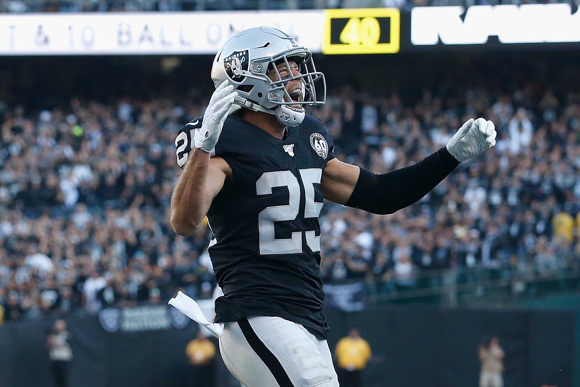
New city, new stadium, same old silver and black. The Raiders’ uniforms, essentially unchanged for a half-century now, are a case study in “If it ain’t broke, don’t fix it.” Flashy? Nope. Modern? Nuh-uh. But while the franchise has had its ups and downs, its on-field look remains the definition of NFL uniform perfection. Chef’s kiss!
2. Green Bay Packers
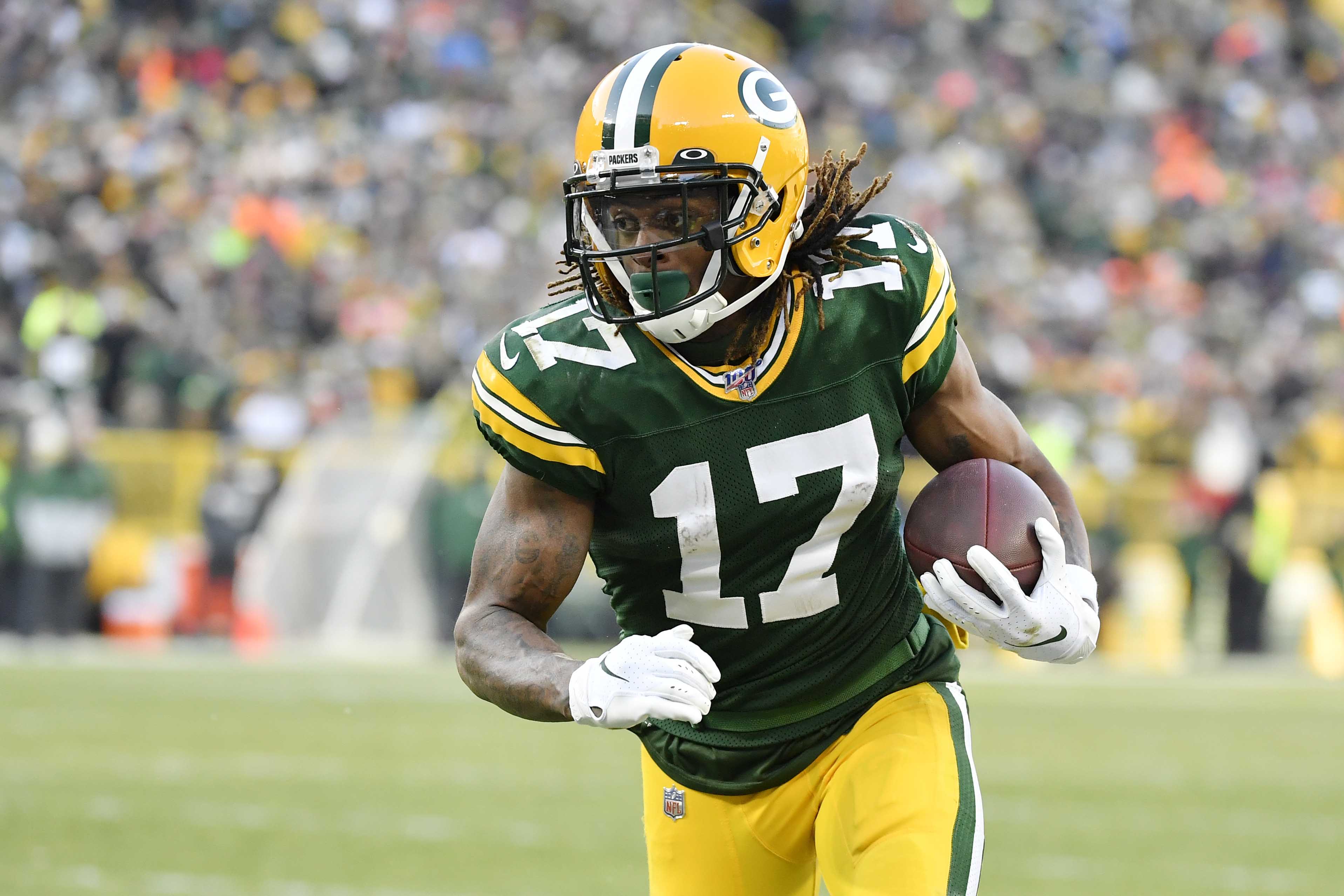
There are trends, there are fads, there are pandemics — and then there’s the timeless, elemental simplicity of the Packers’ uniforms, which provide the ideal autumnal color palette for an autumn sport. If not for the TV numbers on their shoulders being just a bit too large, they’d be in the top spot on this list.
3. Los Angeles Chargers
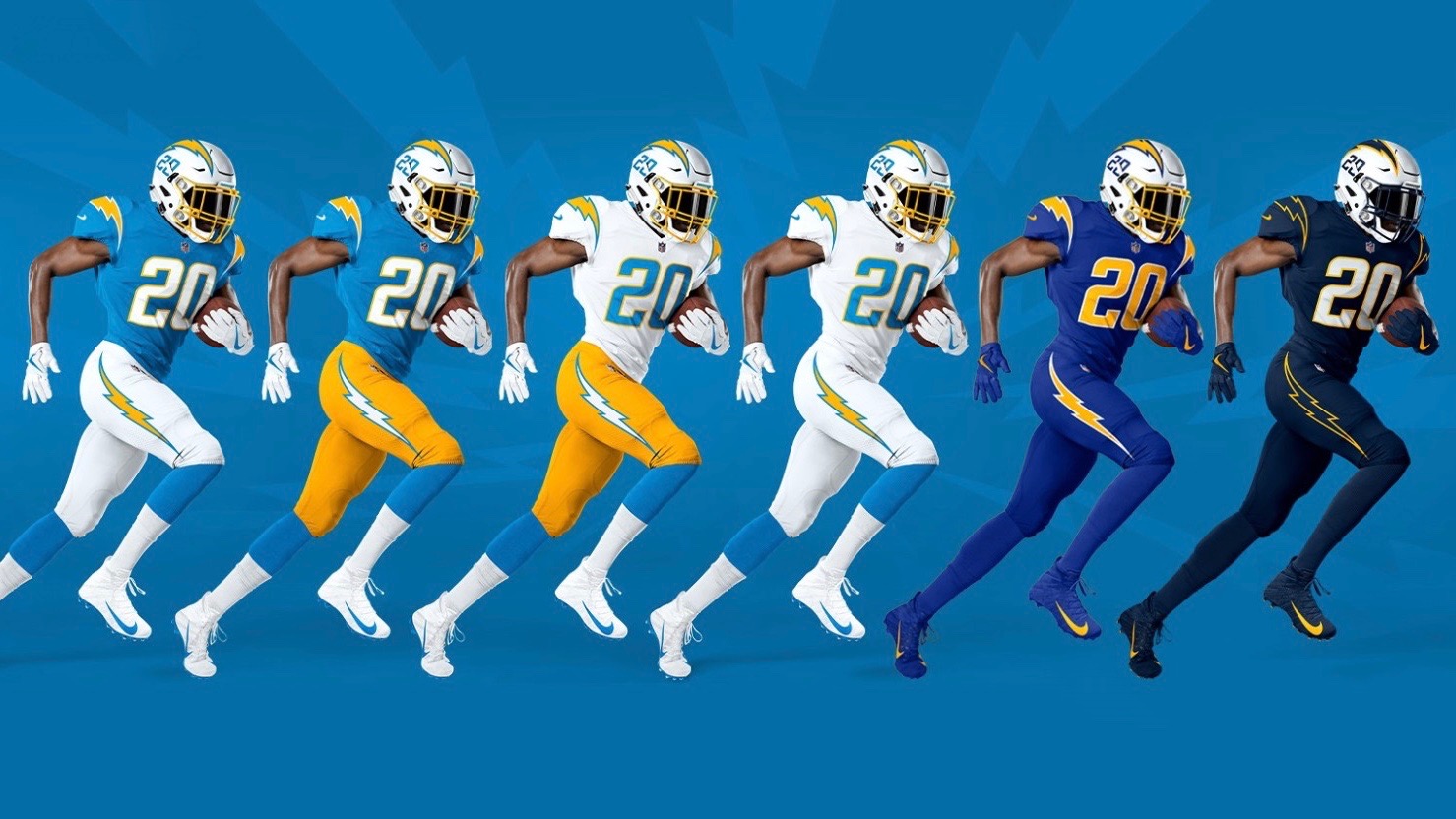
Here’s something to consider: In their six decades of existence, the Chargers have never had a bad uniform set. Their current ensemble, which was unveiled back in April, isn’t quite their best (that honor would probably go to their late-1960s look), but it’s close, and it’s good enough to put them into the upper tier of our NFL uni rankings. Bonus points for restoring the numbers to the helmets, but docked a notch for having two separate mono-blue uniforms, which is at least one too many.
4. Pittsburgh Steelers
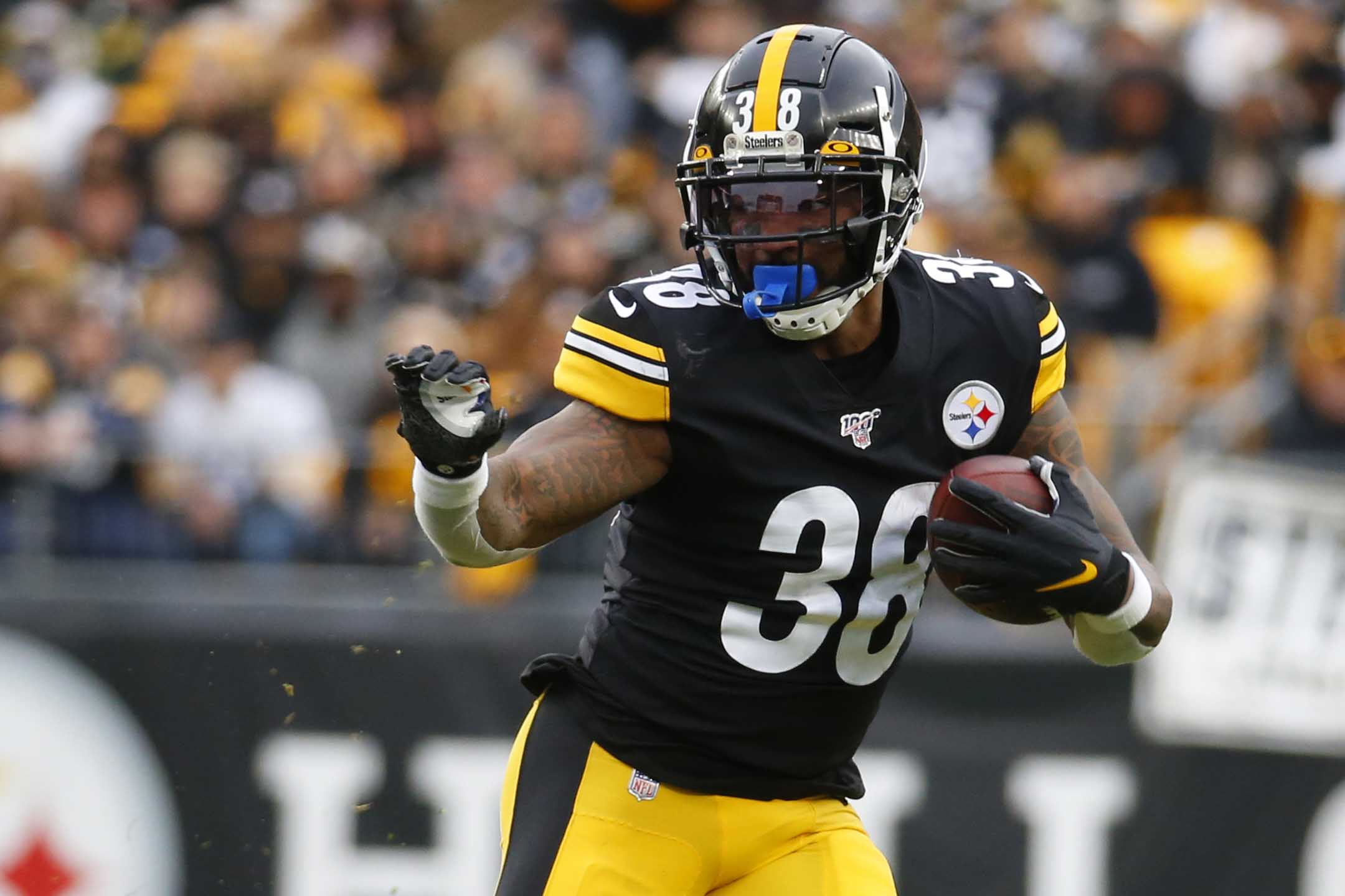
Ever wonder why the Steelers’ logo appears on only one side of the helmet? It’s because the logo decal was initially tested out in 1963 as an experiment, and the team’s equipment staff was instructed to apply only one decal per helmet in case ownership opted not to go ahead with the idea. Ownership did eventually give the green light, but the one-logo treatment stuck — a fun little eccentricity in an otherwise straightforward uniform set. So solid that even their Color Rush uni looks good.
5. Cleveland Browns

After five years in uniform purgatory, most observers were just hoping the Browns would return to some semblance of aesthetic respectability. But their new set, which was unveiled back in April, goes a lot further than that, immediately vaulting the team into the upper echelon of NFL uniform designs. The sleeve stripes, the sock stripes (almost unheard of in today’s NFL), the lack of a chest wordmark — it’s all Just Right. Too bad they haven’t thrown some Brian Sipe-era orange pants in the mix, but that’s rumored to be coming in 2021.
6. Dallas Cowboys
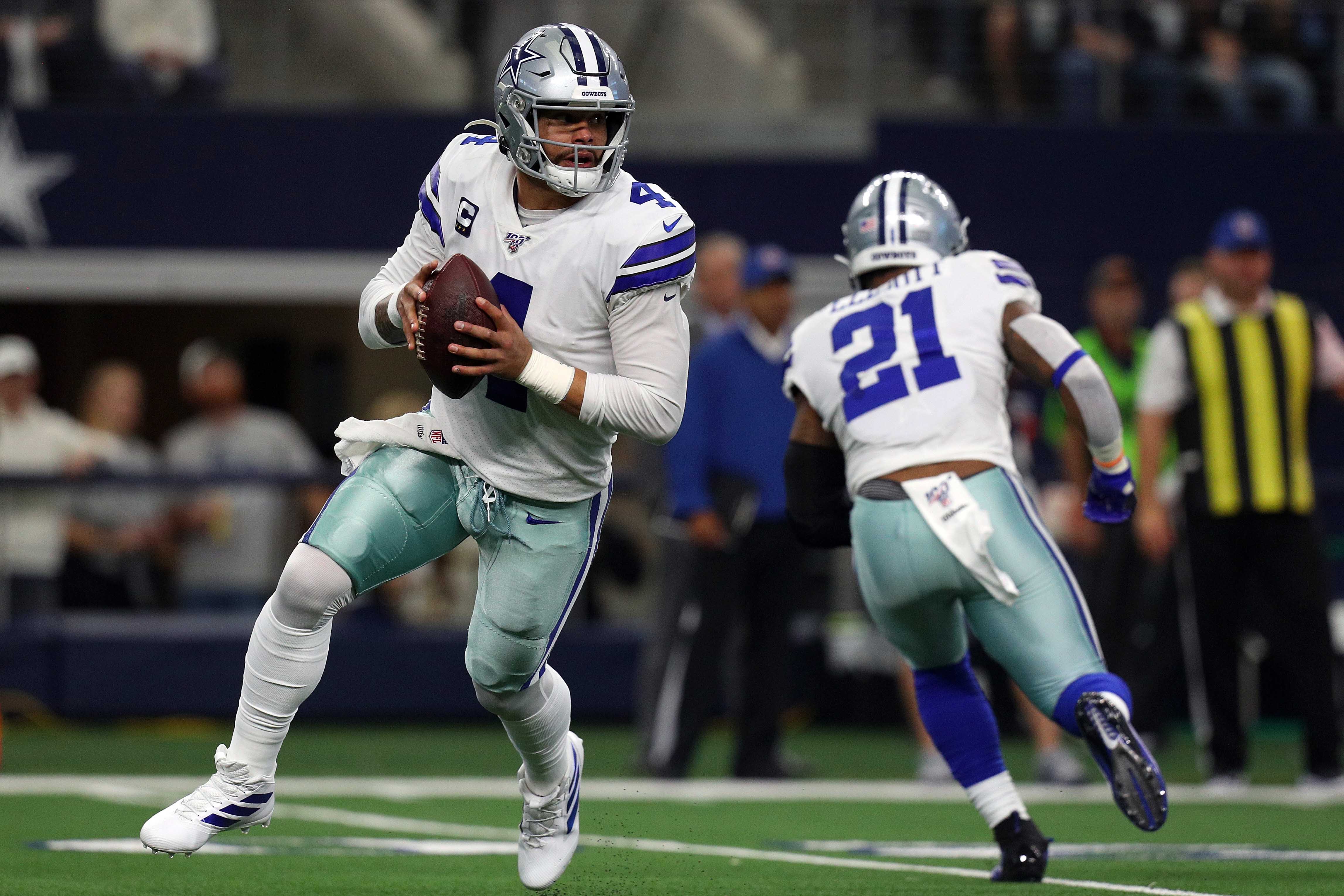
Some uniform connoisseurs are annoyed — even enraged! — by the Cowboys’ inconsistent shades of blue (royal on the white jersey, navy on the helmet and blue jersey), the differing shades of silver pants (aqua-tinted with the white jersey, classic silver with the navy jersey) and the black outline on the blue sleeve stripes (black appears nowhere else on the team’s uniform). But while you probably wouldn’t do any of that if you were drawing up a team’s look from scratch, it somehow looks right, even classic, for the Cowboys. And they’ll look even better this season, thanks to their handsome new 60th-anniversary patch.
7. Buffalo Bills
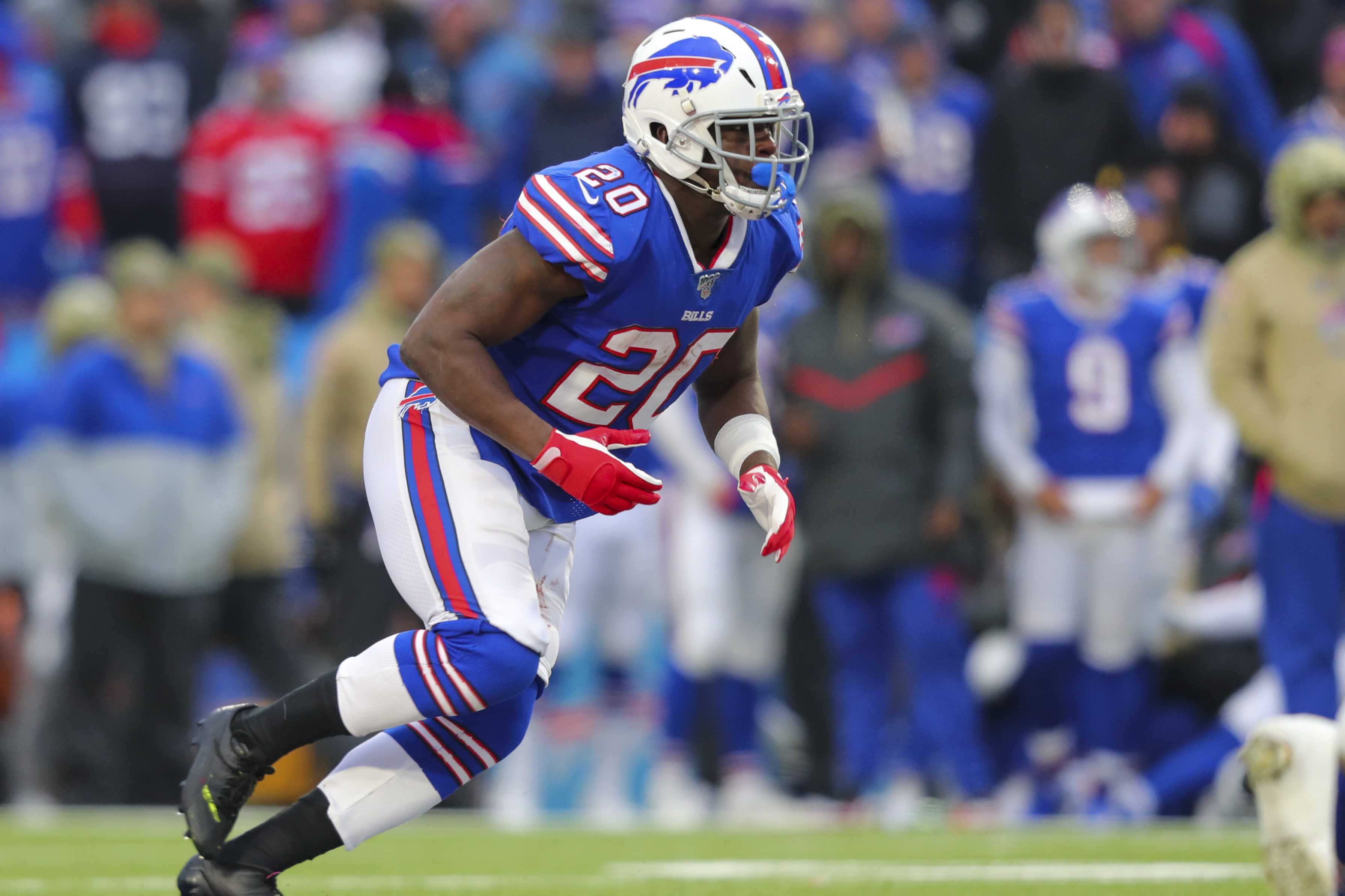
Some folks still pine for the Bills’ red-helmeted days, but the feeling here at Uni Watch HQ has always been that they’re a blue team with red trim, not the other way around, so they shouldn’t be wearing a red lid. Their current look, introduced in 2011, is underrated and very easy on the eyes, from the white helmet on down — at least when they stick to their standard home and road combos. Docked a notch, though, for playing too many games in mono-blue and mono-red.
8. Chicago Bears
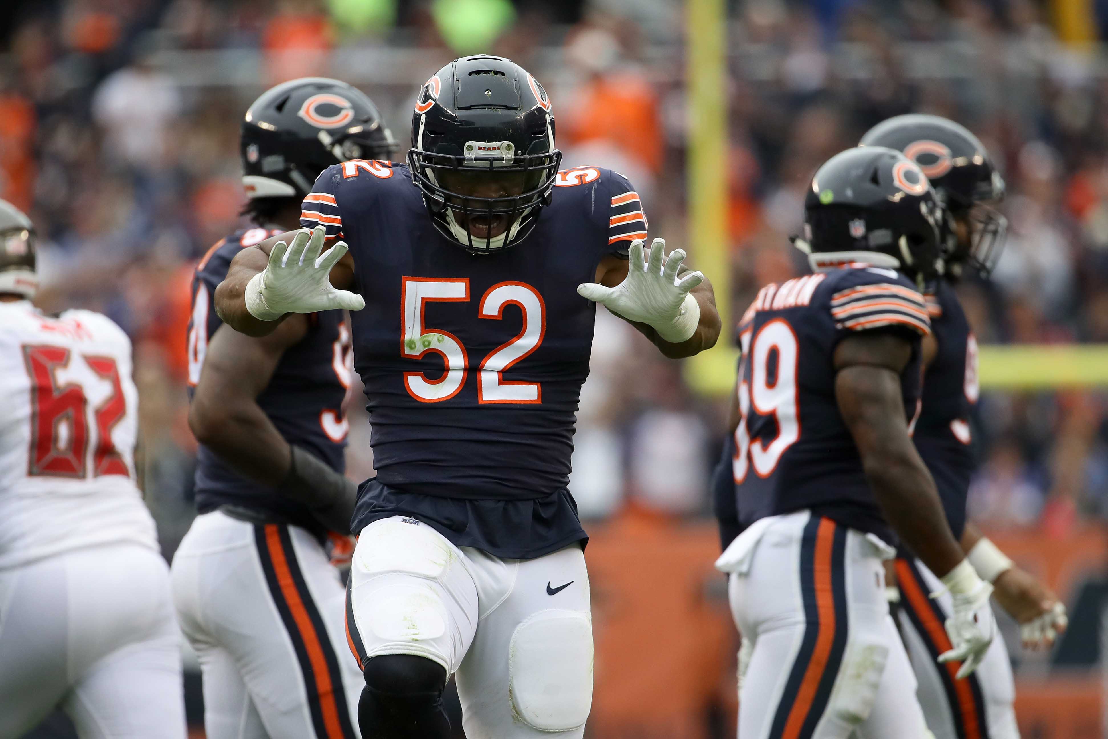
From the distinctive number font to the triple-striped sleeves (very nice) and matching triple-striped socks (even nicer), the Bears are an old-school team that looks just a bit different than the other old-school teams. They’d rank even higher on this list if they kept last season’s magnificent centennial-celebration throwback in their uni rotation.
9. San Francisco 49ers
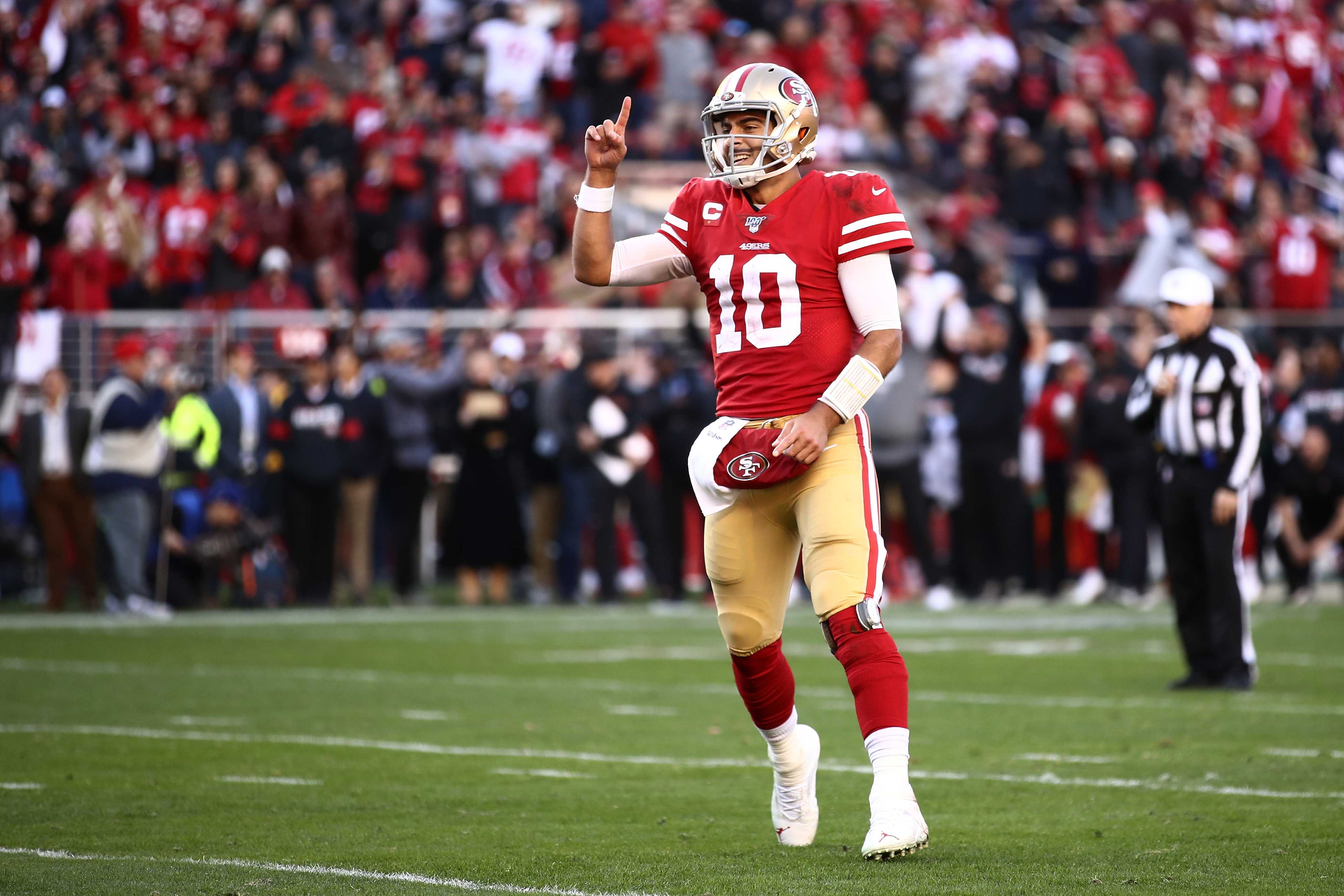
The Packers and Steelers may be good-looking teams (see above), but it’s a tad irksome when they claim to be wearing “gold.” Come on, people, you can call it whatever you want, but we all know it’s really yellow! Now, the 49ers’ helmets — that’s gold. Meshes perfectly with the rest of their uniform set, too. Now let’s just hope they never wear that mono-black nonsense again.
10. New York Giants
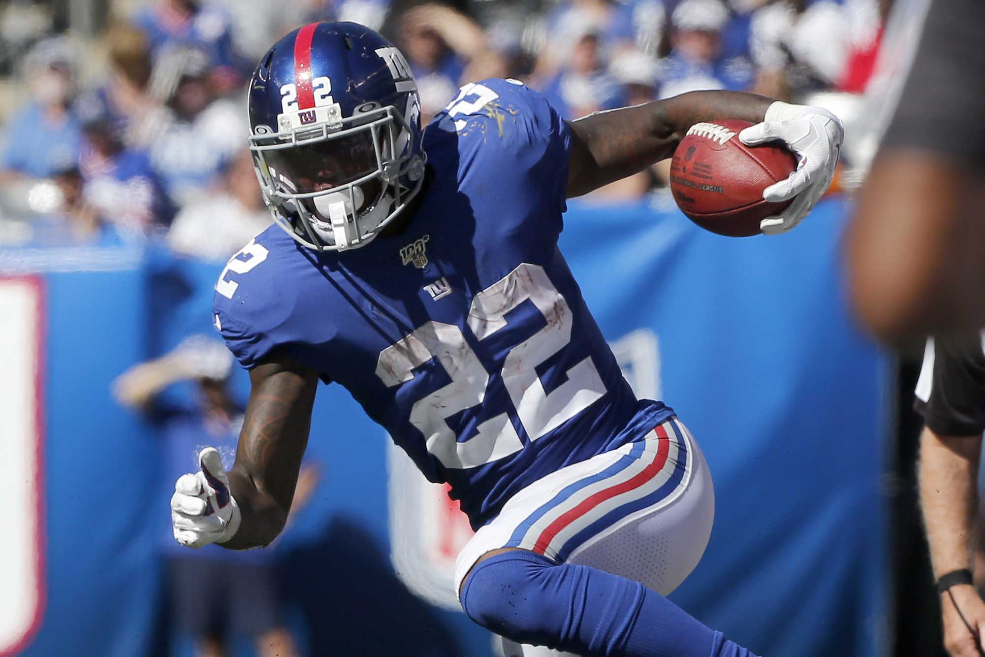
Still wish the white jersey had blue numbers and trim, instead of red. And with the Eli Manning era now finished, maybe it’s time to think about changing the helmet logo back to the “Giants” lettering instead of the “ny.” Overall, though, Big Blue remains very easy on the eyes.
11. Indianapolis Colts
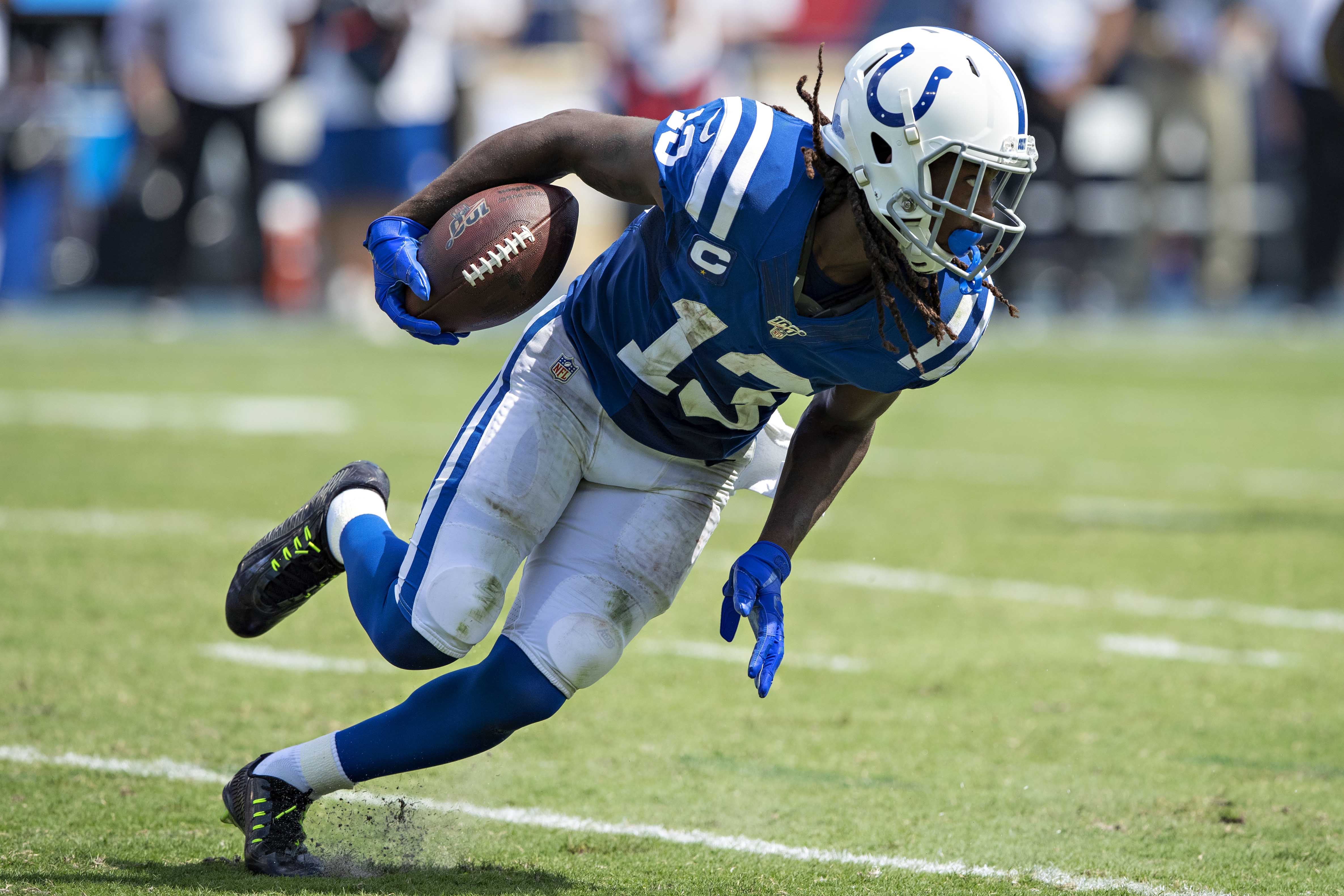
Another traditionalist team — so traditionalist, in fact, that their uniforms are more or less unchanged since 1957! They’ve made some extremely subtle tweaks this season, but most fans won’t even notice. Too bad they play in a dome, because their old-fashioned look really deserves to be showcased out in the elements, not indoors.
12. Washington Football Team
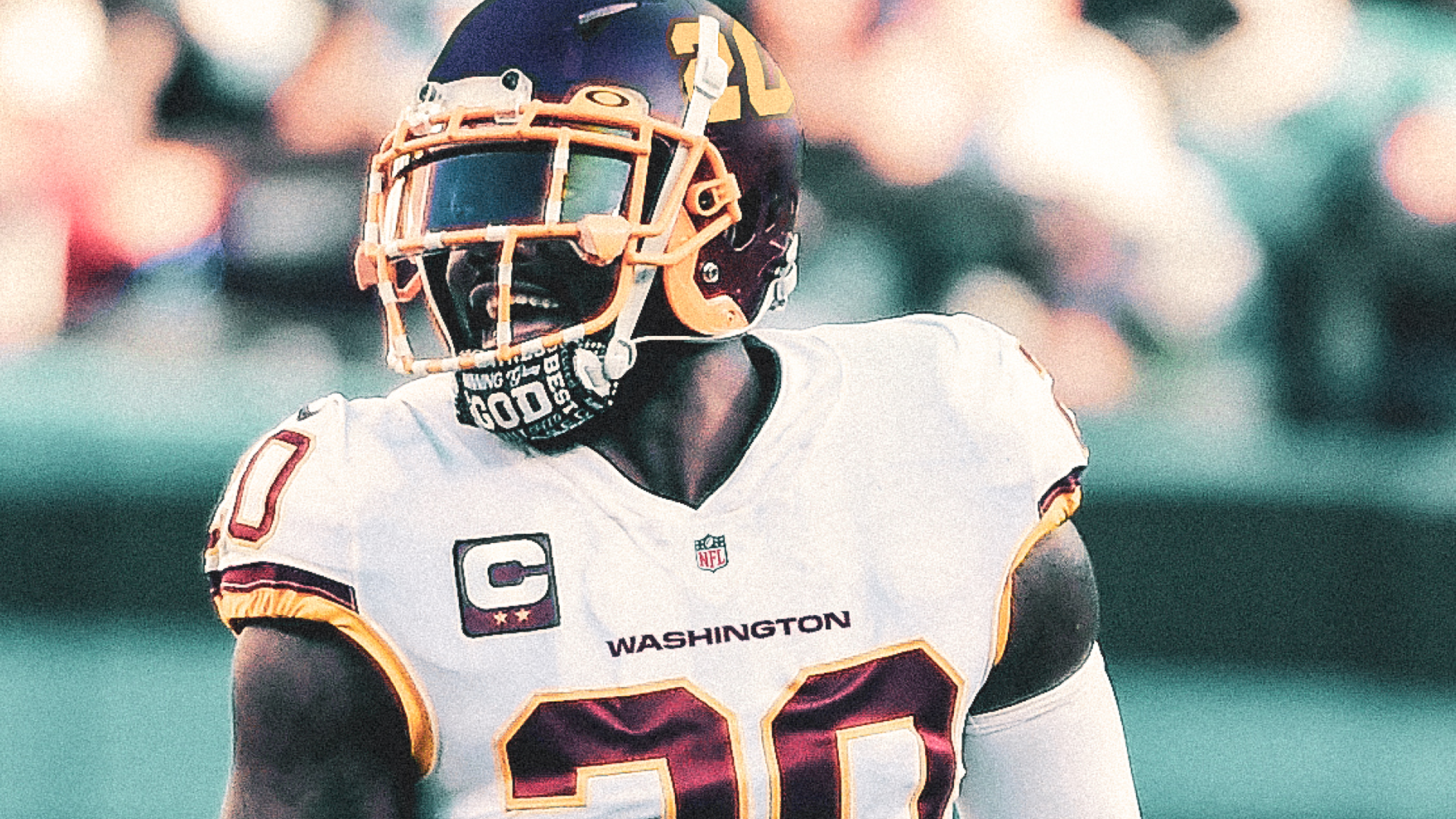
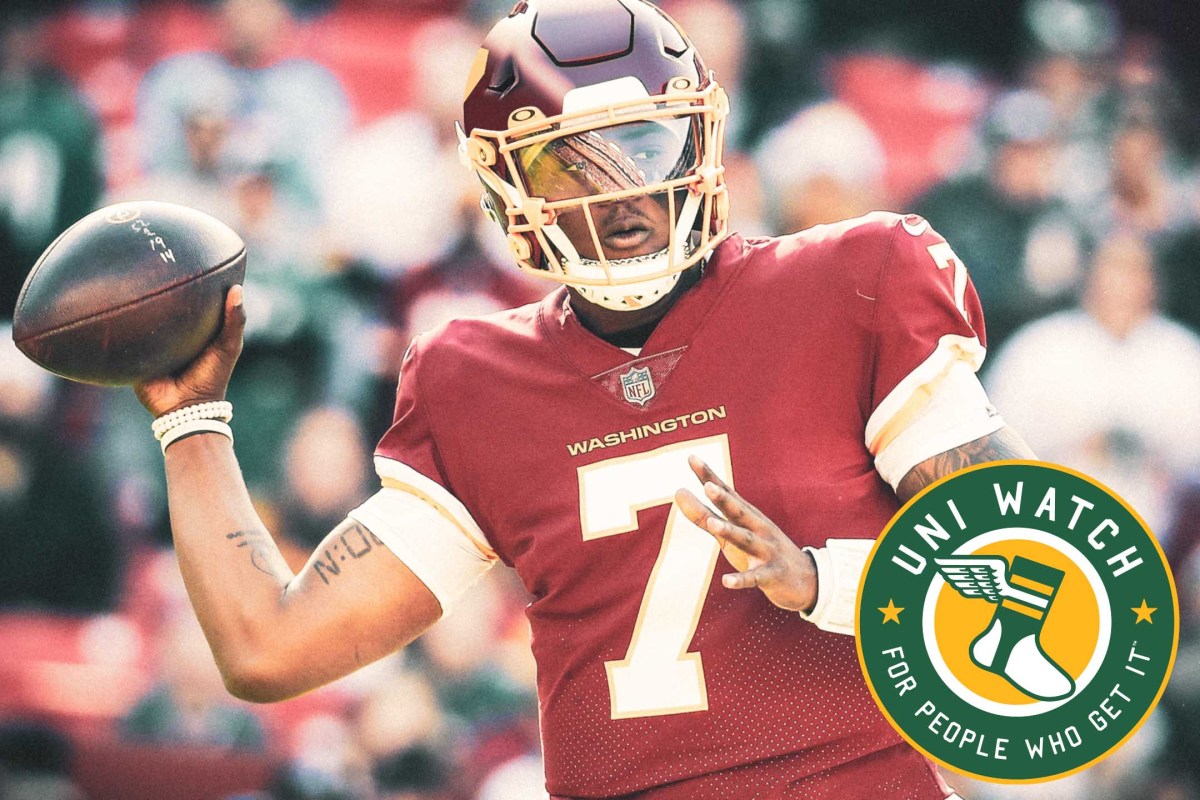
See, that wasn’t so hard. Get rid of the problematic team name and remove the helmet logo, and presto — you’re back in the world of civilized aesthetics! Washington is going with a placeholder identity this year, with the city name on the jersey chest and uni numbers on the sides of the helmet. It’s just a stopgap, but the team’s longstanding color scheme and base visual elements are strong enough to make this a perfectly acceptable NFL uniform. They could do a lot worse than to stick with this beyond 2020.
13. Philadelphia Eagles
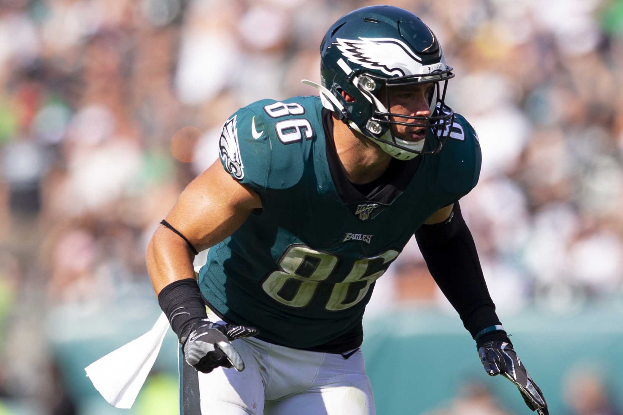
Fans have been clamoring for the Iggles to ditch the midnight green and go back to their Kelly green roots. That would definitely be an upgrade, but Philly’s current look isn’t so bad, especially when they pair the white jersey with the green pants — an underrated combo that they didn’t wear at all in 2018 but finally brought back for their last two road games in 2019. Here’s hoping we see more of it this season.
14. Tampa Bay Buccaneers
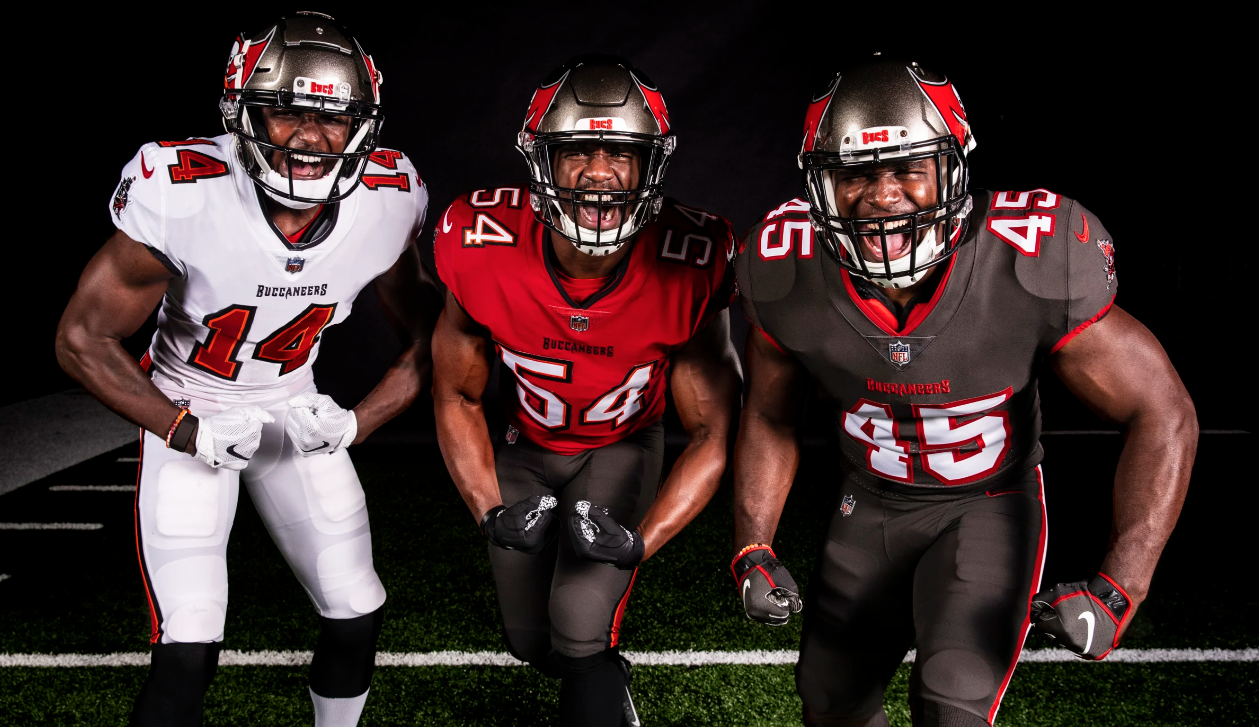
Much like the Browns, the Bucs have hit “Ctrl+Z,” jettisoned almost all traces of the ill-advised designs they’ve been wearing in recent years, and gone back to one of their earlier designs. This is good news on two fronts: First, their latest set is essentially a revival of original red/pewter designs from the Super Bowl glory years. Moreover, we won’t have to look at those godawful digital alarm clock uni numbers anymore (and Tom Brady, thankfully, won’t have to wear them).
15. Miami Dolphins
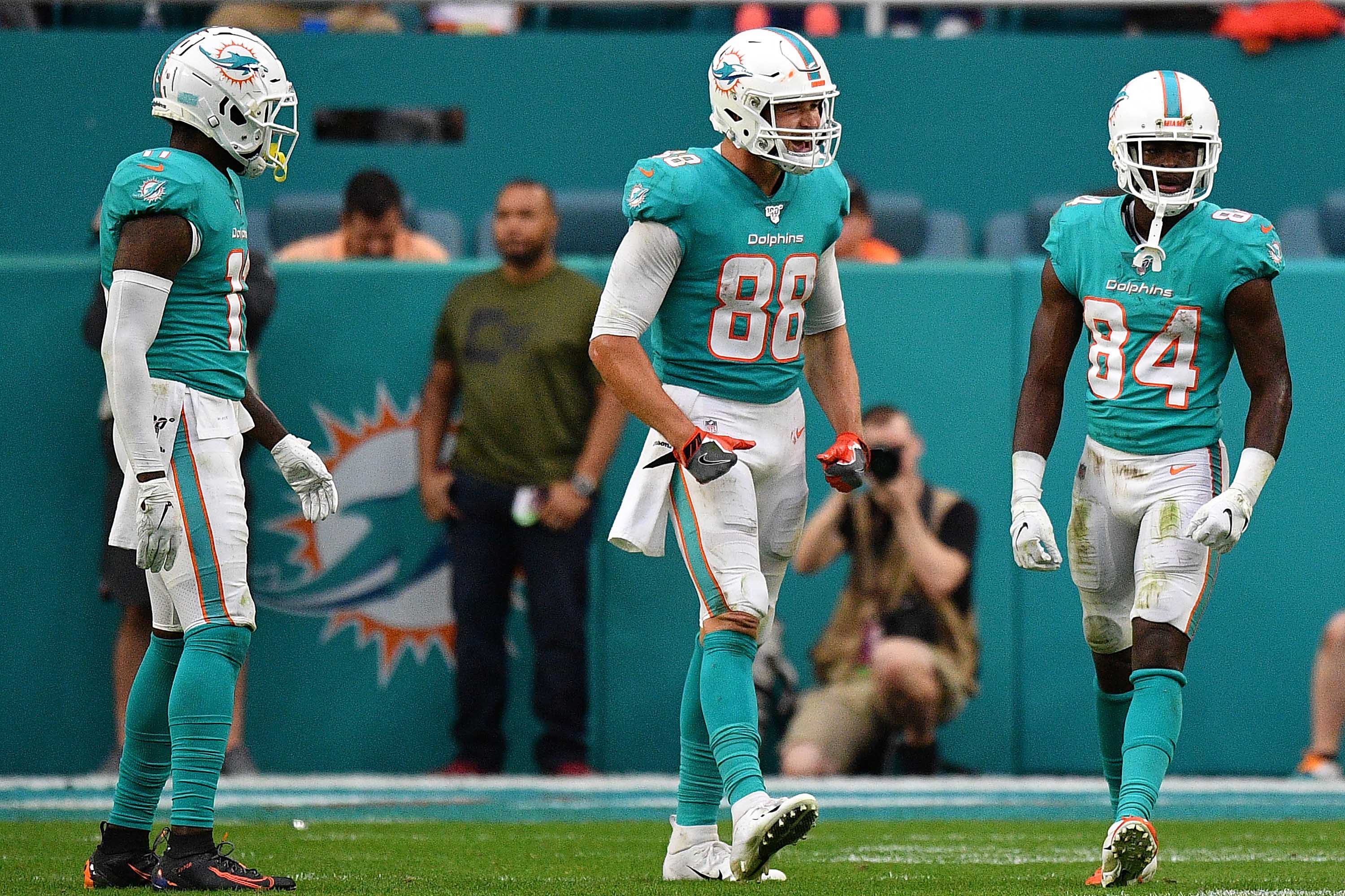
Everyone wants the Dolphins to go back to their old leaping dolphin helmet logo. And sure, that would be nice. Really, though, the current logo isn’t so bad. If they’d just get rid of the high school-ish chest lettering and the “bottlenose”-themed number font, they’d be sitting pretty. As it is, they’re your basic middle-of-the-pack team, at least in terms of their uniforms.
16. Houston Texans
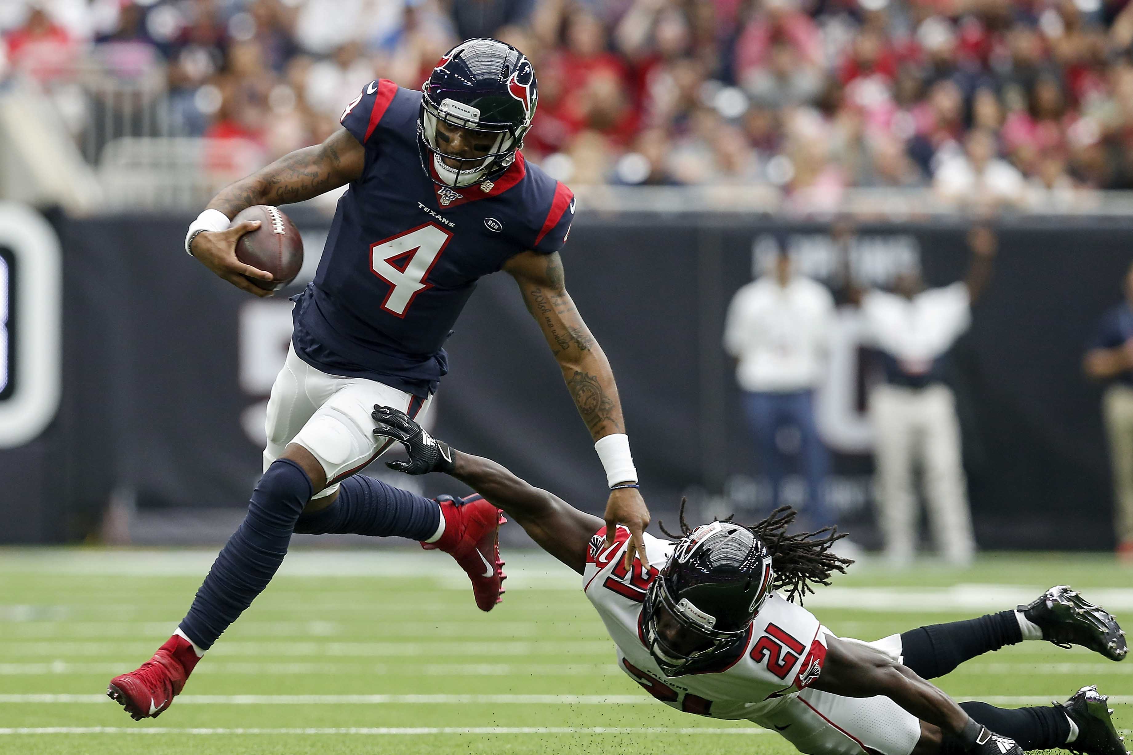
At this point of the list, we’ve arrived at the group of teams whose uniforms are either flawed or just mediocre. The Texans are in the latter group. There’s nothing much to dislike about their on-field look, and nothing much to get excited about either. It all feels bland, unobjectionable and unremarkable. After maintaining more or less the same aesthetic specs since their 2002 inception, it’s time for a makeover.
17. Jacksonville Jaguars
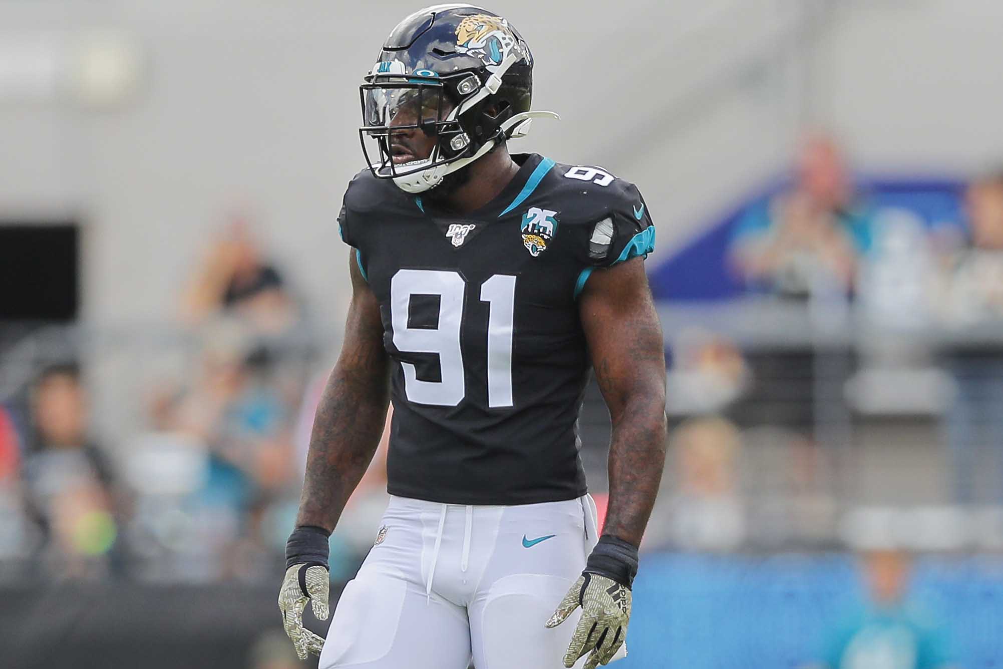
Another visual mediocrity. Sure, they look way better than they did a few short years ago (remember the two-tone helmets?), but nowhere near as good as they looked in their Mark Brunell-era modern classics. The current set strikes a safe, boring middle ground between those two extremes. Come on, guys — add a bit of gold trim and jazz things up a bit. You can do it!
18. New Orleans Saints
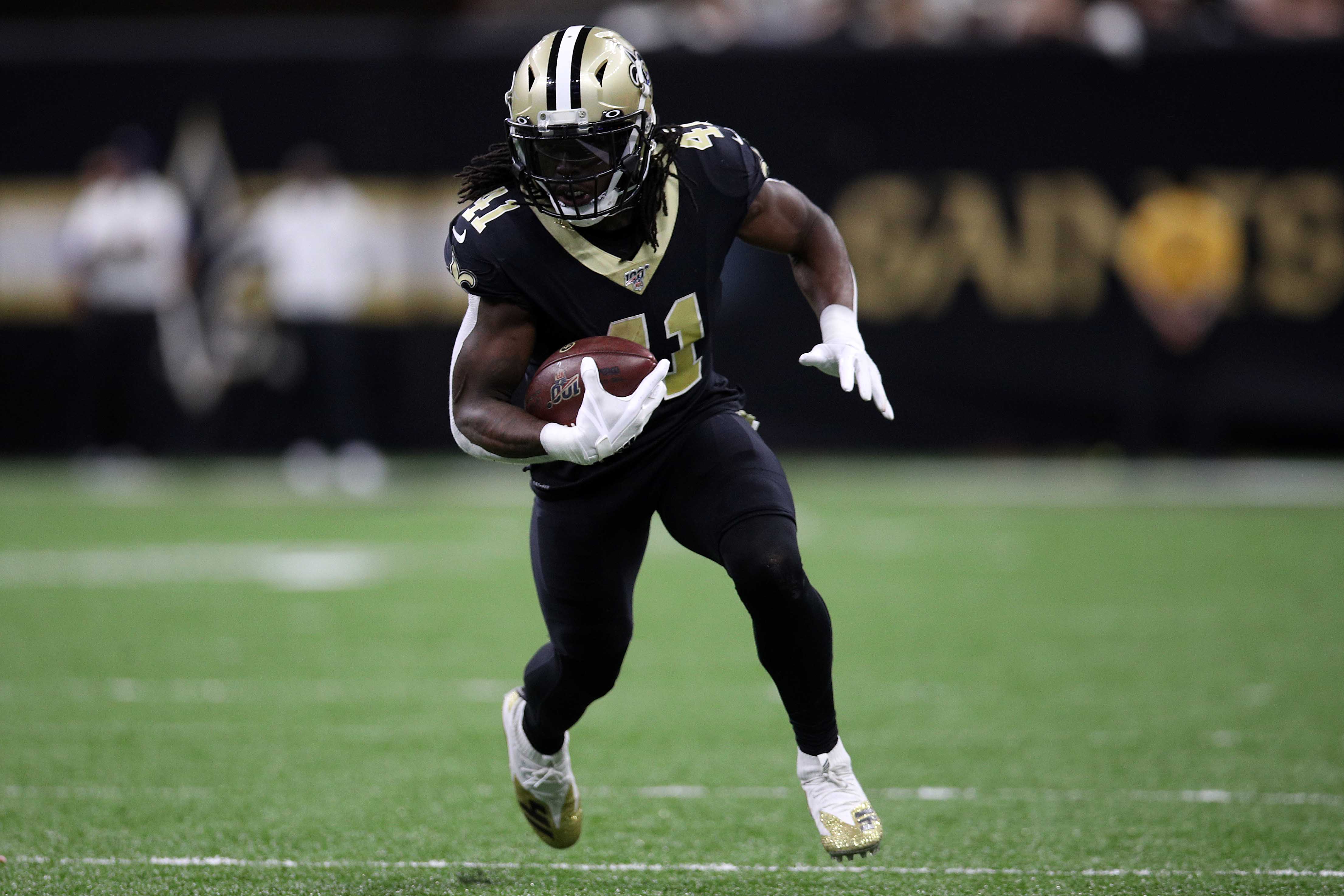
In theory, the Saints are a good-looking team with very solid uniform elements. In practice, they wear mono-black way too often — a whopping seven times in 2019. Such a pointless look for a party town like New Orleans. Look, it’s not that hard: Wear the black jersey with the gold pants! That move alone would let the Saints jump at least half a dozen spots on this list.
19. Minnesota Vikings

Seven seasons ago, the Vikings unveiled their current uniform set. And for seven seasons, fans have emailed or tweeted at your friendly uniform columnist every Sunday to point out the team’s mismatched number fonts. Technically speaking, it’s not a mistake — the Vikes use different fonts for the 10s digits and the 1s digits, an absurd Nike-driven gimmick that looks awful on the field and ruins what would otherwise be a very respectable uniform design. Here’s hoping it doesn’t take them another seven years to change it.
20. Detroit Lions
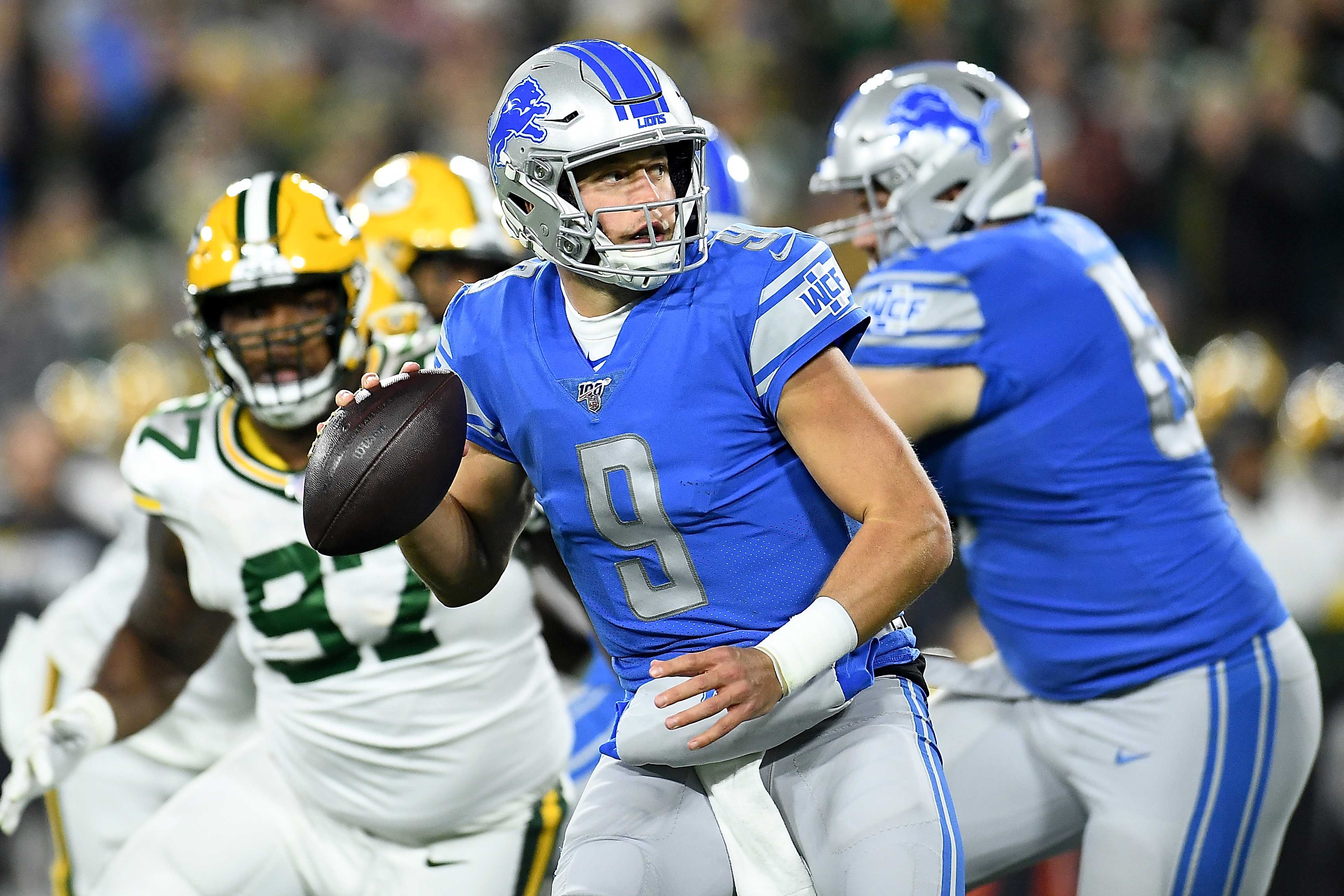
They made the right move a few years ago by getting rid of the black trim and the ridiculous number font, but the Lions’ look still has too many gimmicks. The dopey sleeve lettering, the mono-gray bodysuit — it all says, “Don’t take us seriously.” Request granted.
21. Baltimore Ravens
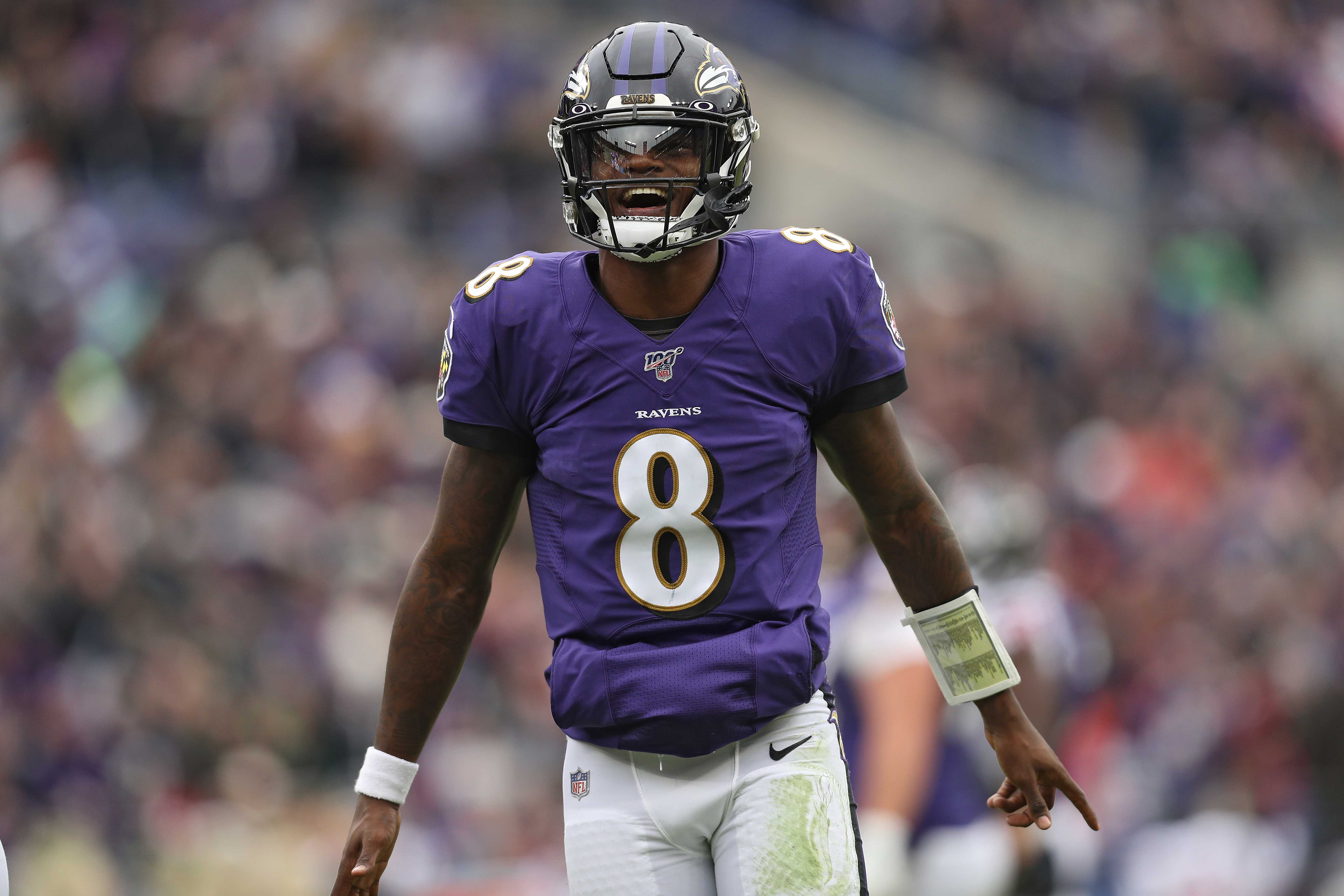
The Ravens are the rare team whose black alternate uniform is an improvement over their primary look. Real ravens are black, after all, and the purple works better as an accent color than as a base color. If they’d make this their default look — and maybe go with a less cartoonish number font — they’d rise significantly in the rankings.
22. Tennessee Titans
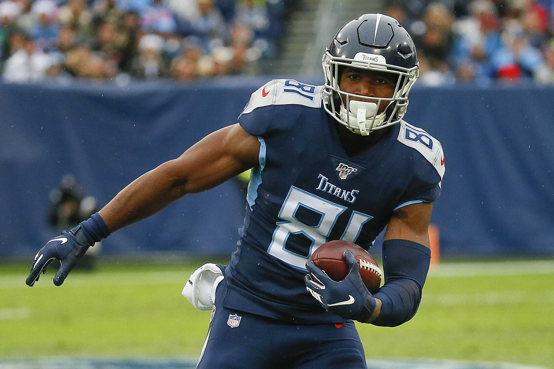
A characterless mishmash of ho-hum elements. It all adds up to something that falls a bit short of meh. It’s past time to lose the flaming thumbtack logo, and the “stone-chiseled” number font isn’t helping either.
23. Seattle Seahawks
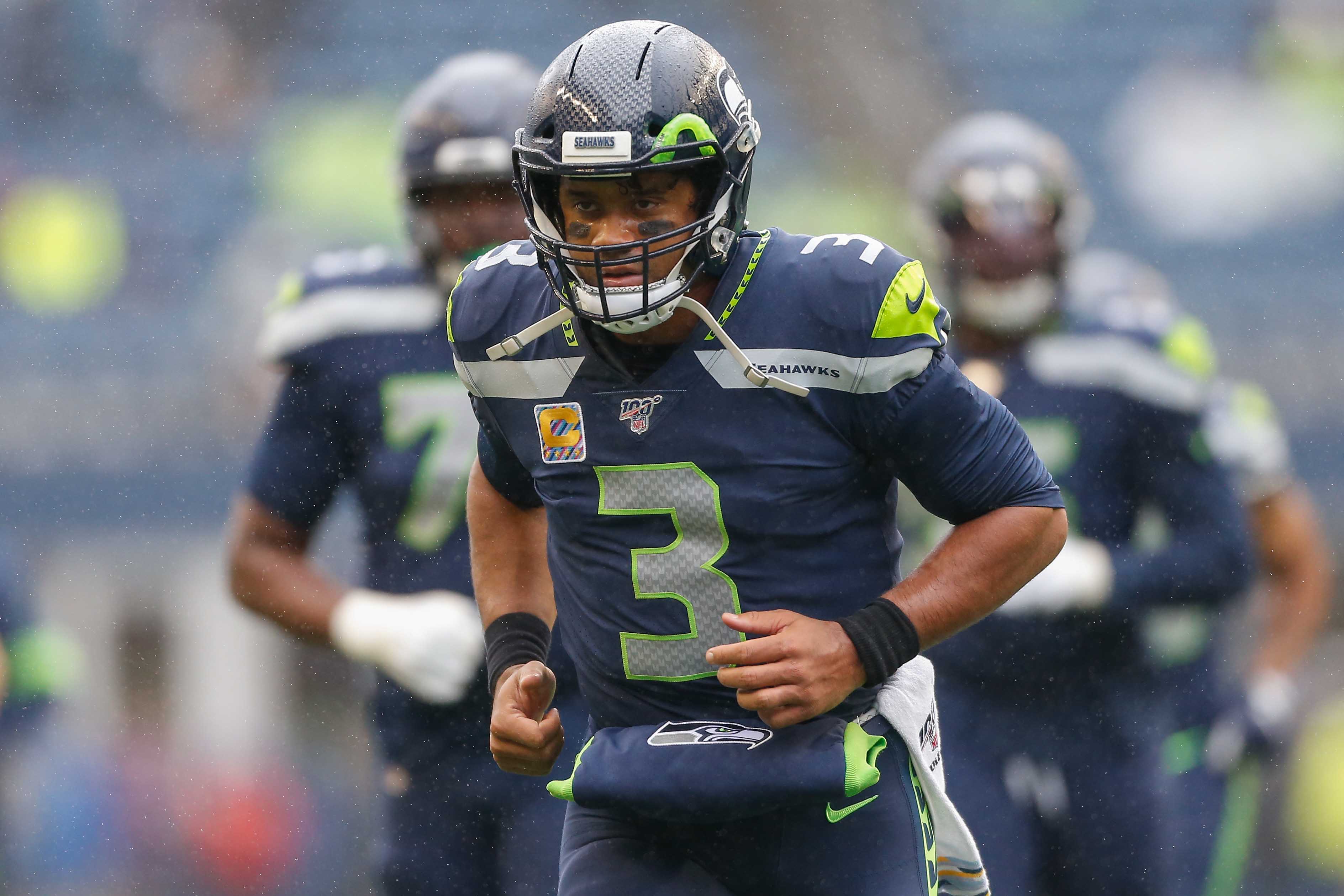
The Seahawks have a decent helmet and one very solid uni combo: white over navy. But the rest of their wardrobe is a mess. The mono-blue bodysuits, the dishwater grays, the neon highlighter getup — save that stuff for video games and wear a real uniform on Sundays.
24. New England Patriots
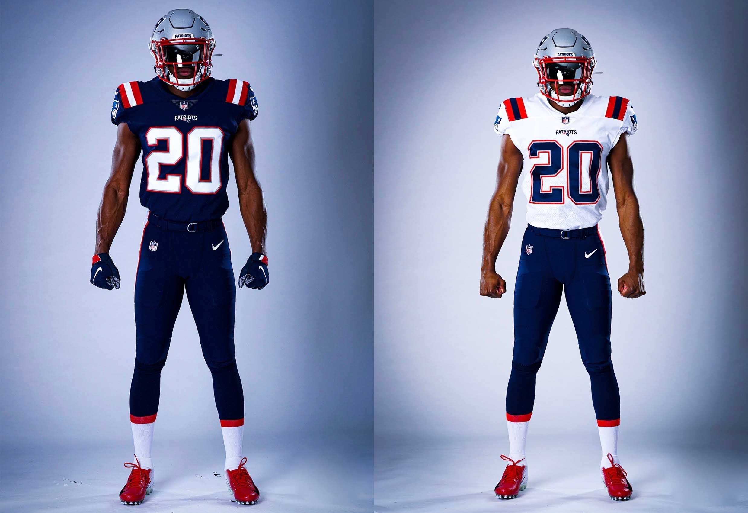
Well, now we know why Tom Brady left New England. The Pats’ longstanding uniforms were nothing special, but their new set, which they unveiled back in April, looks like something put together in an online team-builder interface. And mono-navy at home? Ugh. Cam Newton really will need to be Superman to make these look good.
25. Carolina Panthers
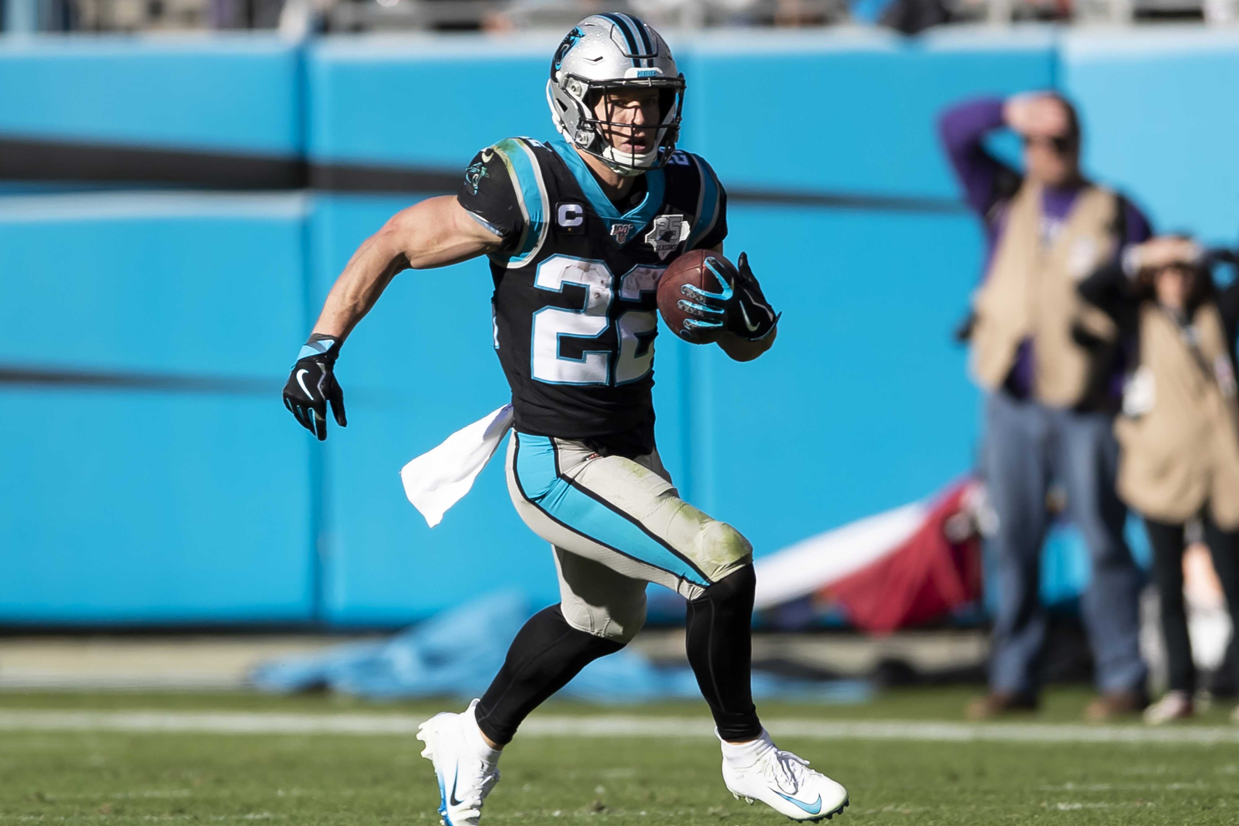
Essentially unchanged since the ’90s, and it shows. The diverging helmet stripes and tapered pants piping are long past their sell-by dates. Give them credit for staying the course for so long — expansion teams tend to tinker with their look much more than Carolina has — but it’s time for a change.
26. Denver Broncos
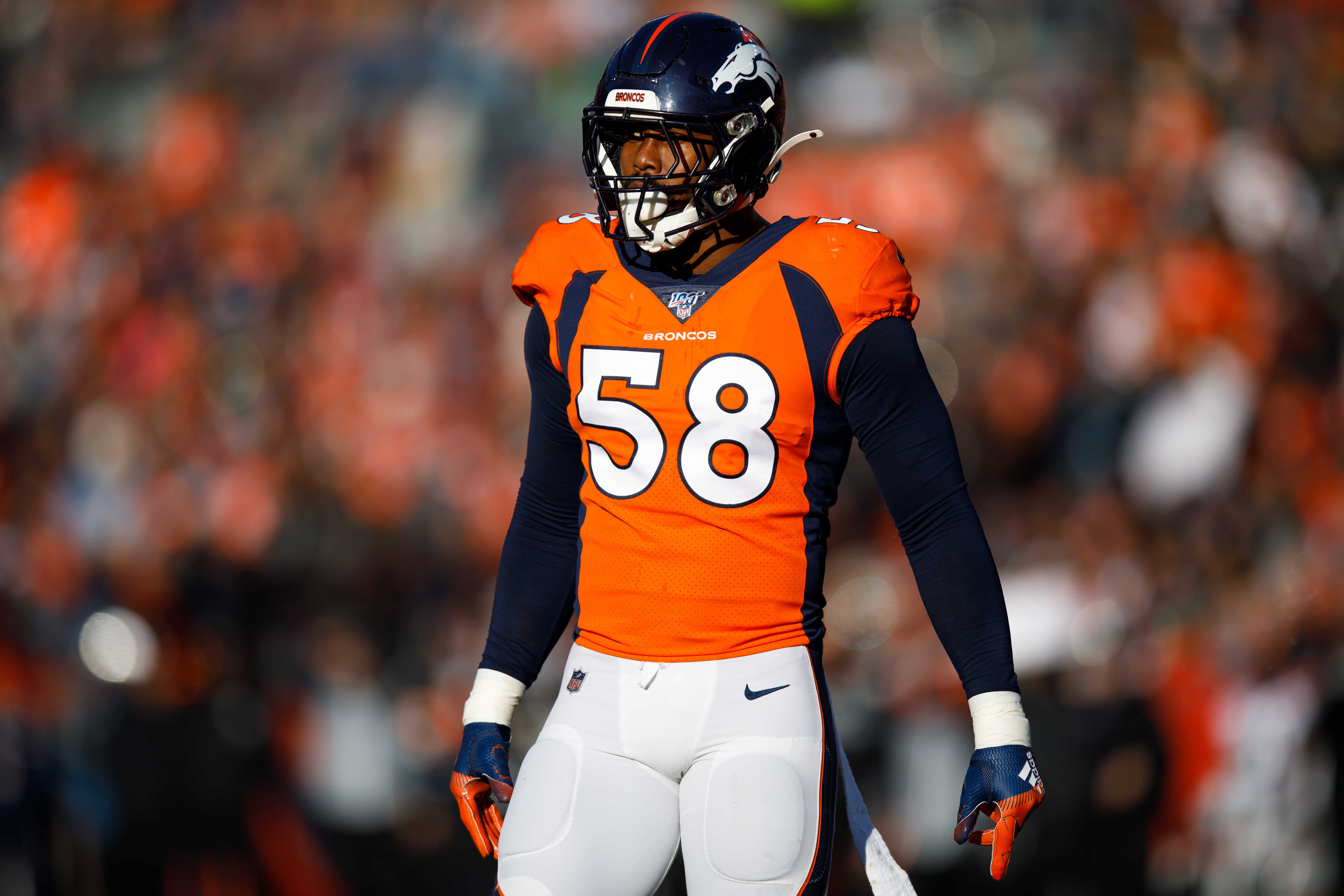
Essentially unchanged since the ’90s, and it shows. When this template debuted in 1997, it looked terrible but at least was something new and interesting. More than two decades later, it still looks terrible, and now it’s dated to boot.
27. Cincinnati Bengals
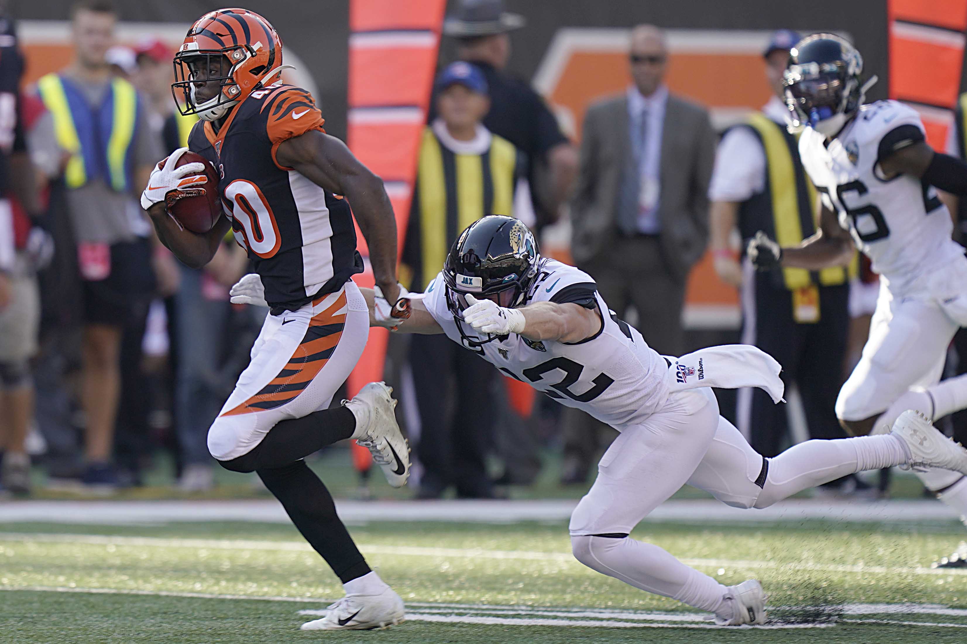
As we’ve been saying here at Uni Watch HQ for years, there’s a fine line between uniform and costume, and the Bengals are on the wrong side of it. The jersey side panels, the tiger-striped sleeves, the tiger-striped “tails” on the pants, the tiger-striped “B” on the chest — it’s all too much. Restrict the stripes to the helmet, get rid of all the other nonsense, and then we can talk. Also docked points for releasing redheaded quarterback Andy Dalton, whose hair matched the team’s color scheme.
28. Los Angeles Rams
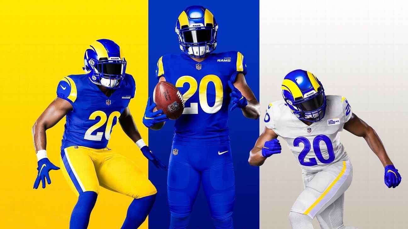
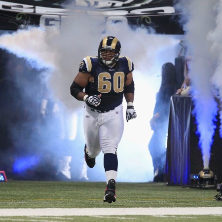
The Rams kept pushing back the release of their new uniforms to coincide with the opening of their new stadium. Too bad the stadium construction wasn’t delayed further. From the gradient jersey numbers and the gray alternate uniforms to the “Your Ad Here” jersey patch and the unsatisfying helmet horns, this set features one bad move after another. NFL rules require a team to stick with a new uniform set for at least five years before undergoing another redesign, so expect the Rams to be holding another uniform unveiling in 2025.
29. New York Jets
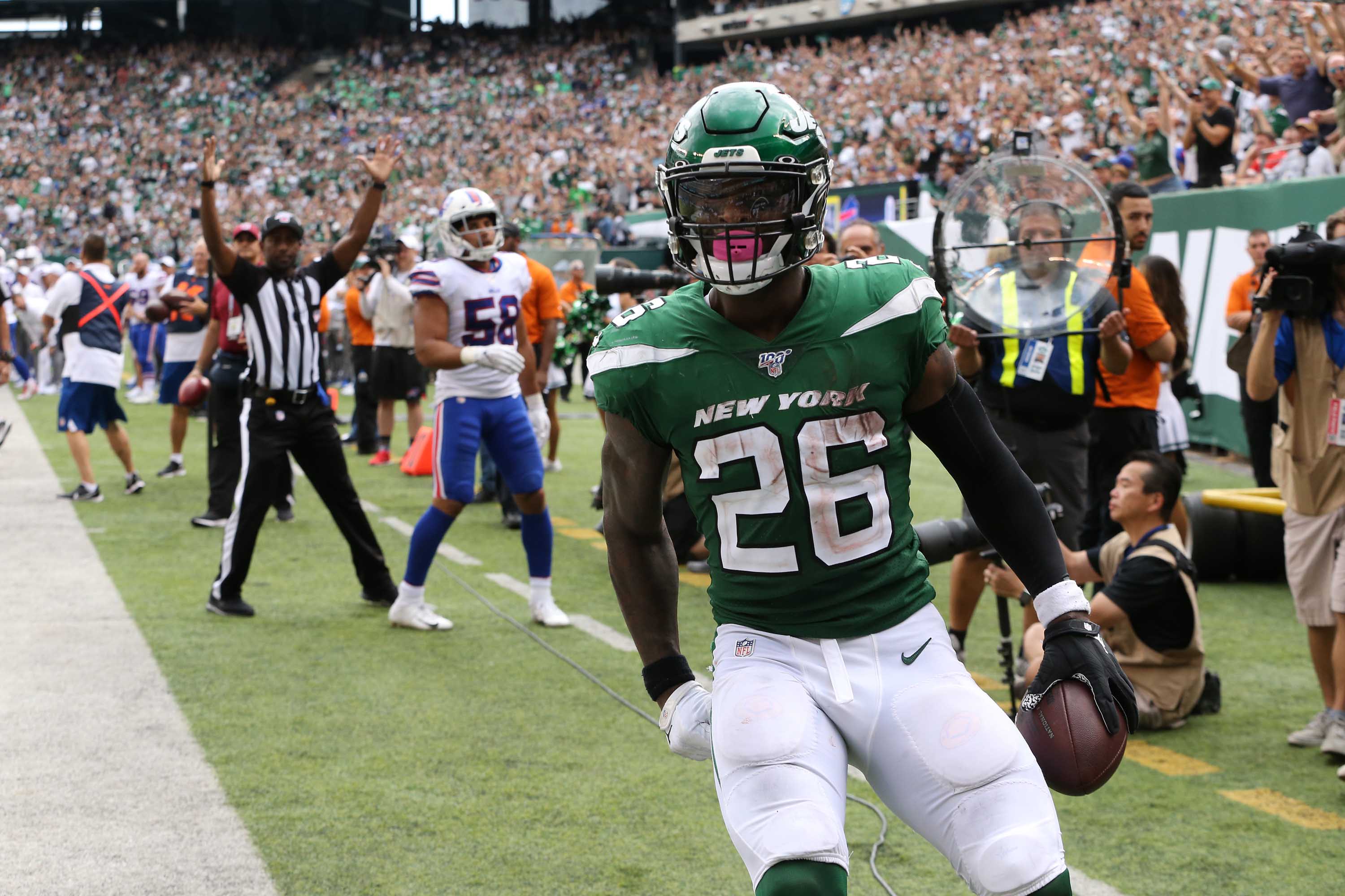
Excellent arena league uniform. NFL? Not so much.
30. Kansas City Chiefs
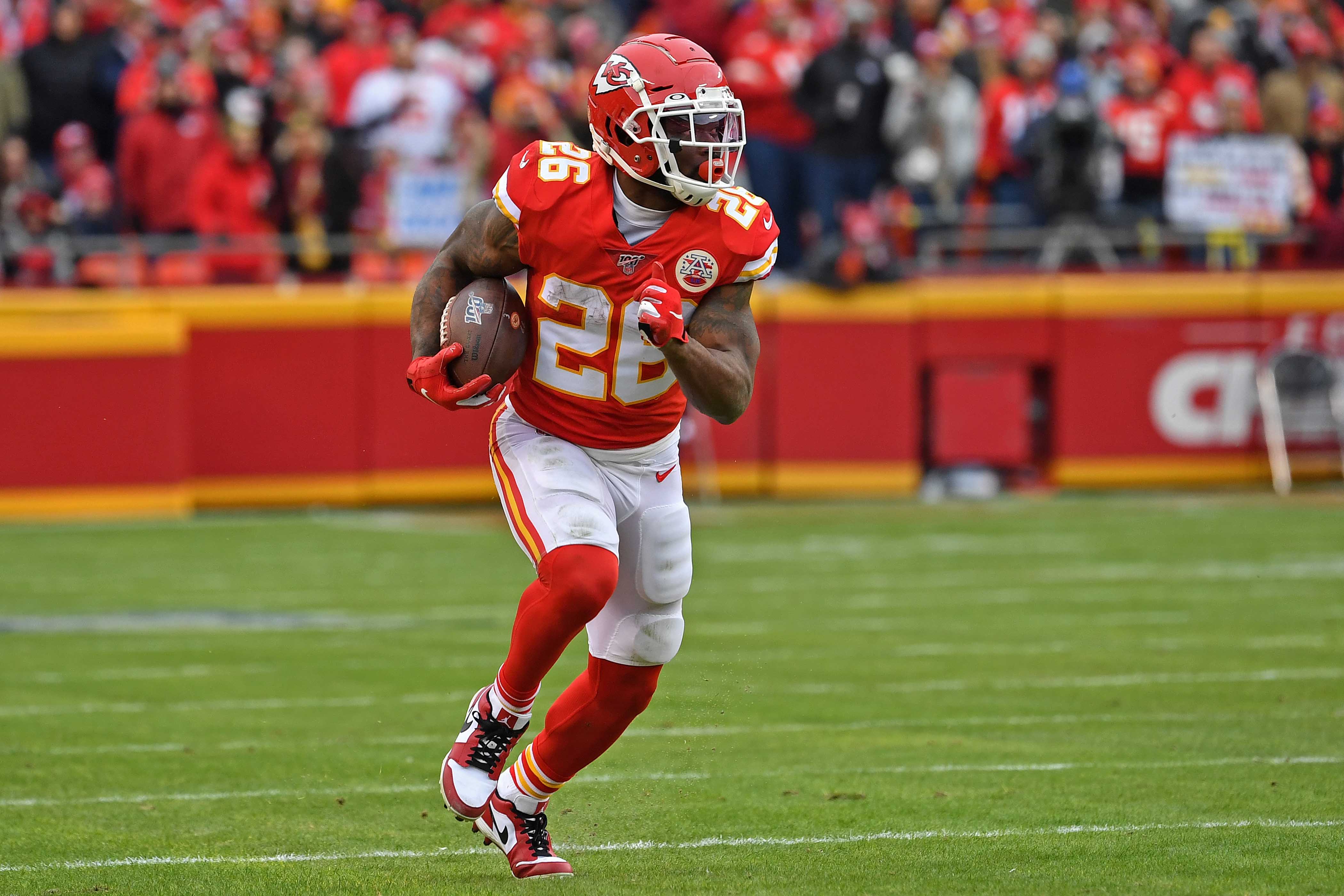
The color scheme is great and the red pants are among the best uni elements in the entire league, but it’s long past time for the Chiefs to move away from using Native American imagery. As long as they keep that arrowhead on their helmet, they’ll rank toward the bottom of the NFL pack.
31. Atlanta Falcons
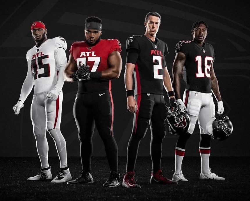
They took one of the league’s worst-looking uniform sets and somehow made it worse. Bonus points for the NFL’s first (and hopefully last) color-gradient bodysuit. Another team that will be going back to the drawing board when the five-year wait period expires.
32. Arizona Cardinals
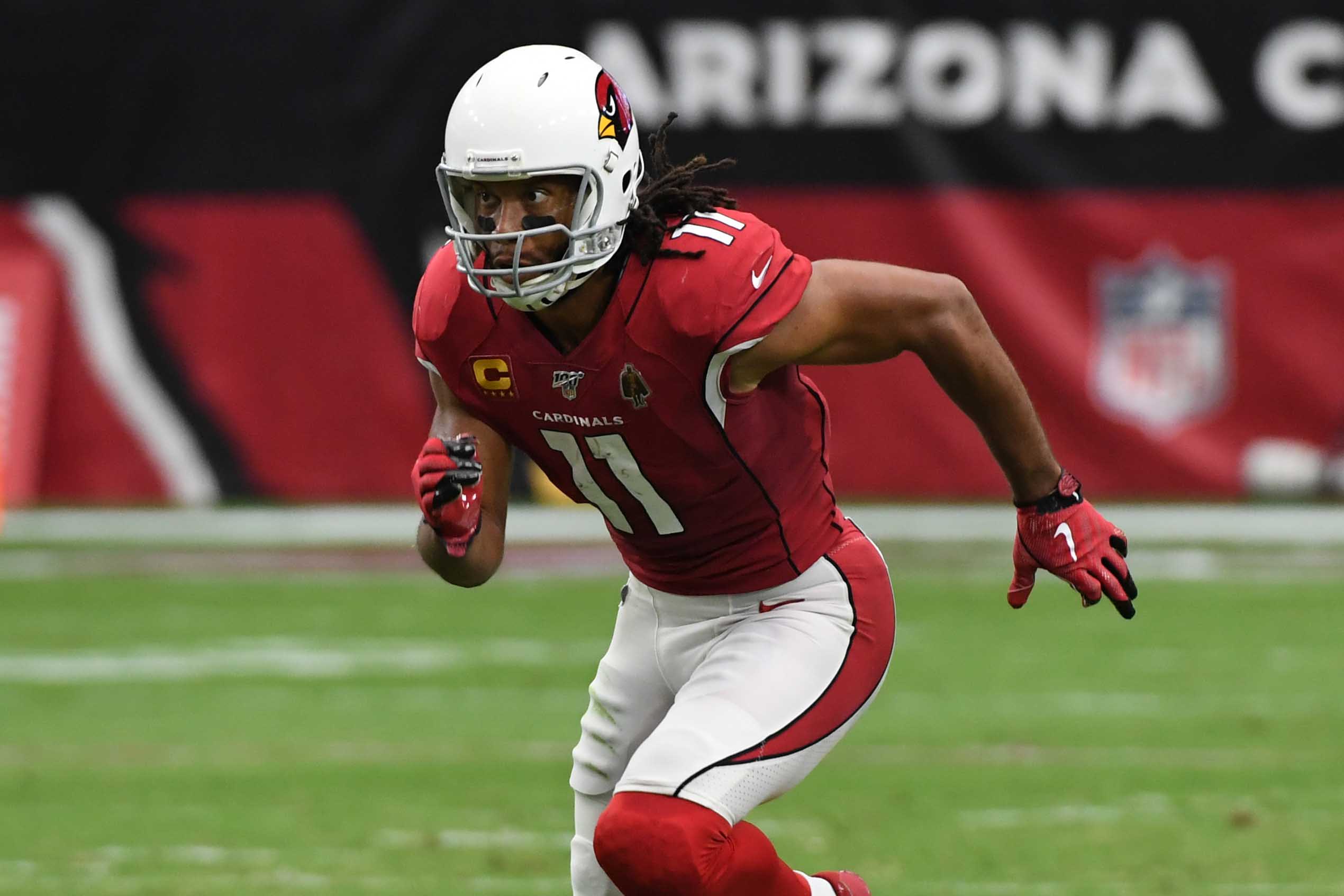
What a disaster. The Cardinals start with a very old-school helmet look — plain white shell, basic logo, gray facemask — and pair it with newfangled elements like those clownish jersey sleeves and the league’s worst pants striping. It’s a painfully bad clash of old-school and new-school, and it all looks even worse when they break out the black alternates. Blow it up and start over.
And there we are. Did you agree with this entire list? Of course you didn’t. Let the bickering commence!
Paul Lukas will have his annual NFL Season Preview column in early September. If you like this article, you’ll probably like his Uni Watch Blog, plus you can follow him on Twitter and Facebook and sign up for his mailing list so you won’t miss any of his future InsideHook columns. Want to learn about his Uni Watch Membership Program, check out his Uni Watch merchandise, or just ask him a question? Contact him here.
Whether you’re looking to get into shape, or just get out of a funk, The Charge has got you covered. Sign up for our new wellness newsletter today.
