If you take your note-taking seriously, you’re probably familiar with Chicago’s Field Notes. They’ve collaborated with everyone from Wilco to illustrator Jay Ryan to the Fifty-Nine Parks Print Series, creating gorgeous handheld notebooks suitable for nearly anything you might need a notebook for. Sketches for a new project? Notes for your novel? A log of your camping trip? Field Notes has you covered.
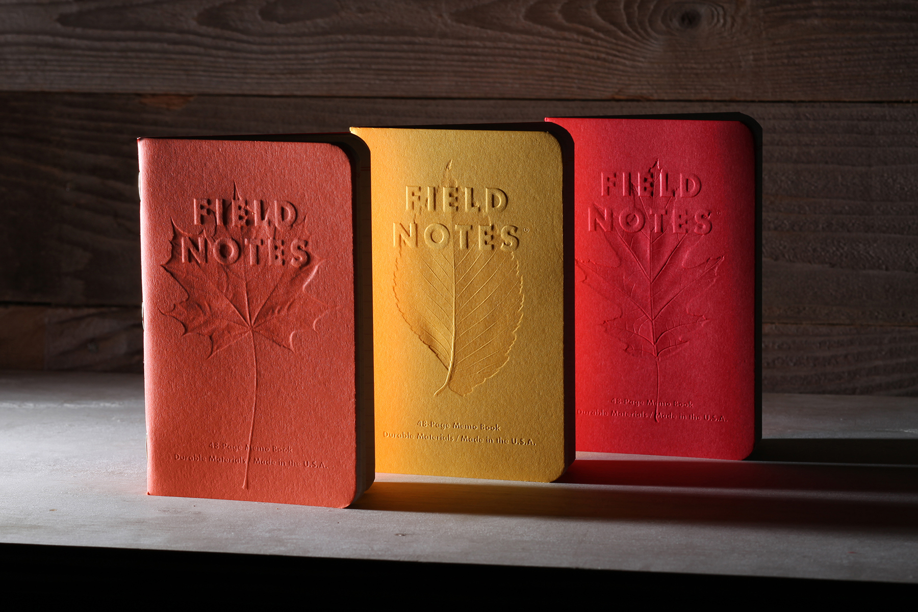
Field Notes releases a new set of notebook designs every season, and the design of their fall 2019 variety stands out as one of the strongest designs to date. Autumn Trilogy, as the set of three notebooks is called, features covers in a trio of seasonally appropriate colors. Each one then has the image of a leaf debossed into it, along with the company’s familiar logo. It’s the ideal blend of form and function — eminently usable, but also a beautiful object in its own right.
As Bryan Bedell at Field Notes explains, Autumn Trilogy came about as a way to revisit some of the same themes as past editions while still putting their own spin on them. “We try to vary the Quarterly Edition designs a lot to keep them interesting, and we have a million ideas lined up,” he tells InsideHook. “But on the other hand, we’ve been making the limited editions for ages now and it doesn’t hurt to go back and try a new spin on some old favorites.”
According to Bedell, the two that served as a point of reference for Autumn Trilogy hadn’t been widely seen compared to more recent offerings. “Mackinaw [2009] was 10 years ago, and we only made 2,500 packs, so hardly anyone’s ever seen those in person; using similar colors and taking that to the next level seemed like a fun challenge,” he says. (By way of comparison, Field Notes made 32,000 packs of Fall 2018’s End Papers.) “We’d done something a little similar with Shenadoah [2015], too, but even that was a few years ago, and pretty different,” he adds. “We like trees!”
The reasons why Field Notes doesn’t produce more colored notebooks comes down to logistics. “There’s — sadly — only a few U.S. mills making colored paper, and they only make so many colors,” says Bedell. “The paper we want isn’t always — often isn’t! — available in the size, weight or quantity we need.”
The paper Field Notes worked with this year is called Via, from US-made paper company Mohawk. “We knew we wanted ‘Fall Colors’ and dug out the sample books,” says Bedell. “If I remember correctly, we had four Mohawk Via colors in mind, and needed to narrow it down to three, and it turned out that one was out of stock, so our choice was made for us.”
From there, Bedell traced a number of leaves in Adobe Illustrator and sent the result to the die manufacturer Field Notes works with. Here, familiarity with the paper used for the project paid off. “We’d embossed Mohawk Via before and knew it’d take a beating, both from the die and from use, so we weren’t too concerned about that,” he explains. “It was just a matter of making sure the dies were the right height and depth to make the details clear without ripping through the paper on the deeper areas.”
For a complex-looking design, Bedell mentions that the production for Autumn Trilogy went fairly easily. “We have really great partners that get as excited as we do about making Field Notes, so they’re always up to a challenge and they always come through for us,” Bedell says.
And for him, the shared design that many of the notebooks have offers a range of opportunities to experiment with what a notebook can be. “That’s one thing I really like about working on Field Notes, Aaron Draplin’s original design is so solid, we don’t ever mess with it much,” he explains. “Instead of worrying about the basic layout, we can focus on materials and process. We tweak a few variables each time rather than starting with a blank slate.”
For Bedell, that creates some unique situations in his job. “I haven’t had to choose a typeface for 12 years, which sounds like a limitation, but it’s a lot easier to take something in an interesting direction when you’re starting with well-defined parameters,” he says.
It’s a fantastic lesson in how to take a unified design and apply it towards a series that can transform into nearly anything. And in the years to come, it just might.
This article was featured in the InsideHook newsletter. Sign up now.
