Plenty of people driving cars today can’t remember a time when General Motors’ logo was anything other than two white upper case letters against a blue background. That towering “GM” offered a sense of consistency, even if it wasn’t the most exciting of logos. Then again, sometimes changing a consistently solid logo can be more trouble than it’s worth; GM going with the slow-and-steady option never seemed like a bad idea. But for the first time in decades, that’s all about to change.
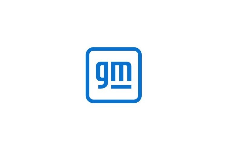
At AutoBlog, Zac Palmer reports that GM announced a dramatic change to their logo moving forward. Gone are the imposing, all-caps letters that have endured since the 1960s. In their place are two lowercase letters, meant to better symbolize the company moving forward in the age of electric vehicles.
Changing their logo is not something that GM does lightly. As CNBC’s Phil LeBeau noted on Twitter, it’s only the fifth time the company has made this type of change in over a century.
GM’s statement on the new logo describes the blue as “evoking the clean skies of a zero-emissions future and the energy of the Ultium platform.” Palmer’s own analysis of the logo notes that it seems more amicable than its predecessor. “It’s light, airy and lacking in intimidation or authority like the previous sharp-edged and blocky logo,” he writes. “There’s an unsaid message here: The EV future is going to be nice.”
It’s a bold move for the automaker, and a bold choice for a logo — in part because of how unassuming it is compared with its predecessor. Will auto buyers past and present find it as compelling? That remains to be seen.
Thanks for reading InsideHook. Sign up for our daily newsletter and be in the know.


