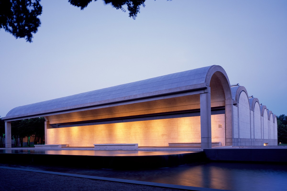
Nabbing a starchitect to build or expand has been a branding strategy for art museums for years. The Guggenheim Museum opened its Frank Lloyd Wright building in 1959 and by the 1980s, it seemed every major architect — Cesar Pelli, Michael Graves, Richard Meier, Arata Isozaki — was being tapped to elevate the physical profile of institutions around the country. One of the most widely admired fine art facilities actually appeared in 1972: the masterpiece Louis Khan created for the Kimbell Art Museum in Fort Worth, Texas. In 2013, the institution expanded its footprint with an addition by Pritzker Prize winner Renzo Piano. As the Kimbell marks its 50th anniversary this fall, it not only celebrates its admirably select collection, but the structures that show it off.
Trained in the beaux-arts at the University of Pennsylvania, Kahn came of age professionally with the International Style and was deeply affected by the ancient architecture he encountered in Italy, Greece and Egypt. He had already made his mark with such projects as the Salk Institute for Biological Studies at La Jolla, the Phillips Exeter Academy Library and the Yale University Art Gallery when the Kimbell Art Foundation — founded by businessman and collector Kay Kimbell — set out to establish a museum housing the work he and his wife had assembled.
Foundation president Richard Brown was determined that natural light be a key aspect of the design. After considering various architects — including Marcel Breuer, Pier Luigi Nervi and Gordon Bunshaft — the foundation awarded the commission to Kahn. No wonder. The role of natural light in architecture was central to Kahn’s thinking. As he said, “A plan of a building should be read like a harmony of spaces in light.” This seems a simple-enough statement, but Kahn’s conviction ran deep. “All material in nature, the mountains and the streams and the air and we, are made of Light,” he said, “and this crumpled mass called material casts a shadow, and the shadow belongs to Light.”
From a distance, the building Kahn devised — composed of 16 gently curved vaults (cycloids) arranged in three parallel units of six, four and six — strikes an austere, almost industrial aspect. But up close, its human-scaled, antiquity-evocative forms cohere to generate an agreeable sense of occasion and welcome. Inside, natural light flows through narrow plexiglass skylights running along the vaults and bounces off wing-like aluminum reflectors below to suffuse the galleries with gentle illumination.
Should the Market for Keith Haring's Art Be Bigger?
An upcoming show of his work could change how it’s perceivedWhile widely — even rapturously — admired for the clarity and understated monumentality of its design, by the late 1980s, the Kimbell was already looking to expand. When the museum revealed a plan to extend Kahn’s cycloid vaults, it did not go over well. Philip Johnson, Frank Gehry and James Sterling were among the signatories of a sharp letter to the New York Times. “Why ruin the masterwork of Kahn’s life with such an ill-considered extension?” they demanded. “We are convinced it would be preferable to preserve the present museum and create an entirely new structure in some adjacent position.”
That’s exactly what the Kimbell ended up doing when, in 2013, it unveiled the Renzo Piano Pavilion. Scaled to respect Kahn’s building, the newer structure is situated a healthy distance away, with a loose allé of red elms sitting in between. Piano, who spent time in Kahn’s office early in his career and whose recent museum clients include the Whitney and the Art Institute of Chicago — echoed Kahn’s light-admitting strategy with a roof system of fabric, glass, wood beams, and aluminum louvers. As with the original museum, concrete dominates, but Piano also included a significant amount of glass at the center of his composition, allowing for a strong visual link to Kahn’s work.
Speaking publicly just days before the debut of his building, Piano — who had described his predecessor’s work as “small but strong…brave and modest,” said, “When you’re working close to a master like Kahn, you have to be careful because you cannot be arrogant, stupid.”
Although the museum’s collection, which has grown since the Kimbells’ day, ranges from ancient art to the mid-20th century, it comprises only about 350 carefully chosen works. Quality over quantity has always been the mantra here, as evidenced by such holdings as Michelangelo’s The Torment of Saint Anthony, Rembrandt’s Bust of a Young Jew and Cézanne’s Maison Maria with a View of Chateau Noir. The museum’s current exhibitions include Lives of the Gods: Divinity in Maya Art and Murillo: From Heaven to Earth. And to mark this anniversary year, the museum will present a special exhibit of archival material chronicling the history of the museum and the design of the Kahn and Piano buildings, along with a film fest pegged to the work of the architects.
Compared to Zaha Hadid’s shard-like design for The Eli and Edythe Board Art Museum art Michigan State University, or the wet-paper-bag-like facade of the San Francisco Museum of Modern Art’s addition by the Norwegian firm Snøhetta, the Kimbell campus may look its age. But when it comes to architecture, that’s not always a bad thing. In fact, it’s one of the reasons we love the buildings we do.
This article was featured in the InsideHook newsletter. Sign up now.
