You probably already know what the hottest new fiction book of the day looks like — without even seeing it. Picture electric blues, earthy greens, maybe pops of pinks and splashes of red blended together. While a plain white font announces the title, perhaps the swirling cursive of the author’s name is mixed into the pattern itself.
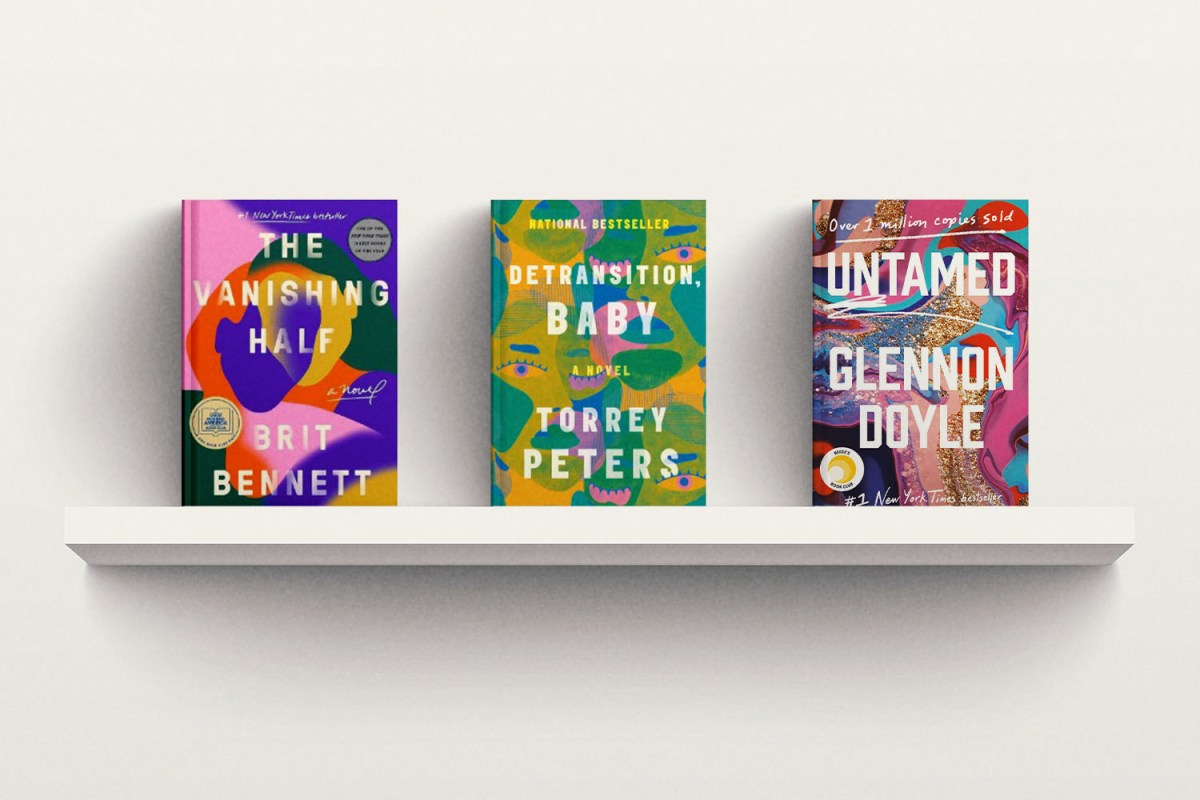
This is the modernist book cover of 2022 — or “the blobs.” There are a few very prominent titles that share this aesthetic: The Vanishing Half, a story about the lives of two Black sisters by Brit Bennett, with a cover design by Lauren Peters-Collaer; and Detransition, Baby, a novel about queer parenthood by Torrey Peters, with a cover design by Rachel Ake Kuech. But there are many titles. Many more “blobs.” It’s become a joke online; where people notice that even packages of beef jerky are starting to look like New York Times Bestsellers.
Book designer Laura Duffy tells InsideHook that when she began working as a designer for Random House, the appeal of the cover was to stand out in the sea of books. “Get somebody to look over at a shelf, be like, what’s that? Walk over, pick it up, job is done,” she says. Designer Lynn Buckley agrees. “It has to be arresting and stand out on a crowded table,” she explains. “It has to make somebody want to pick it up.”
Book cover artists are some of the unsung heroes of the publishing world; you can probably recall the cover of a book that moved you, but can you name the artist behind it? It’s highly unlikely — even if you can still picture their work, which may have even led you to a book you read and still remember fondly.
To create a cover, the book designer starts at square one — the content of the book itself. “I honestly don’t know how you could really create a good cover without understanding the book,” Duffy explains. “I’m looking for details and ideas and things that will jump out to me that would lend themselves to an interesting cover, something that really pops.” Attention to detail and content is what makes a successful book cover. “It’s about representing the content well, and representing the author well,” Buckley says. “If I do that, and I’m emotionally invested, and I really get to know the content and understand what the author’s trying to say, it’ll happen, it’ll come through.”
These abstract covers actually contain hidden details; if you look closer at The Vanishing Half, two faces appear, representing the two sisters. In the cover for Detransition, Baby, multiple faces and eyes stare back at you. In Duffy’s cover for Once the Voices Start, a watery blue figure on a mixed blue background connects to the protagonists struggle with psychosis. Buckley’s cover of Glennon Doyle’s Untamed, was described by the author herself as seeing “all of [her] pain, joy, struggle, failure, pride, loss, and hope…not as messy chaos, but as a stunning, dazzling miracle.”
Like everything else in today’s world, the similarities between the covers could be due to the almighty algorithm. It’s not just about browsers becoming interested in a book while shopping at Barnes and Noble. “It has to look good in the thumbnail and Amazon,” Buckley tells InsideHook. “It has to make people want to click on it.” Similar book covers mean that there’s a better likelihood that you’ll be drawn back, or continue to click on covers that remind you of the last book you read. In an article for Vulture about the “Instagram Era of Book Covers,” author Margot Boyer-Dry writes that the role of book covers now “is to look great in miniature. That means that where fine details once thrived, splashy prints have taken over, grounding text that’s sturdy enough to be deciphered on screens ranging from medium to miniscule.”
With online appeal comes social appeal, Boyer-Dry writes, “Books that are designed to render well on digital screens also look great on social [media].” Ashley Tisdale stirred internet debate after admitting in an Architectural Digest video earlier this year that her husband had to buy 400 books to fill their bookshelf before the shoot. There are whispers of a celebrity “book stylist” who will assist celebs in getting the look they want with the book that they’re carrying. Simply put, the appeal of a book cover is also how good you can look holding it, and like whatever is trending, people love to show it off if they have it.
The blobs aren’t the first trending book cover, as Duffy explained from her experience working at Random House. “You were oftentimes given the instruction to make it look like, you know, Eat, Pray, Love,” Duffy says. “It was like, ‘Oh, I don’t want all my covers to be made out of food!” Buckley says that while no one wants to copy trends, they can be transformed into something new every time. “The modern, abstract rainbow thing catches people, but doing it in a little bit of a different way is generally what I aim for. Finding a different way to do it that’s still aesthetically pleasing.”
Trends come and go in every industry, and books are no exception. One day it’s blobs, the next it’s the Eat Pray Love food font, or flat cartoon people, or baroque portraits. The “single object on a blank background” cover was so popular that one New Yorker article on book covers from 2013 linked to a “Malcolm Gladwell book generator” (a now dead link).
In that same article, the author writes about how adult book covers are so much more plain than those for children’s stories. “How come books for kids get to look so mysterious and tantalizing and spooky, while books for us grownups have to be so dull? Why don’t the covers of mainstream literary books make me feel that same way—almost scared to find out what’s inside?” The blobs might look similar to each other, but it’s a breath of fresh air to pick up a book as an adult that’s filled with color and light and fun (at least from the outside), instead of feeling like you’re carrying around something designed to seem “grown-up” or serious.
Artists like Duffy and Buckley aim to bring that fun back into the adult book world, but generating that fun is not as easy as it looks. “[The author] spent years, if not decades, writing this thing,” Buckley explains “But one editor once said to me, ‘Oh, you just get to sit and make pretty pictures all day long.’ And I remember thinking, ‘If you only knew how much work goes into this.’”
This article was featured in the InsideHook newsletter. Sign up now.
