The last NHL season started three months late, had only 56 games instead of the usual 82, featured rejiggered divisional alignments and took place primarily in empty arenas — all due to the coronavirus pandemic.
This season, the NHL is largely back to normal and the schedule is starting on time — which means it’s also time for the annual Uni Watch NHL Season Preview, which breaks down everything you need to know about this season’s new uniforms, logos, ice designs and more.
One change that’s big in scope but subtle in execution is the introduction of a new raised-embroidery technique on jersey crests. The league and Adidas are simply calling it “dimensional embroidery,” and it appears to be similar to puff embroidery, which is commonly used for MLB cap logos. You can see a good example of it on this shot of the Hurricanes’ home jersey crest, which now has a raised white ridge running just inside the logo’s border:
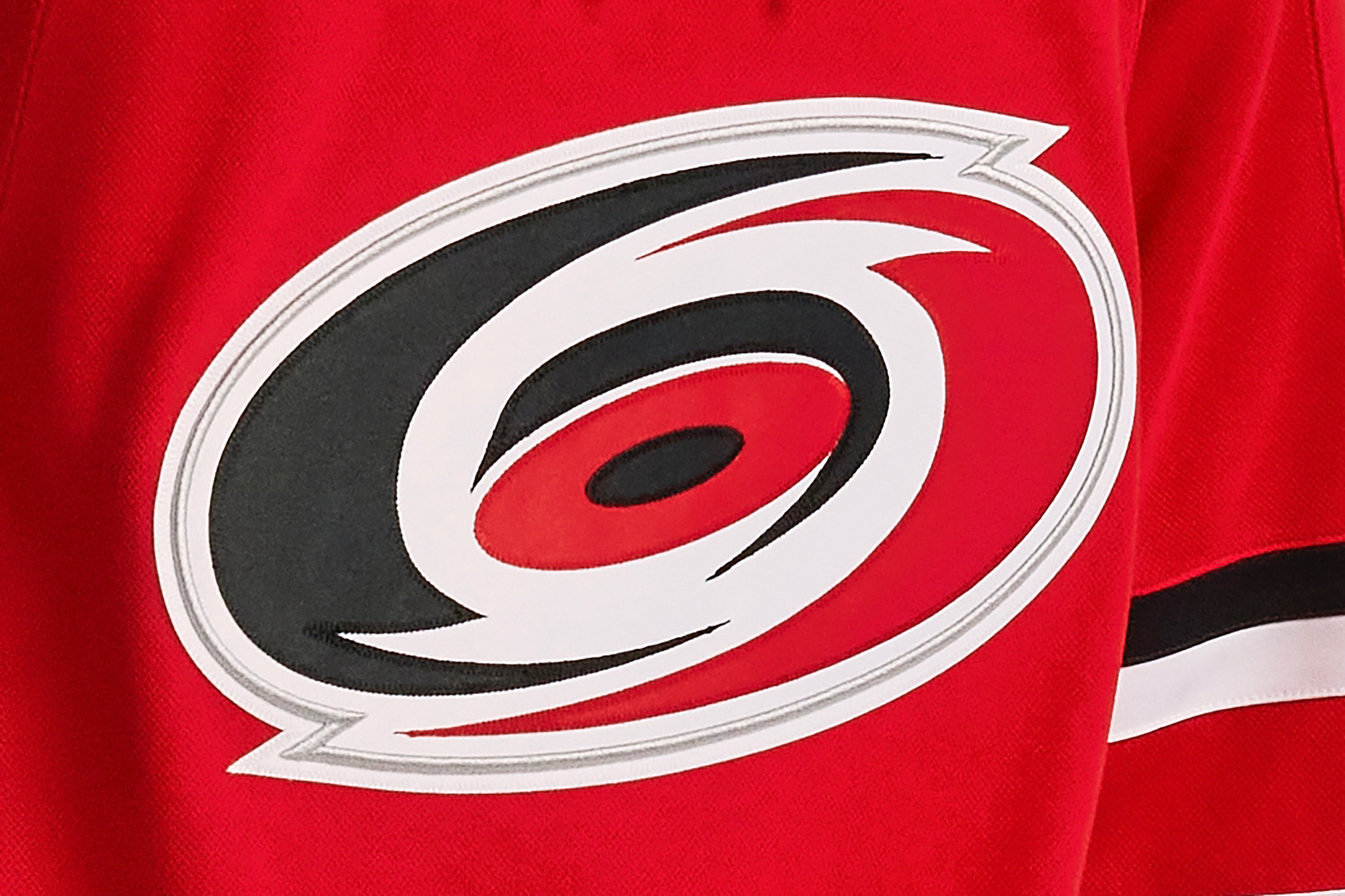
That white ridge is the new dimensional embroidery. It’s more apparent on some jersey crests than on others, depending on how hard you squint. Also, Buffalo and Chicago aren’t using it (their crests are unchanged), and the Rangers are using a different embroidery enhancement, which you can learn more about in the team-by-team rundown that follows.
Speaking of which, let’s get going with that team-by-team breakdown! With the season set to begin on Oct. 12, here’s what you can expect to see on the ice.
ATLANTIC DIVISION
Boston Bruins
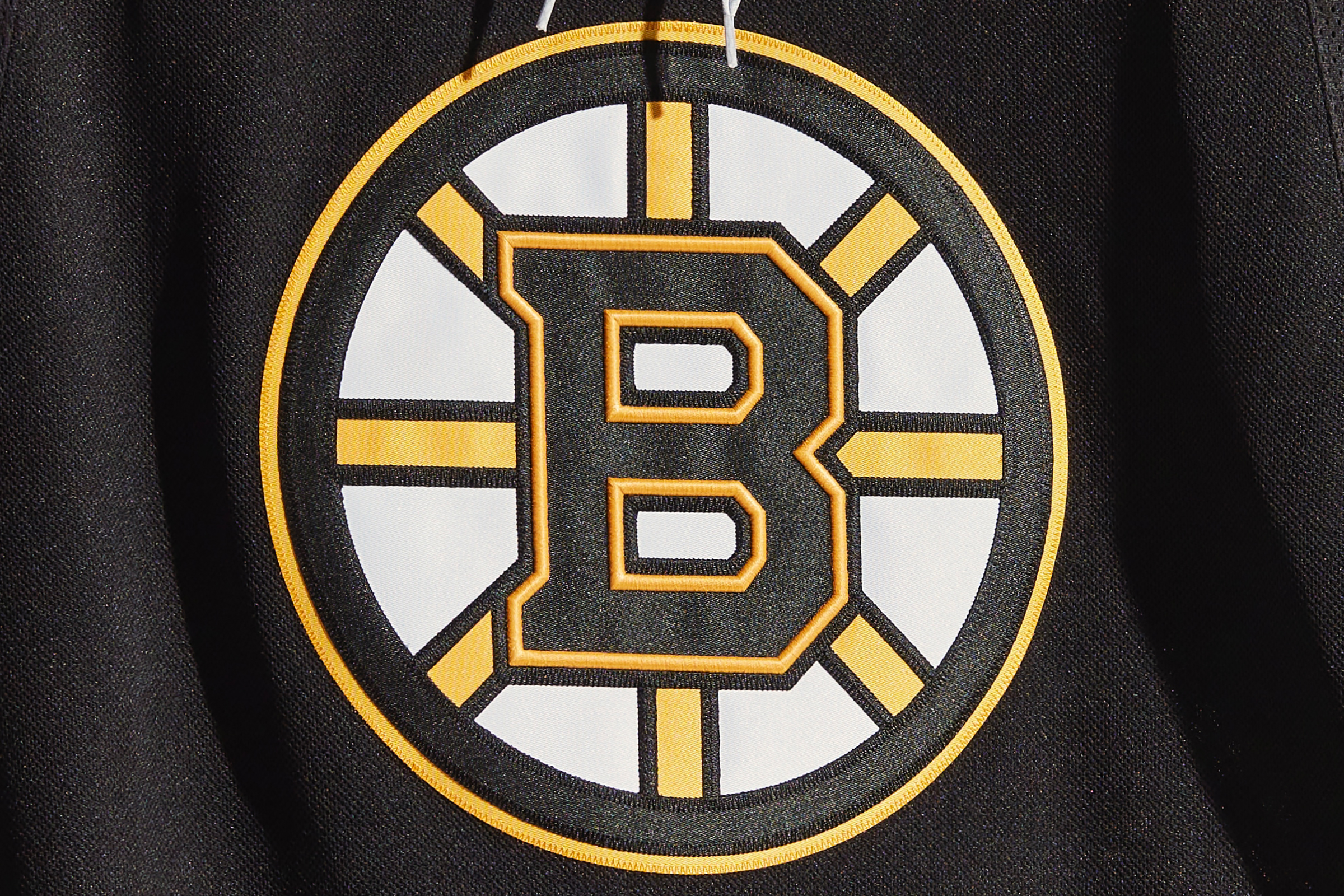
The Bruins’ only uni change is the new dimensional embroidery, which makes the yellow lines of the “B” on their crest pop a bit more:
Buffalo Sabres
The Sabres will play the Toronto Maple Leafs in the annual Heritage Classic game, which will take place outdoors at Tim Hortons Field in Hamilton, Ontario. No word yet on the uniforms for that game, but it’s a safe bet that both teams will have something special for the occasion. Additional info here and here.
Detroit Red Wings
It’s an annual rite of autumn: The Red Wings use straight block lettering for the player names on the back of their jerseys for their preseason games (instead of the more familiar vertical arching), prompting lots of outraged emails flooding your friendly uniform columnist’s inbox. Don’t worry, folks — they do this every year. The vertical arching will return when the regular season begins.
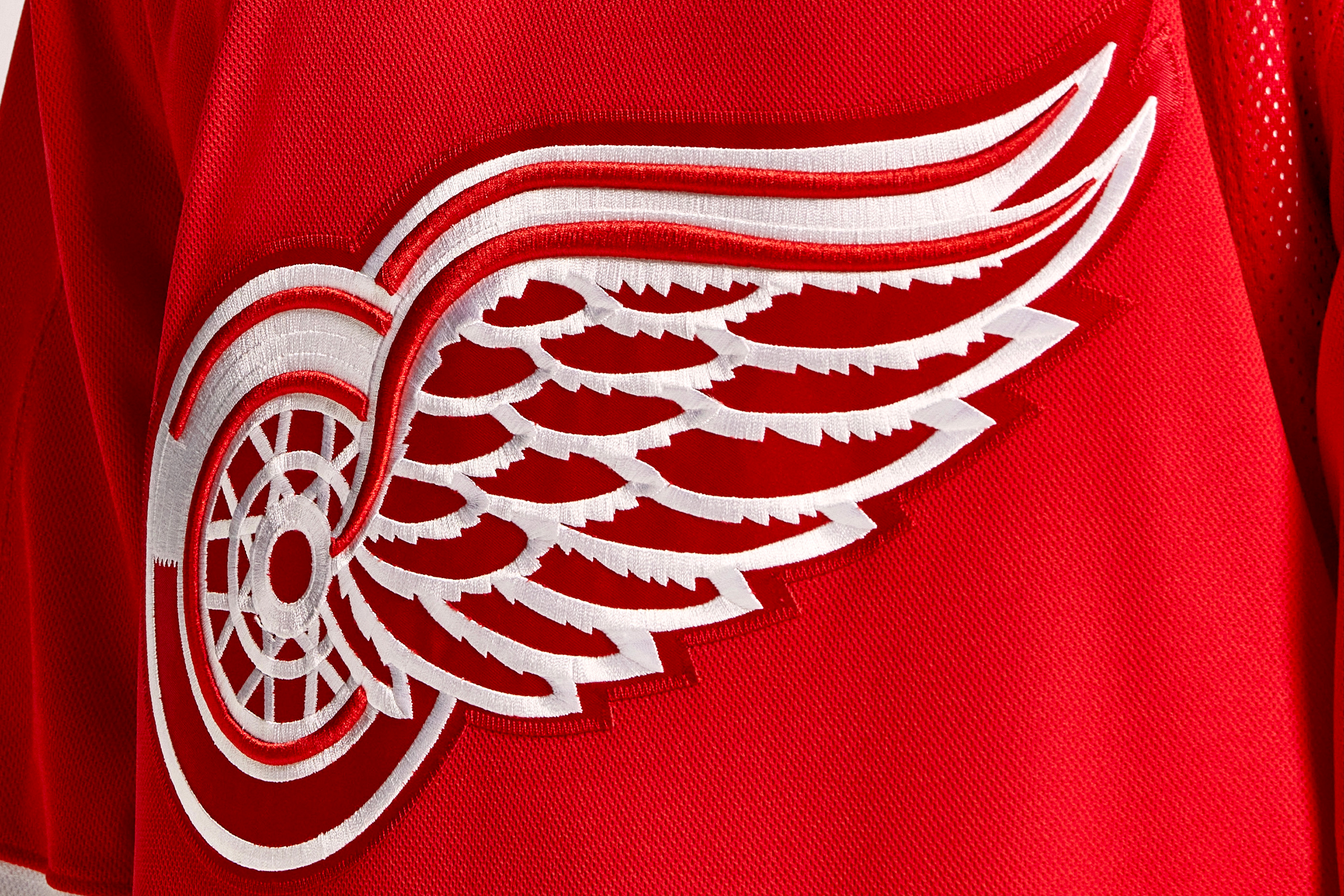
Meanwhile, several of the red strokes on the Wings’ jersey crest now pop a bit more, thanks to the new dimensional embroidery:
In addition, the Red Wings have a new helmet entitlement partner advertiser.
Florida Panthers
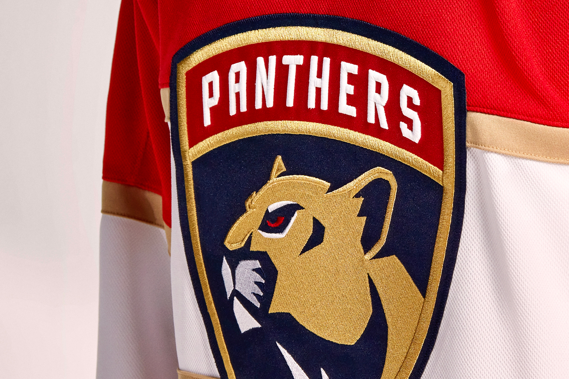
It’s subtle, but you can see the new dimensional embroidery around the outlines of the panther’s forehead, nose and ears. The lettering is now raised as well:
Meanwhile: Thanks to the expiration of a naming rights deal, the Panthers’ home venue is now known as FLA Live Arena, making it the rare pro sports facility that doesn’t have a corporate-advertised name — at least for now.
Finally, the Panthers have a new helmet branding partner advertiser.
Montreal Canadiens
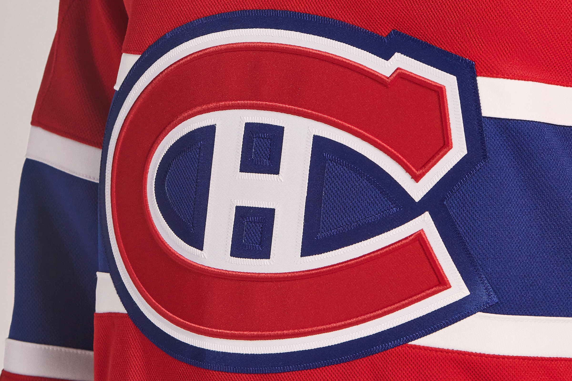
As you’d probably expect, the Habs have taken a very conservative approach to the new dimensional embroidery, adding just a raised outline to the red layer of their iconic “C” logo:
Ottawa Senators
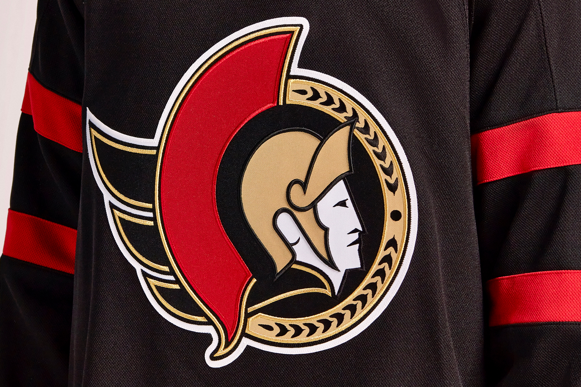
All of the gold, black and red outlines on the Senators’ crest have been enhanced with the new dimensional embroidery:
Tampa Bay Lightning
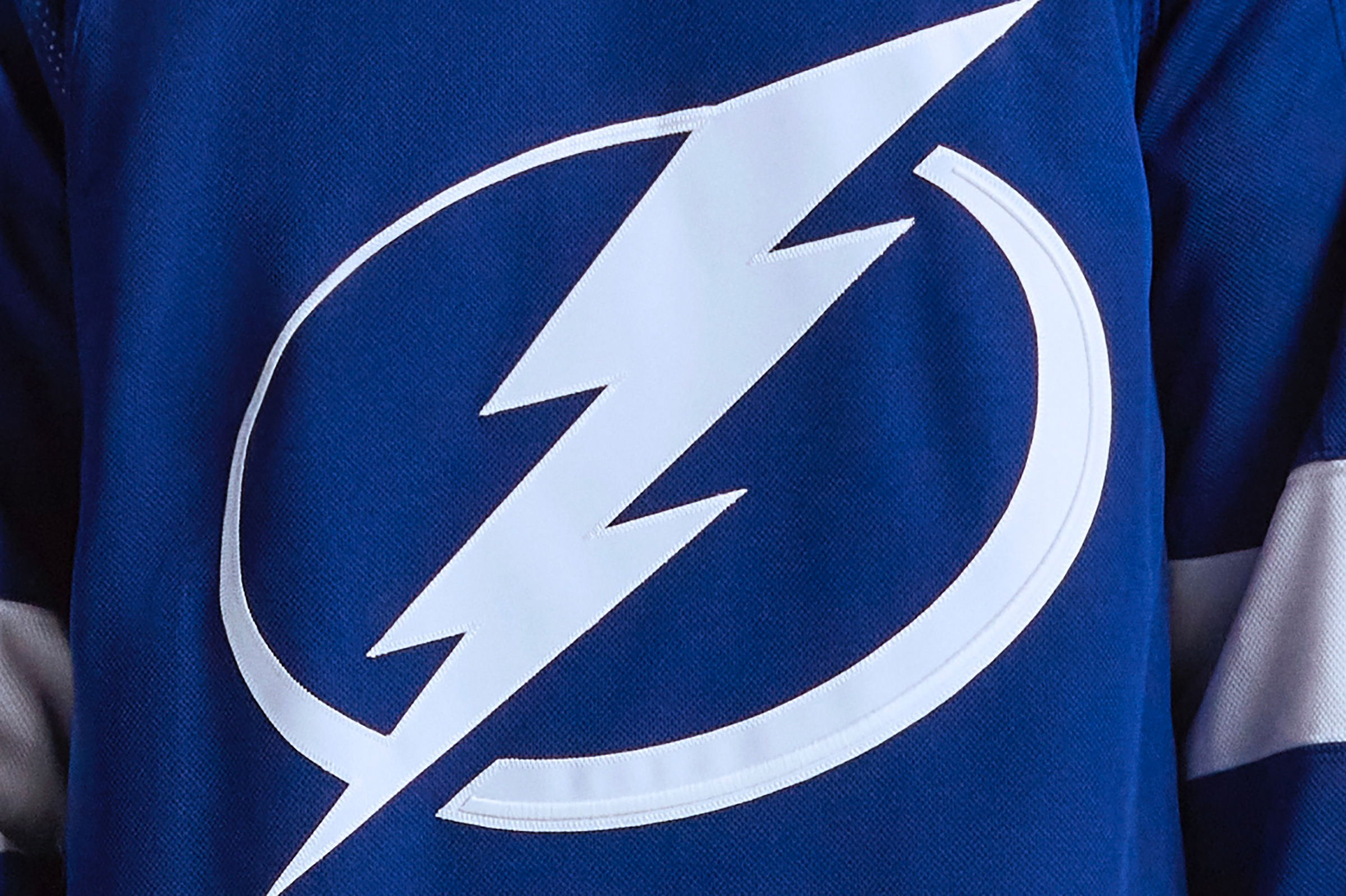
The two-time defending Stanley Cup champs made perhaps the subtlest of all the dimensional embroidery adjustments, adding a raised highlight to the right side of the oval on their crest:
In addition, the Lightning are the visiting team for this season’s Stadium Series game, which will take place on Feb. 26 in Nashville, so you can expect some sort of special uniform for that game.
Toronto Maple Leafs
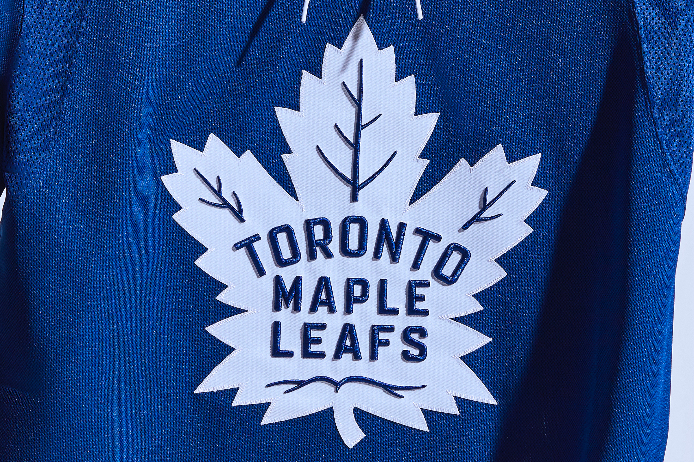
All of the blue details on the Leafs’ crest — the lettering and the leaf veins — have been enhanced by the new dimensional embroidery:
Also: The Leafs will play the Sabres in the annual Heritage Classic game, which will take place outdoors at Tim Hortons Field in Hamilton, Ontario. No word yet on the uniforms for that game, but it’s a safe bet that both teams will have something special for the occasion. Additional info here and here.
Additionally, it’s worth noting that pregame proceedings at Leafs home games will now include a land acknowledgment, to recognize that the team’s arena is situated on Indigenous lands.
And finally, the Leafs did not have a helmet advertiser during the preseason. Remains to be seen whether that state of affairs will still hold sway when their season starts on Oct. 13, but here’s hoping!
METROPOLITAN DIVISION
Carolina Hurricanes
As noted in this article’s introduction, the Hurricanes have made particularly good use of the new dimensional embroidery. The new raised ridge running just inside the border of their crest looks really sharp:
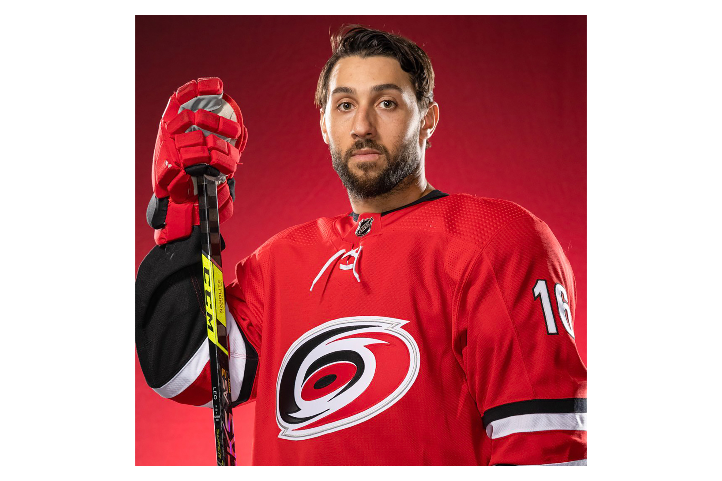
The ’Canes have also taken the unusual step (at least by NHL standards) of releasing their uniform schedule for the entire season. It calls for them to wear their Hartford Whalers throwbacks for one game — at home against the Devils on Jan. 29.
Finally, Carolina also has a new helmet branding partner advertiser.
Columbus Blue Jackets
No visuals yet, but the Blue Jackets will memorialize goalie Matiss Kivlenieks, who died in a fireworks accident on July 4, with a season-long “80” helmet decal, plus “80” will appear behind the nets for the Jackets’ first two regular season games (Oct. 14 and 16, when they host the Coyotes and Kraken, respectively) and an “80” banner will be hung from the rafters this season.
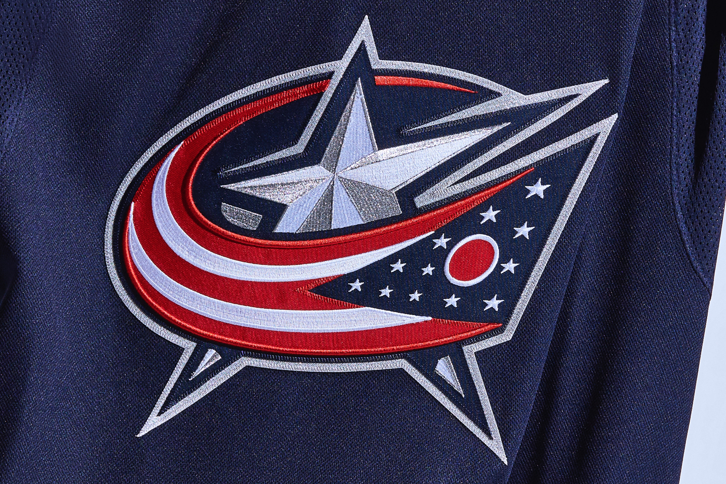
Meanwhile, the top and bottom red lines of the Ohio flag on the Blue Jackets’ jersey crest have been enhanced with the new dimensional embroidery:
New Jersey Devils
After nearly 30 years of wearing solid-black pants, the Devils have added a dark-grey version of their primary logo to the left pant leg. For any other team, this would be an afterthought, but it’s big news for the famously uni-stable Devils. In fact, it’s only the third pant design in team history!
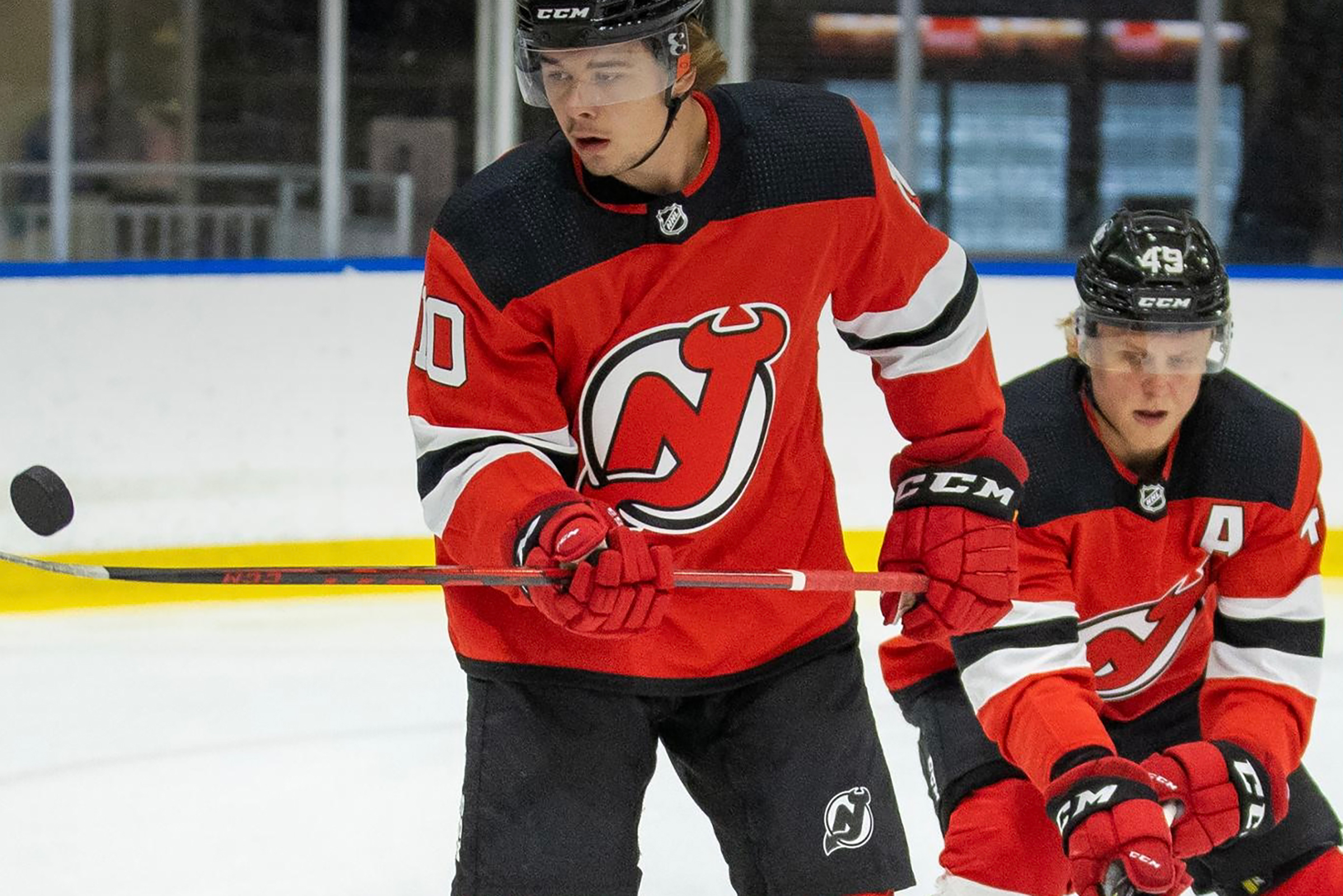
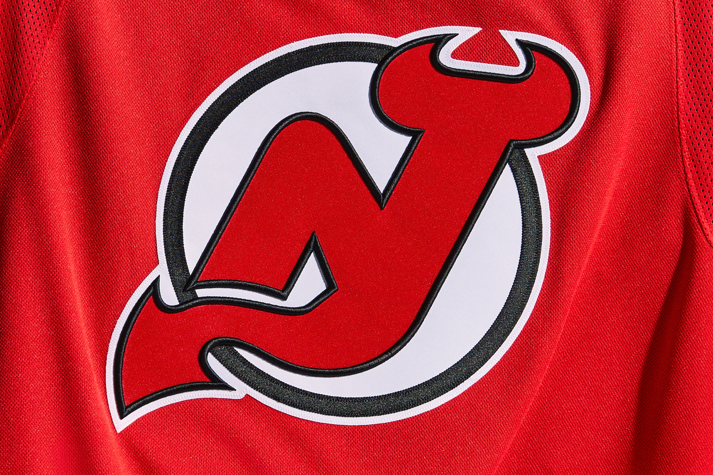
Meanwhile, the thin black lines in the team’s jersey crest have gotten the dimensional embroidery treatment:
New York Islanders
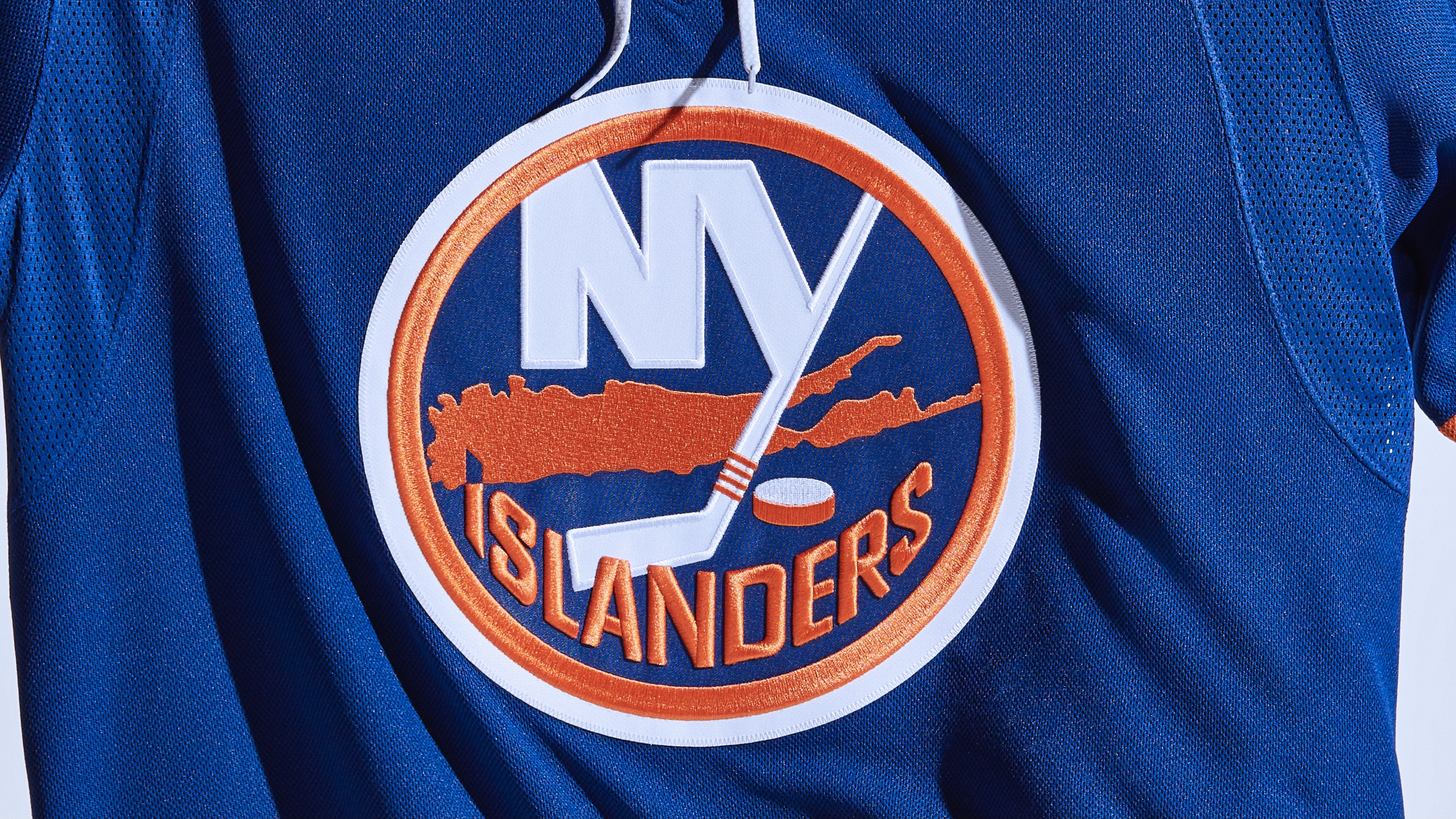
The orange “Islanders” lettering on the Isles’ jersey patch has gotten the dimensional embroidery treatment (the white border around the “NY” is not new):
In addition, the team will be playing this season in their shiny new arena, right next to horse racing’s Belmont Park.
New York Rangers
The Broadway Blues will be adding a “7” memorial patch for the great Rod Gilbert, who died earlier this year. The team hasn’t worn it during preseason games, so we can’t be sure what it looks like or where it will be positioned on the jersey, but the Rangers have a long history of wearing patches on the shoulder, not on the chest, so that will likely be the case this time as well. In addition, all players will wear “Gilbert 7” pregame jerseys prior to the team’s home opener on Oct. 14. (Additional info on all of this is available here.)
Speaking of great Rangers, the team will retire Henrik Lundqvist’s No. 30 prior to the Jan. 28 game against the Wild.
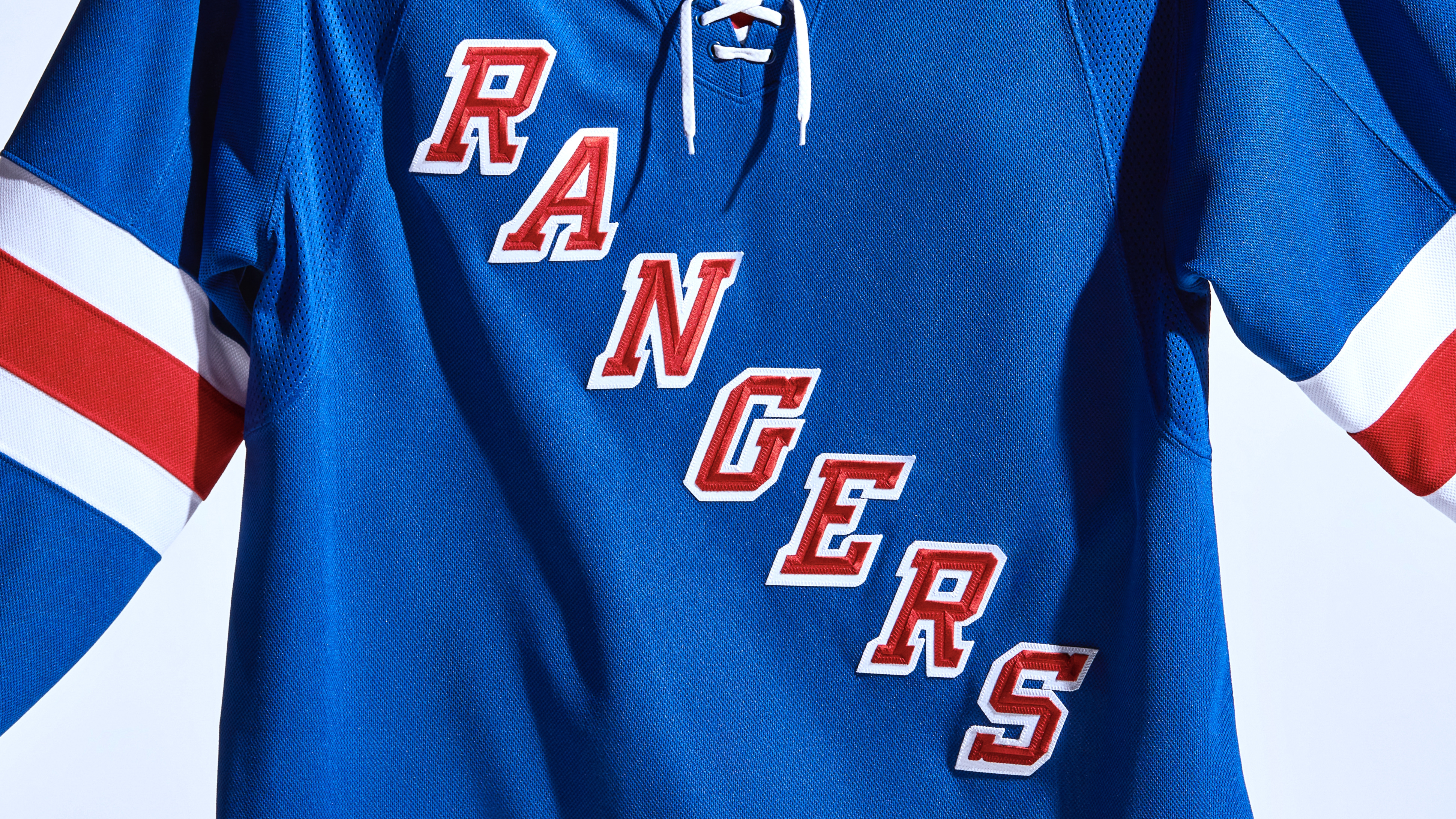
Also: The Rangers don’t have a conventional jersey crest like most other teams, so they don’t have any new raised highlight. But their jersey lettering has been given a new treatment that creates a subtle beveled effect:
Meanwhile, the Rangers also have a new helmet advertiser.
Philadelphia Flyers
Here’s a uni detail you don’t often see teams paying attention to: The Flyers have changed the strap color for their home helmets:
Also: As you can see in the second photo of that tweet, Philly doesn’t currently have a helmet advertiser, although that will likely change in the near future.
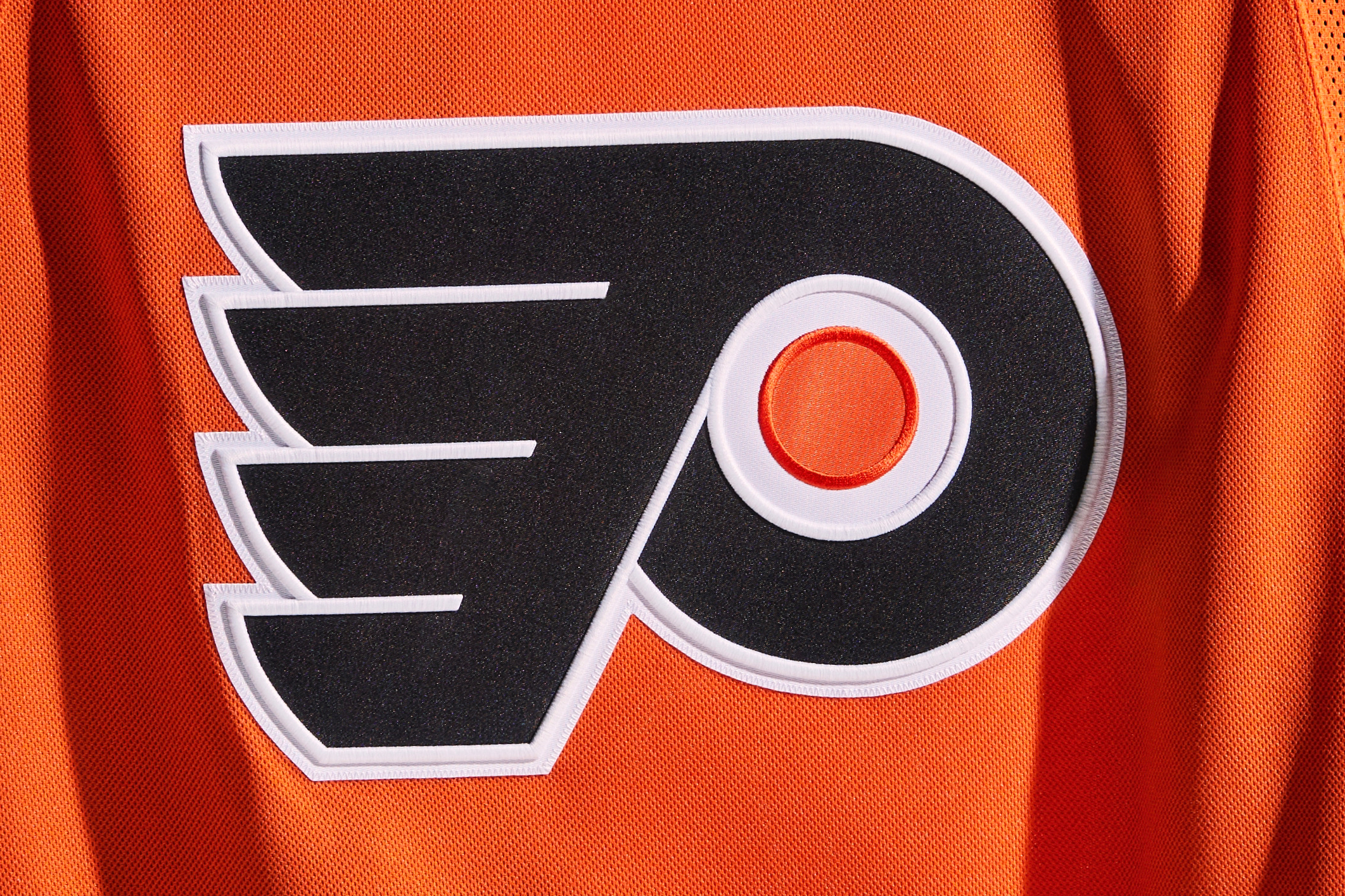
Meanwhile, the white outline on the team’s crest has been enhanced by the new dimensional embroidery (the orange outline, however, is not new):
Pittsburgh Penguins
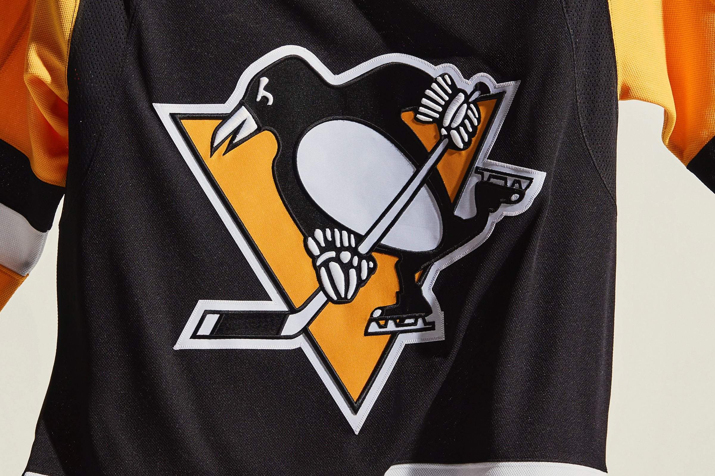
It’s a little hard to see, but the white “padding” on the gloves of the Pens’ mascot character has been enhanced by the new dimensional embroidery, and so has the black border of the triangle:
In addition, the Pens have a new home helmet partner advertiser.
Washington Capitals
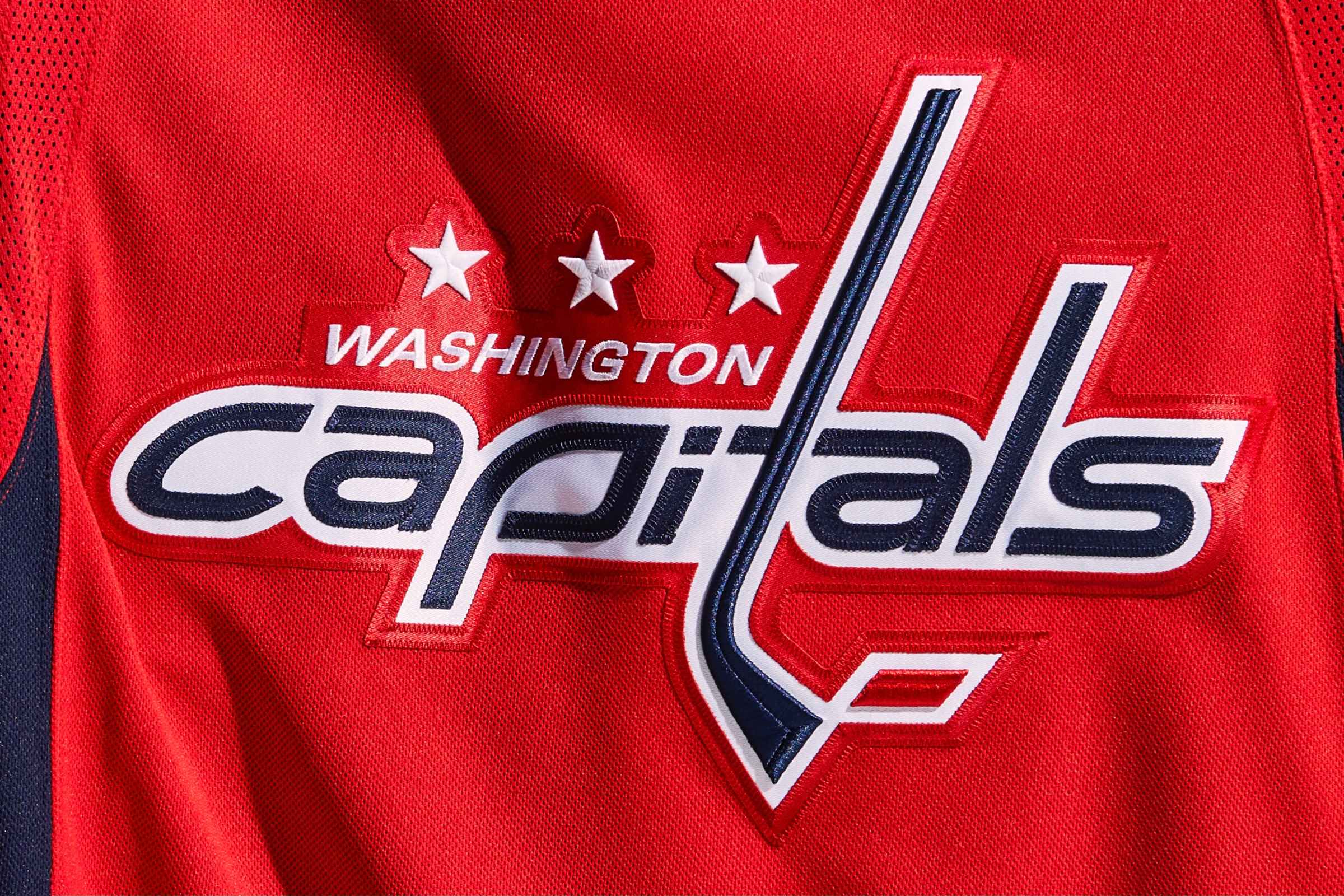
The hockey stick, puck and stars on the Caps’ jersey have all been enhanced by the new dimensional embroidery:
CENTRAL DIVISION
Arizona Coyotes
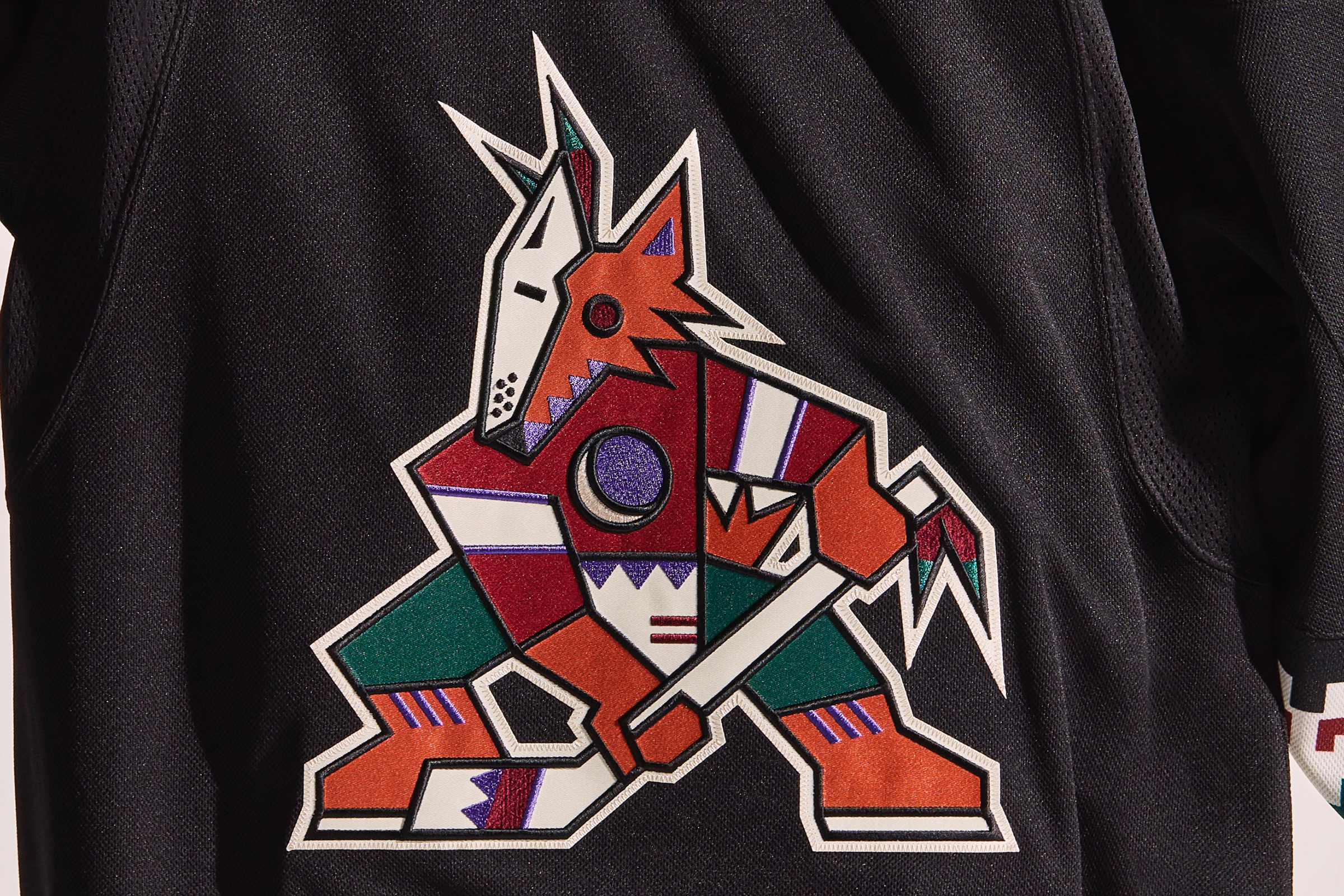
Lots of news for the Yotes, beginning with the welcome news that the team’s original “Kachina” logo, which was restored to the team’s black home uniform last season to commemorate the team’s 25th anniversary, will now grace the white road uniform as well (additional info here):

The white road uni will also be worn for the Oct. 18 home opener against the Blues.
Speaking of the Kachina logo, it has received a bunch of tweaks this season. Most fans won’t even notice, but these changes bring the logo back to how it looked in the late 1990s:
In addition, the logo’s various black outlines have been enhanced via dimensional embroidery:
In addition, the Kachina logo is also being used this season at center ice, marking the first time that the full logo, rather than just its head, has been emblazoned on the the ice surface. New red line design, too (additional info here):
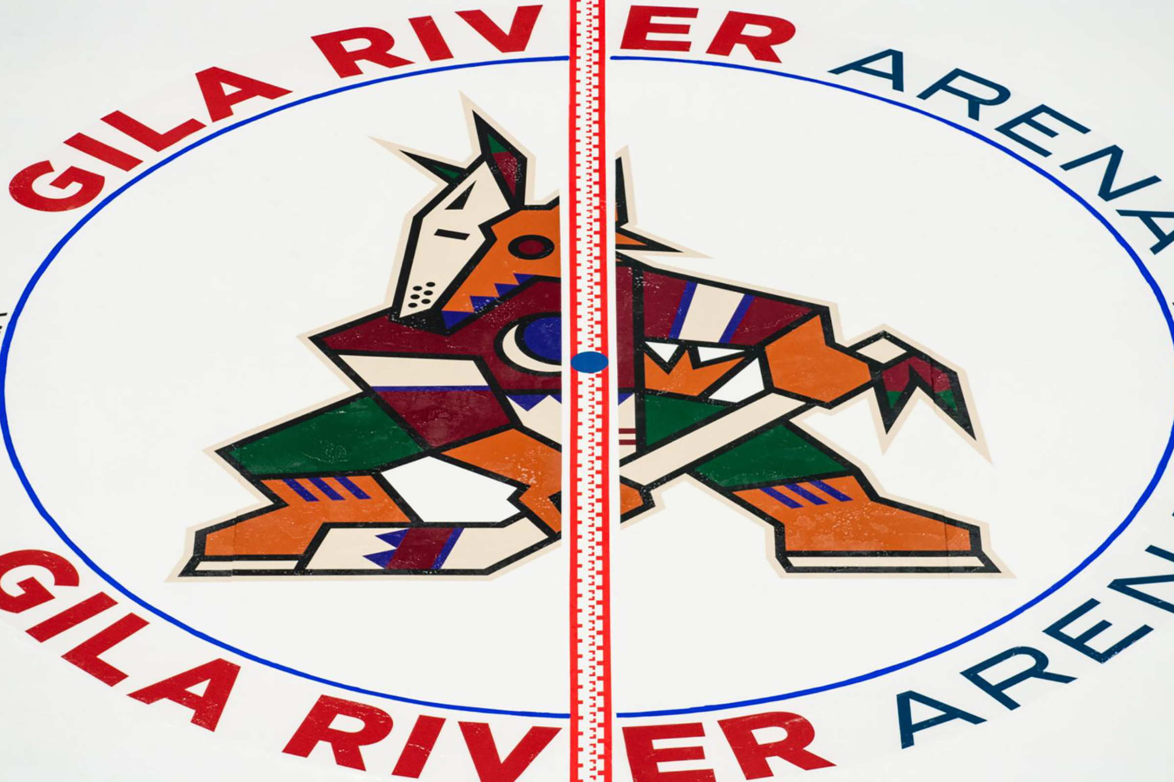
Unfortunately, that ice design may not be in use for long, because the city of Glendale plans to terminate the team’s lease at the conclusion of this season, so it’s not clear where the Coyotes will be playing a year from now.
Chicago Blackhawks
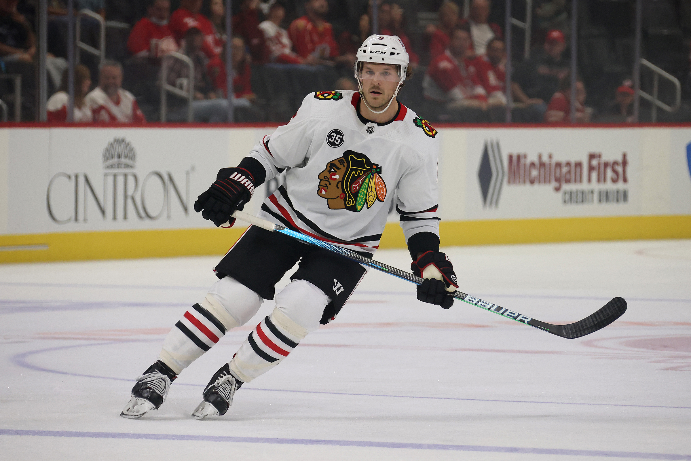
Chicago has added a “35” memorial patch for Tony Esposito, who died earlier this year (and have also put a “35” on the ice behind the nets):
Meanwhile, as various teams throughout the sports world rethink their use of Native American imagery, it’s interesting to hear that the Blackhawks reportedly rejected three mask designs for goalie Marc-André Fleury “due to racial tensions.”
Also: Chicago has a new helmet advertiser, which is weird on multiple levels.
Colorado Avalanche
The Avs’ purge of black from their color scheme, which began last season, has continued this season on the back of the team’s road jersey. The player names and numbers, both of which were black, are now burgundy and light blue, respectively:
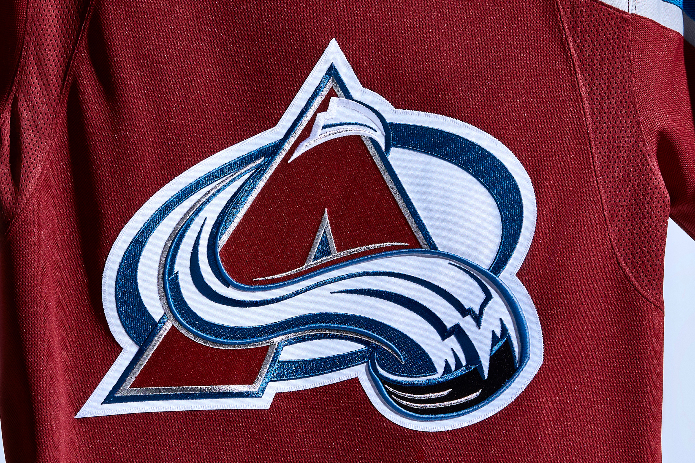
Turning to the front of the jersey, you can see the new dimensional embroidery on some of the blue highlights in the team’s crest:
Dallas Stars
Lots of news this season for the Stars. For starters, they’re changing the shade of green in their logos, but only for print applications, marketing campaigns and so on. The color shift does not apply to the team’s uniforms — those are staying the same, but the logos should now match them more accurately (additional info here):
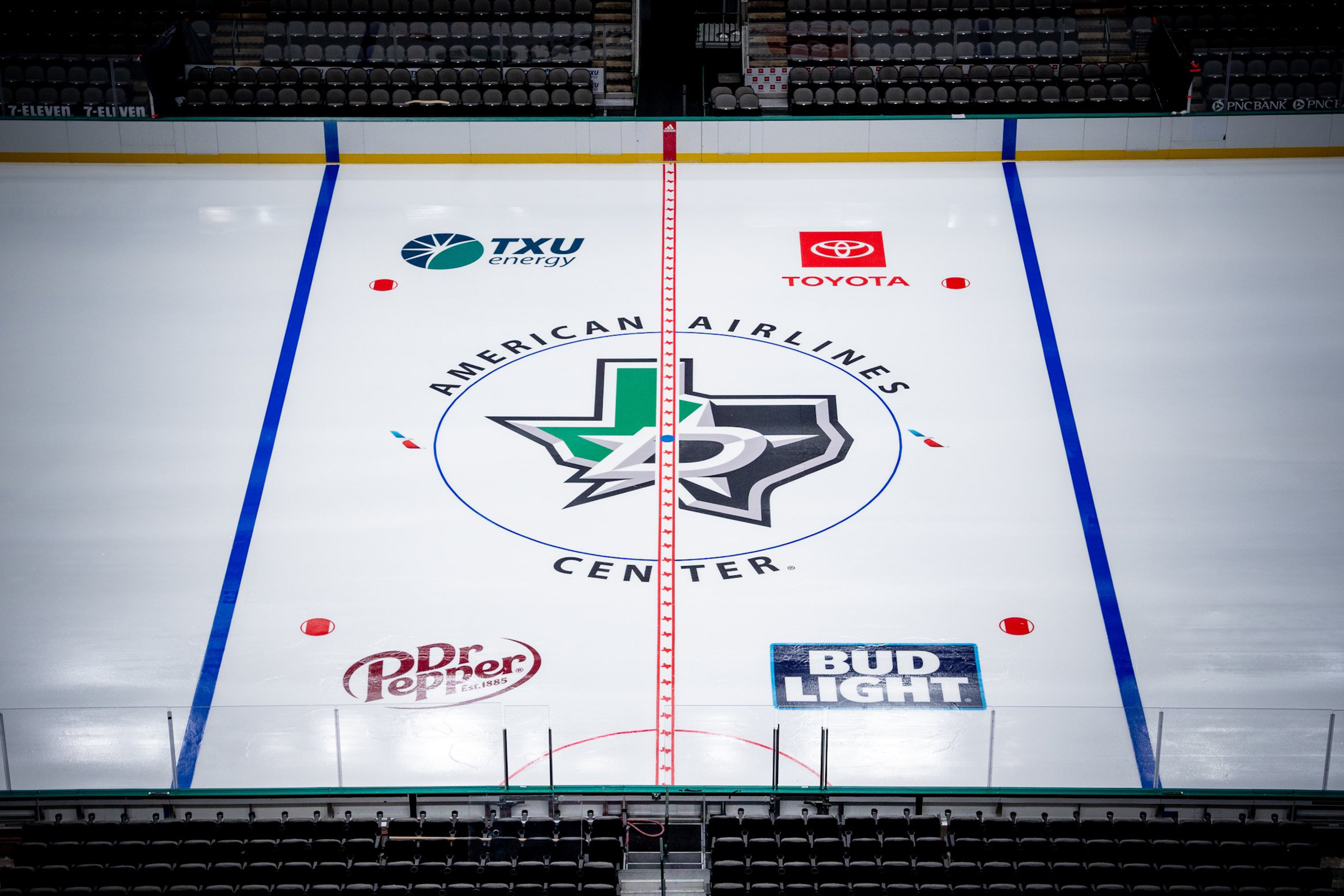
Second, the team has a new Texas-themed logo at center ice:
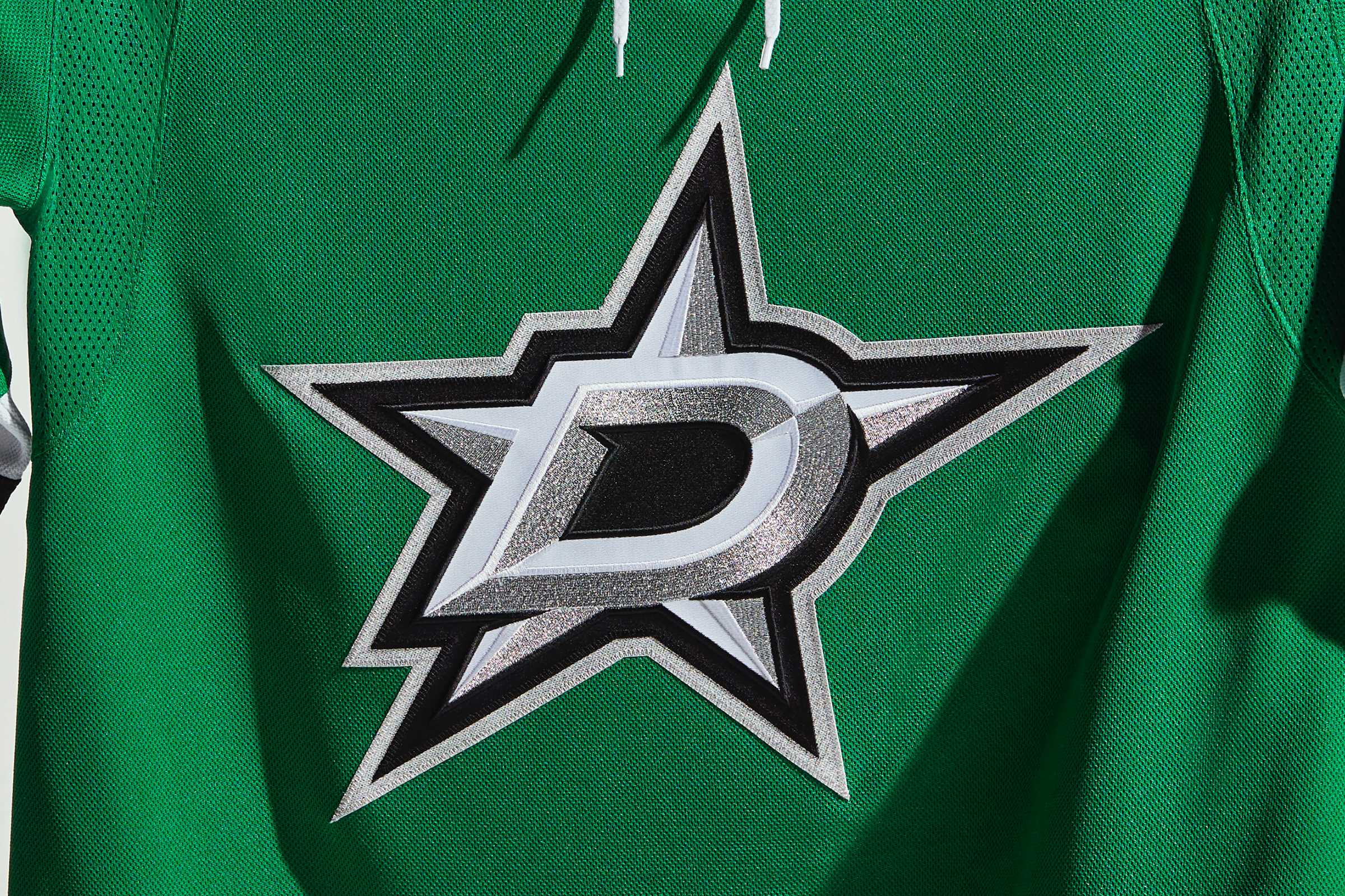
Third, you can see some new white highlights in the team’s crest, thanks to the new dimensional embroidery:
Fourth, the Stars will retire Sergei Zubov’s No. 56 prior to their Jan. 28 home game against the Capitals. (The number retirement was originally planned for last season but was postponed due to the pandemic.)
Fifth, not content to have merely one new helmet advertiser, the Stars have two of them — one for home games and another for road trips.
And finally, in a fan-friendly move that other teams could learn from, the Stars have also provided the dates for the 14 games when they’ll be wearing their neon-trimmed black alternate uniform.
Minnesota Wild
The Wild will be one of the two teams playing in the annual Winter Classic on New Year’s Day, this season’s edition of which will take place at Target Field in Minneapolis. They’ve created a new uniform with a serious retro theme for the occasion, and holy moly is it a beauty (additional info here):

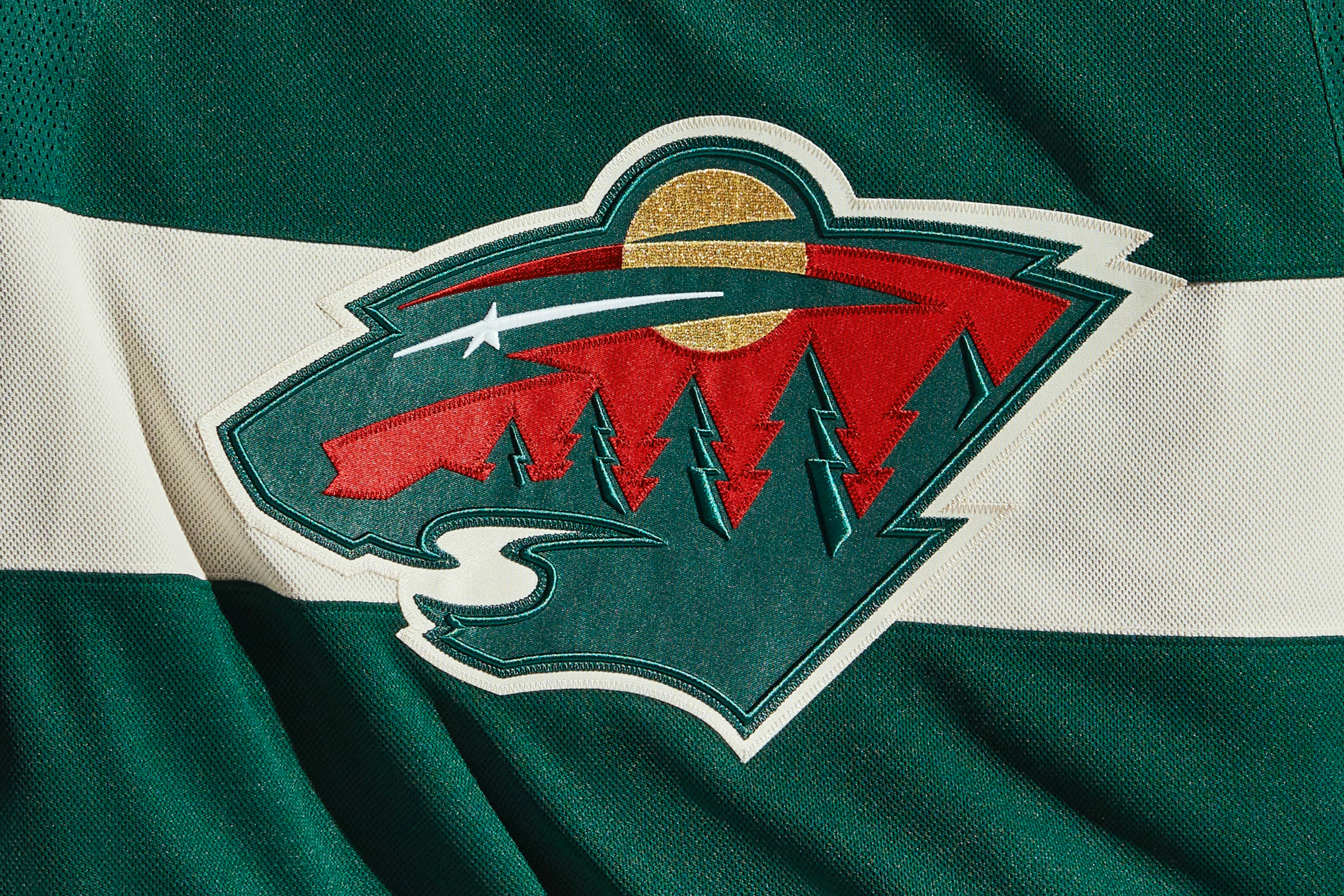
As for the team’s standard uniforms, many of the green details on the jersey crest have gotten the dimensional embroidery treatment:
Meanwhile, looking ahead: Beat writer Michael Russo, who covers the Wild for The Athletic, has reported that the team will have a new alternate jersey next season.
Nashville Predators
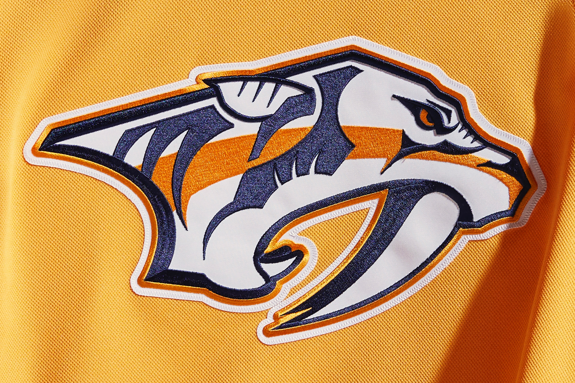
Several of the navy blue elements of the Preds’ jersey crest have been enhanced by the new dimensional embroidery, mainly along the top edge of the logo:
In addition, the Predators are the host team for this season’s Stadium Series game, which will take place on Feb. 26 in Nashville, so you can expect some sort of special uniform for that game.
St. Louis Blues
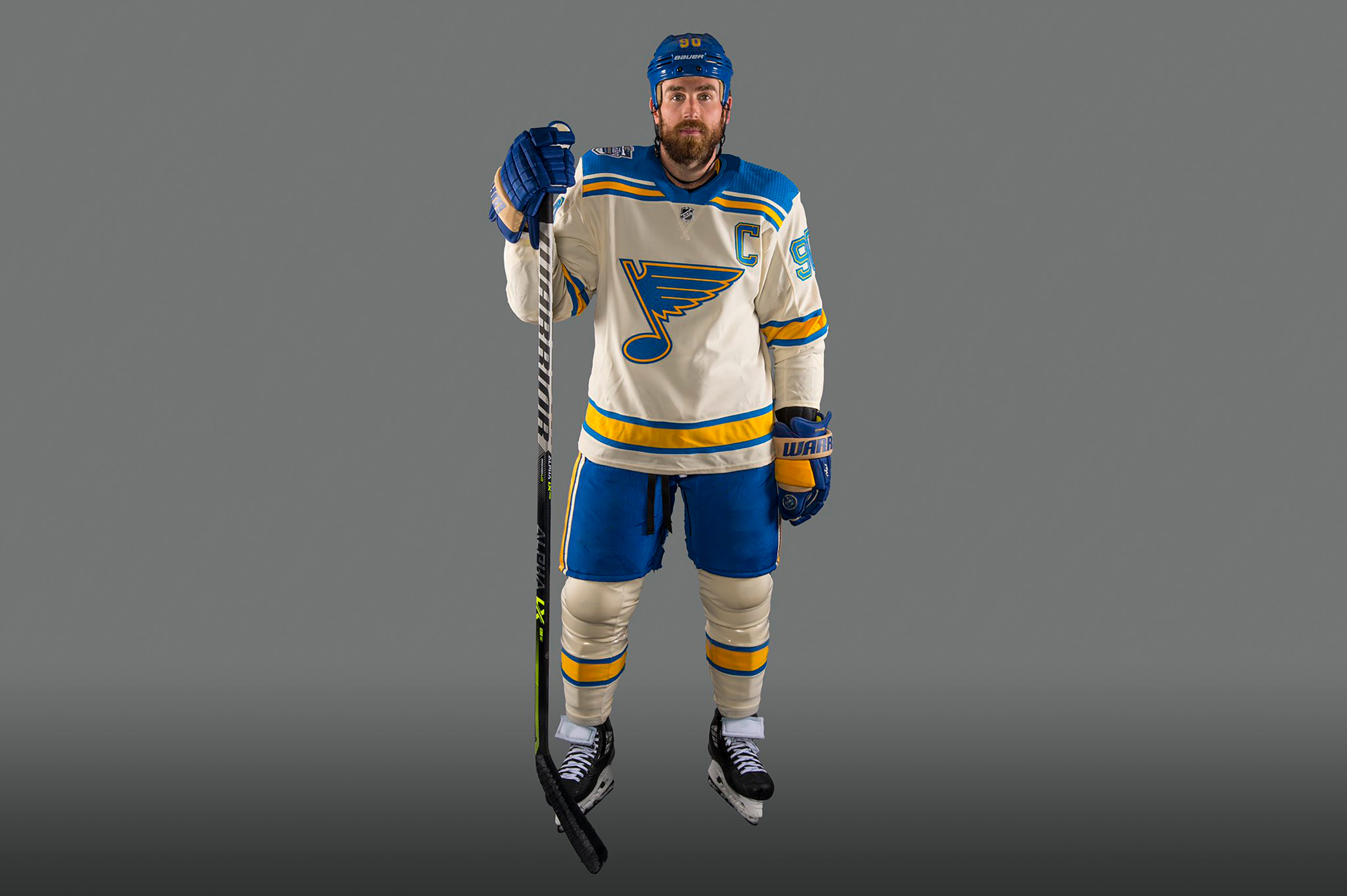
The Blues will be facing the Wild in the annual Winter Classic game on New Year’s Day at Target Field in Minneapolis. While the Wild have created a new design for the occasion, the Blues will be wearing an updated throwback based on their 1967 uniform. The one thing it has in common with the Wild design is that it looks great (additional info here):
Meanwhile, here’s a cool detail: Goalie Jordan Binnington’s new mask has a piano keyboard theme that echoes the mask design used several decades ago by Blues goalie Grant Fuhr:
Winnipeg Jets
Remember when the Jets wore an awesome throwback uniform for the 2019 Heritage Classic and then for two additional games that season? Okay, so maybe you don’t remember, but here’s how it looked:
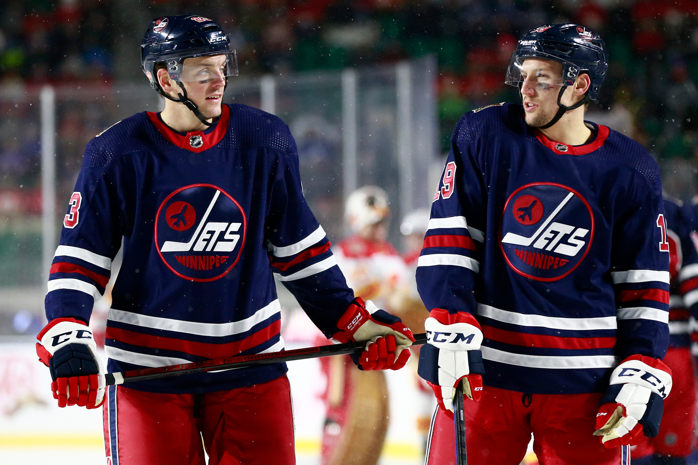
The Jets have now redesignated this design as their official alternate uniform. It’ll be worn 14 times this season, beginning with the Nov. 9 game against the Blues.
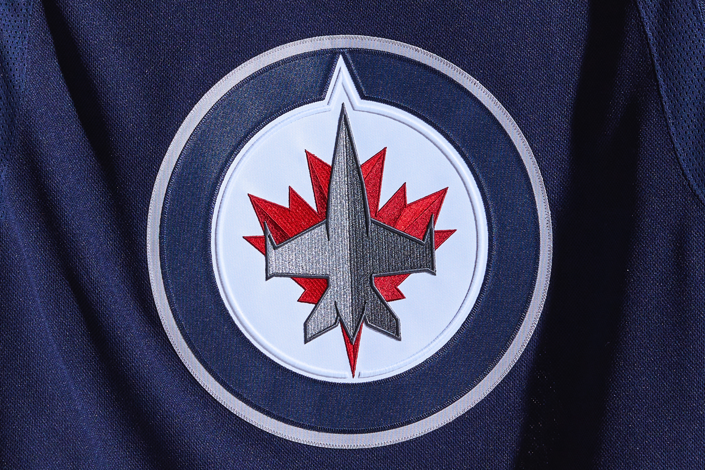
Meanwhile, the team’s standard jersey crest has received some dimensional embroidery enhancements, as you can see along the edges of the white circle and the grey fighter plane:
Finally, the Jets’ arena has a new name, courtesy of a new naming rights agreement.
PACIFIC DIVISION
Anaheim Ducks
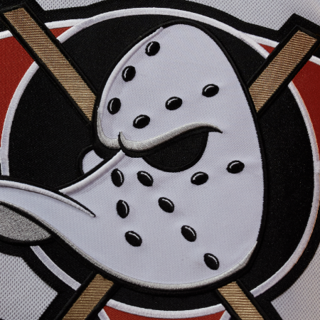
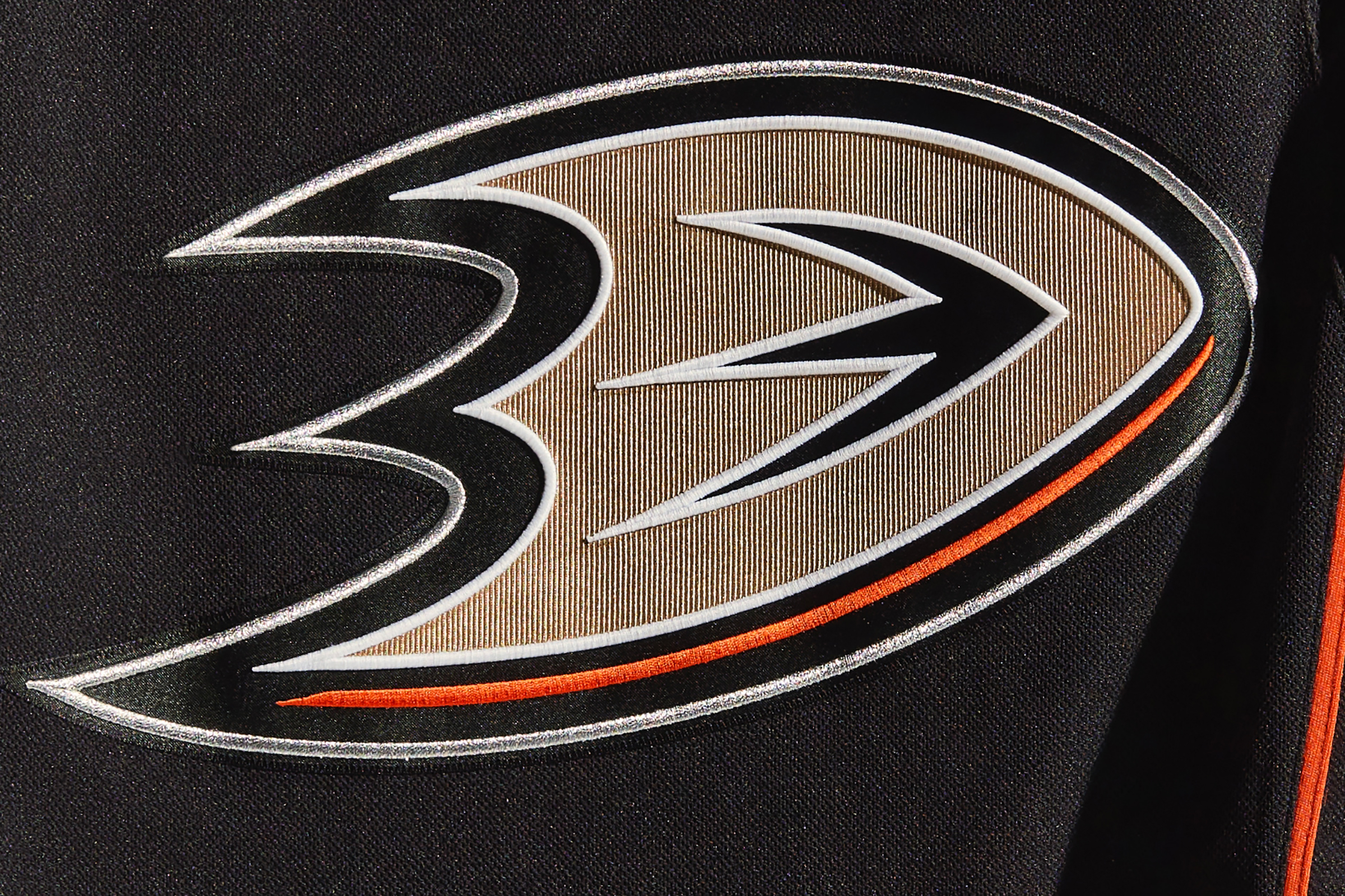
The white, silver and orange line work on the Ducks’ jersey crest has all been enhanced by dimensional embroidery:
Meanwhile, if you’re into ice design (and what hockey fan isn’t?), here’s a really good video showing the Ducks’ ice being painted for the upcoming season. Much better than the standard-issue time-lapse videos we often see!
Calgary Flames
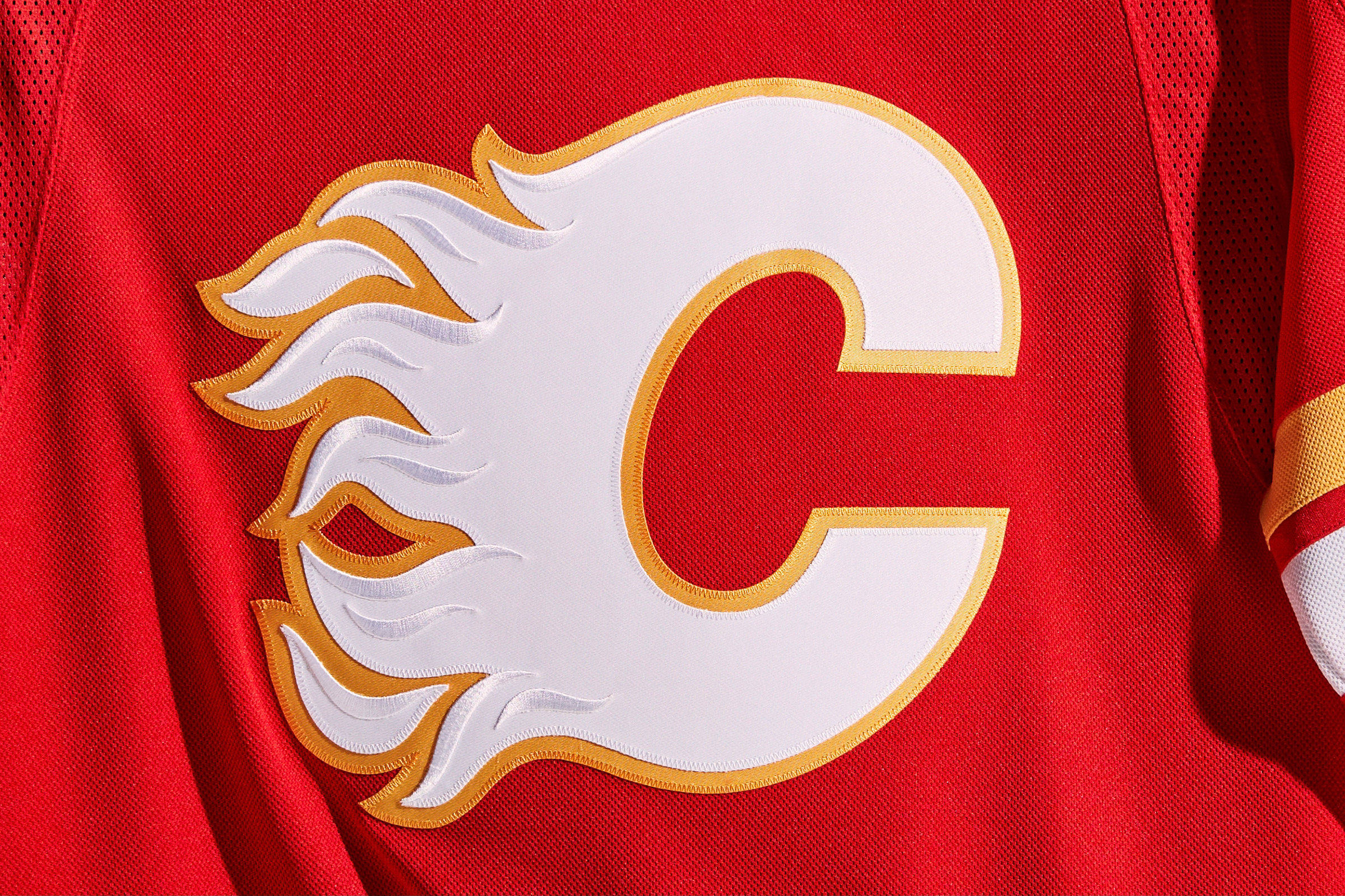
The Flames have made excellent use of the new dimensional embroidery, employing it to add some flashy white highlights to their flaming jersey crest:
And speaking of flashy, check out goalie Adam Werner’s new pads — hot stuff indeed:
Edmonton Oilers
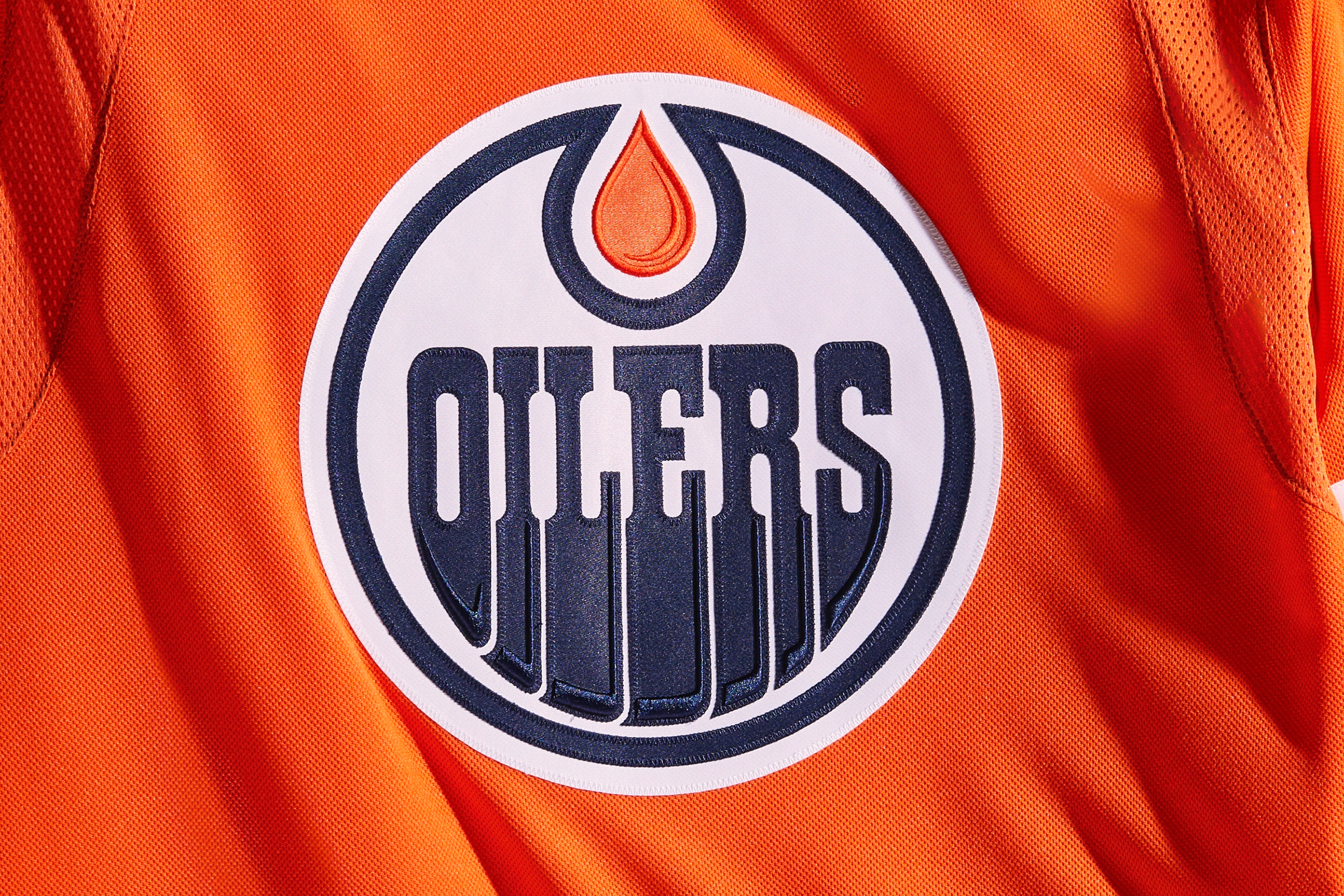
The Oilers are another team that’s made particularly good use of the new dimensional embroidery. Check out how the oil drip and lettering in their logo look with the new enhancements:
Meanwhile, here’s something pretty great: Longtime Oilers clubhouse attendant Joey Moss was known for high-fiving the players as they went out onto the ice. Moss died earlier this year, but his spirit will live on in the Oilers’ dressing room, where a statue of him — high-fiving, of course — now has a place of honor. Get the full story in this video clip:
Los Angeles Kings
In the past, the silver trim on the Kings’ jerseys has been flat silver fabric. But this year they’re going with a more vibrant trim fabric that’s much more sparkly and metallic. It looks particularly good around the white sleeve stripes:
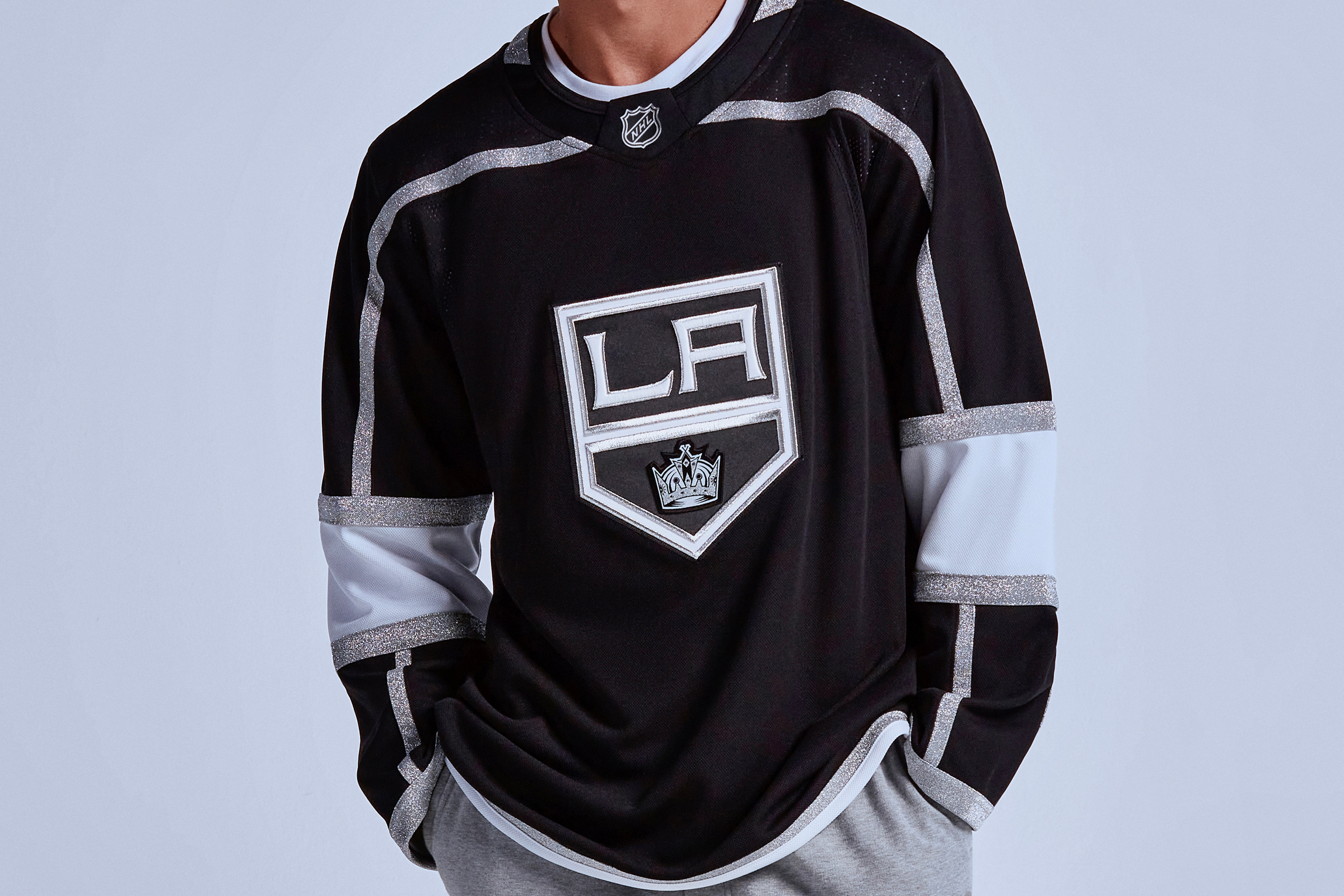
It’s a little hard to see in that photo, but the “LA” lettering is now more prominent, thanks to the new dimensional embroidery.
The Kings have also made a slight adjustment to their pants, moving the manufacturer’s logo from the front to the side and removing the team logo altogether:
Meanwhile, there’s also some chatter about the Kings possibly having a new alternate jersey this season. No confirmation yet on that, however.
Update: The new alternate has now been released, and it’s essentially a 1990s throwback, but with metallic silver trim and a chrome helmet:
San Jose Sharks
Much like the Kings, the Sharks have streamlined their pants design by moving the manufacturer’s logo from the front to the side and eliminating the team logo:
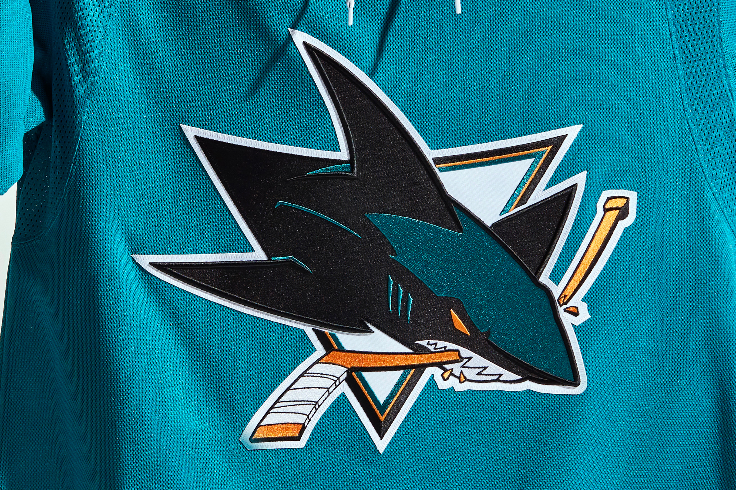
Meanwhile, you can see the effects of the new dimensional embroidery on the black outlines of the team’s jersey crest:
In addition, Sharks prexy Jonathan Becher recently hinted during a podcast interview that the team may soon have a new throwback jersey. Stay tuned.
Seattle Kraken
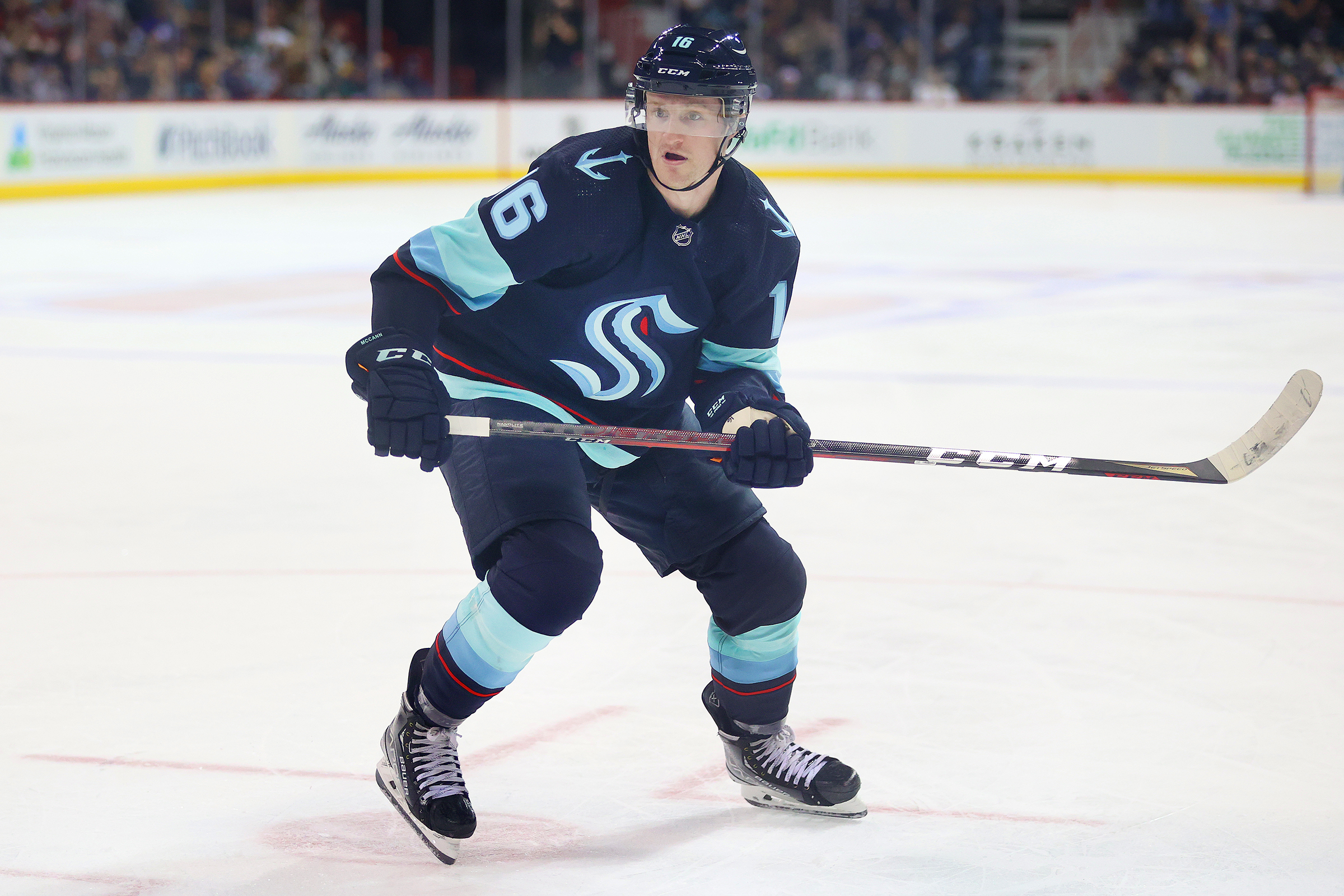
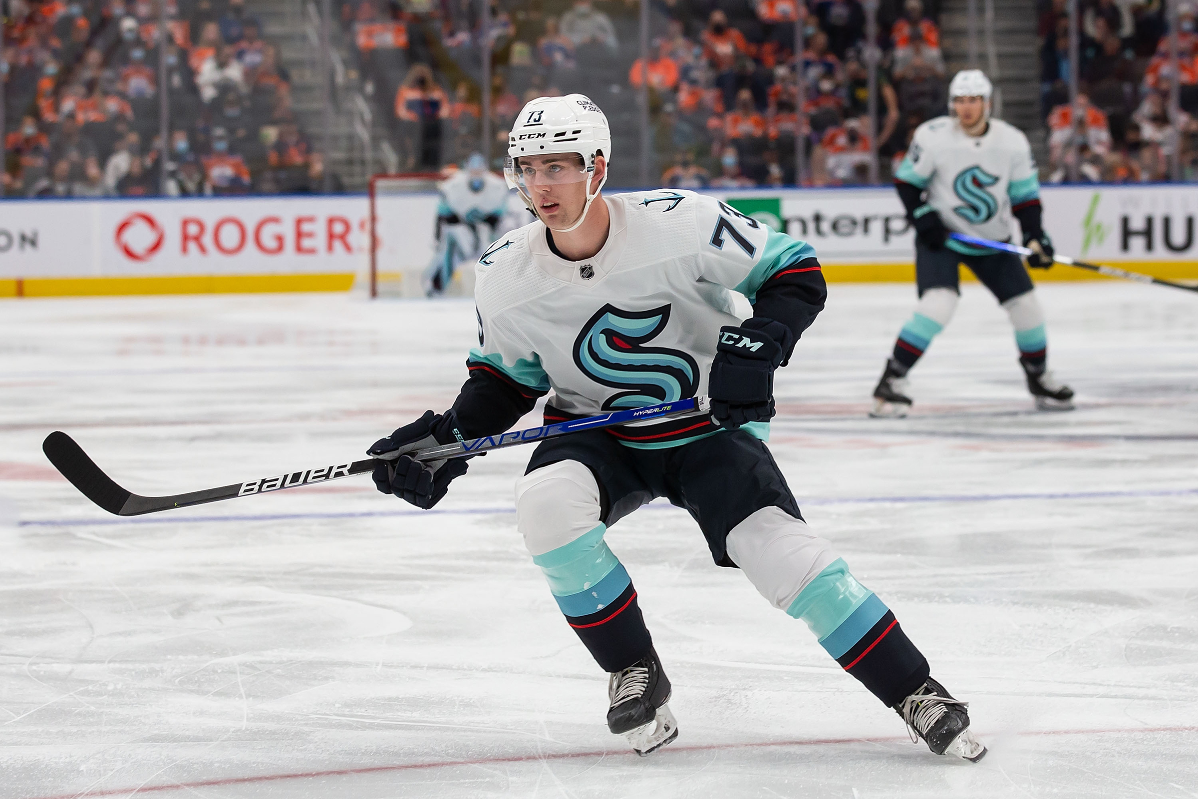
The start of this season will also mark the regular season debut of the NHL’s newest team. Based on what we’ve seen during preseason action, they look pretty sharp (additional info here):
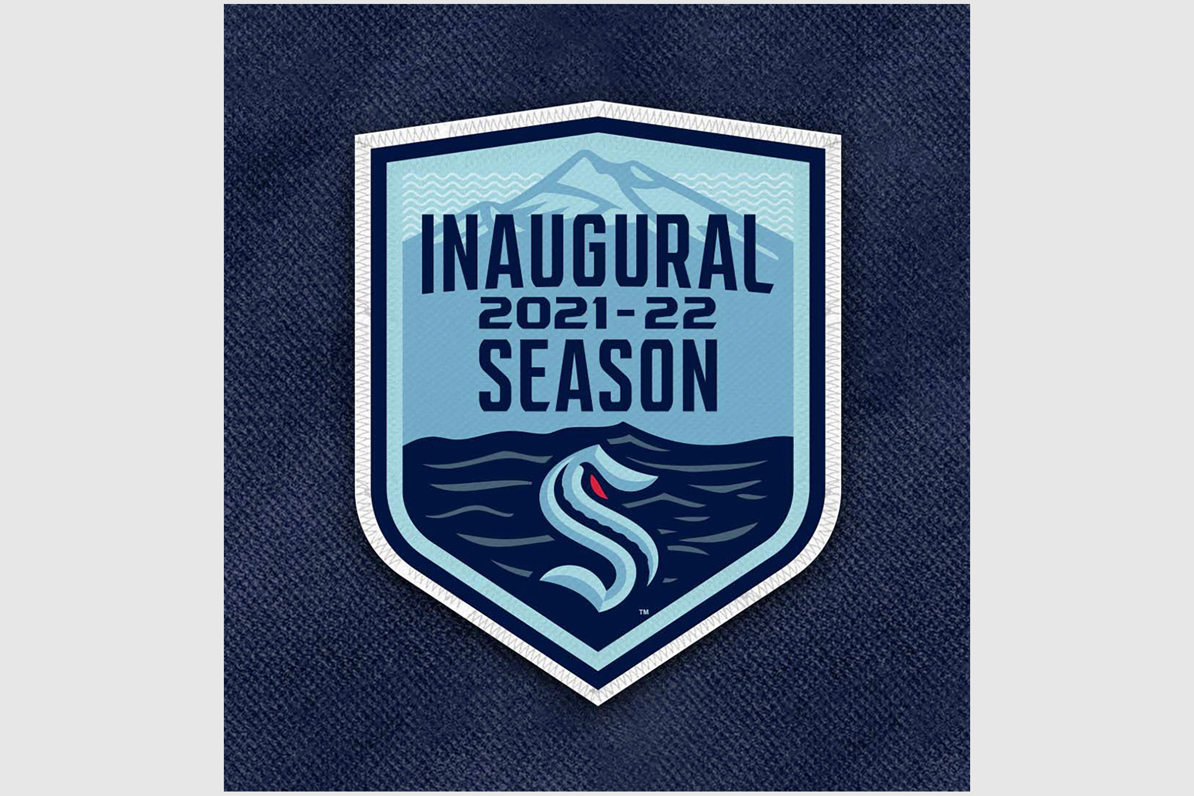
In addition, the Kraken will be wearing an inaugural-season patch. They haven’t worn it during the preseason but will add it once the regular season starts:
Meanwhile, here’s the full scoop on the Kraken’s inaugural helmet advertisers.
Vancouver Canucks
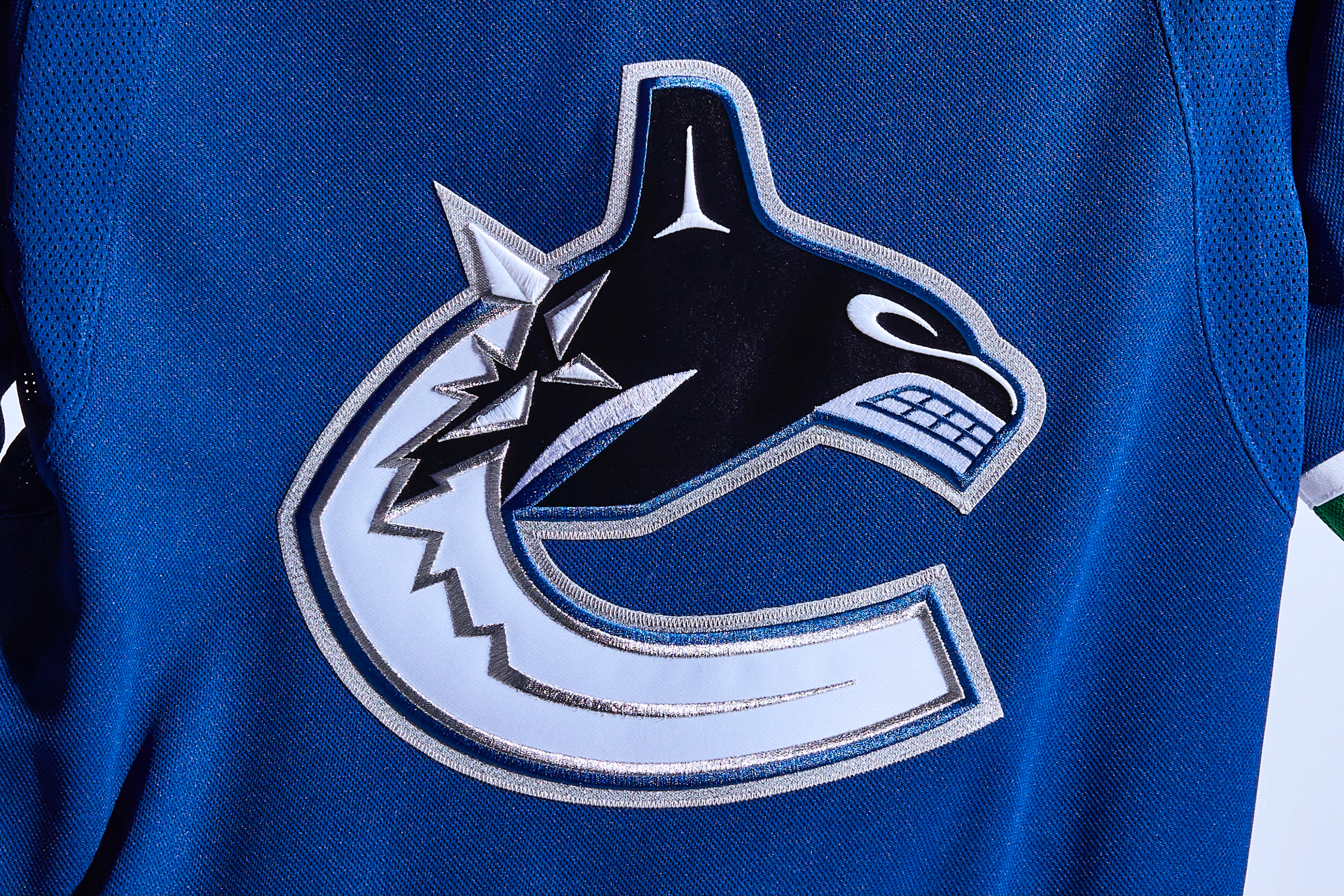
It’s a little hard to see, but some of the white highlights in the upper part of the Canucks’ jersey crest have gotten the dimensional embroidery treatment:
Also, this year marks the 10th anniversary of former Canucks player Pavol Demitra’s death in a plane crash. Vancouver goalie and fellow Slovak Jaroslav Halak is marking the occasion by wearing Demitra’s old number, 38, on his new mask’s backplate:
Vegas Golden Knights
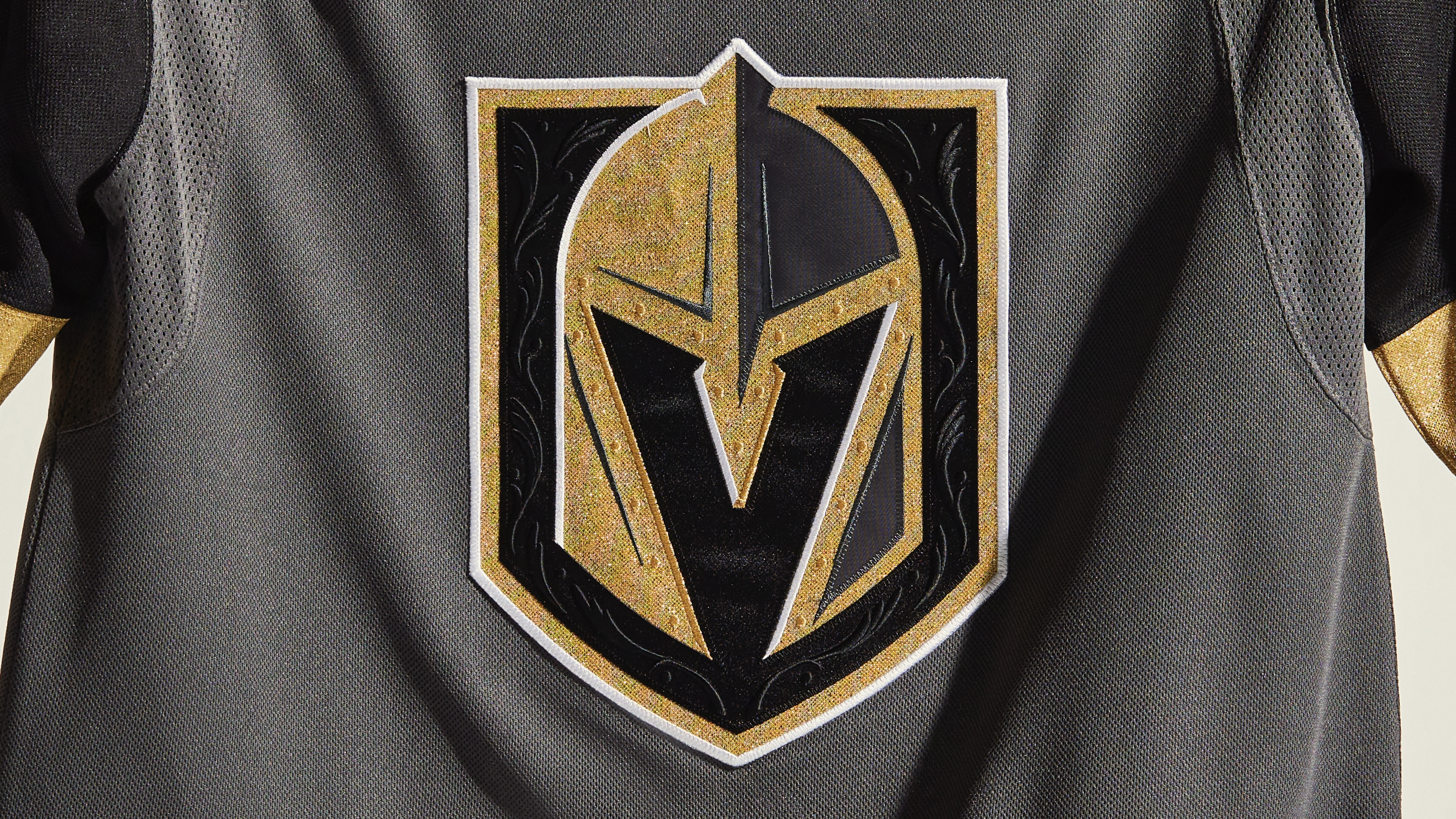
The Golden Knights’ crest already had lots of textured embroidery and raised filagrees. Adidas says those details have been further enhanced this season, although it’s frankly hard to see any significant difference:
Also, the Knights have rolled out a new center-ice design for each year of their existence. Here’s this year’s version:
Meanwhile, here’s everything you need to know about this season’s Golden Knights helmet advertisers.
Update: In a late-breaking development, the Golden Knights have just unveiled the jersey patch that they’ll be wearing this season as hosts of the 2021-22 NHL All-Star Game:
ADDITIONAL NOTES
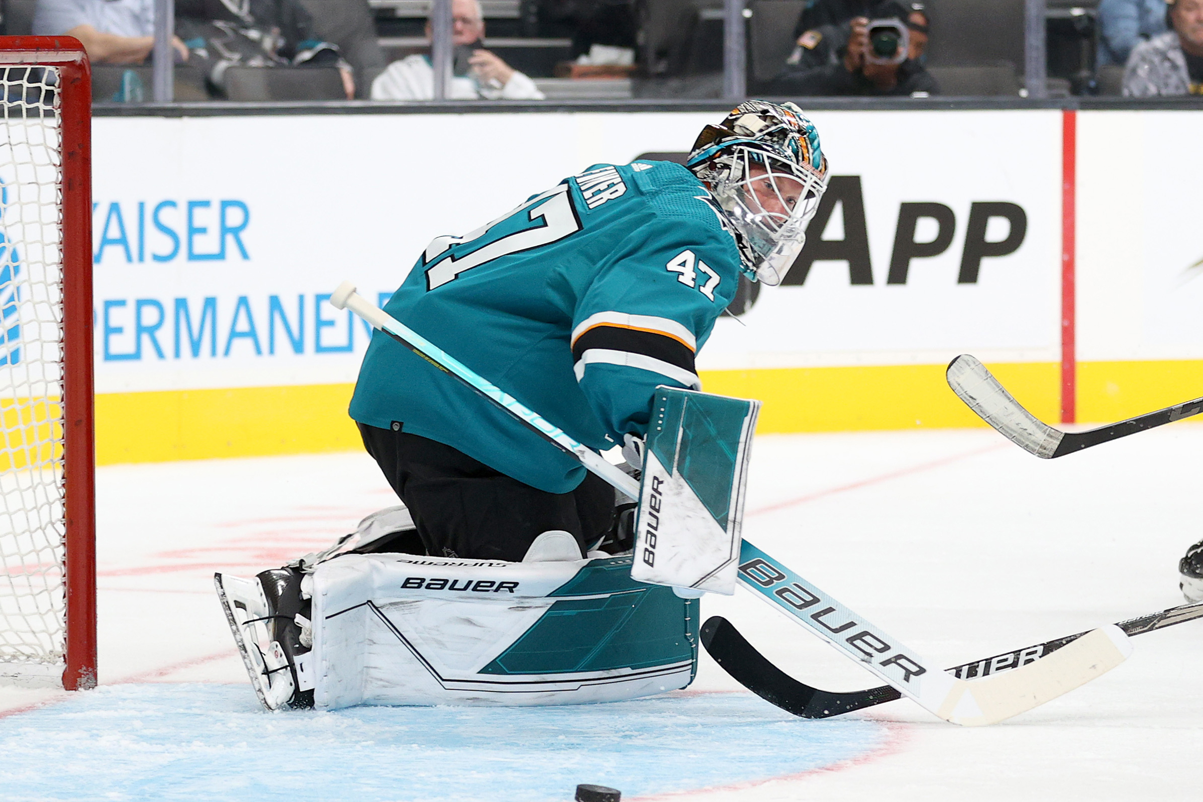
- You may notice a very small patch on the lower-right rear hemline of jerseys this season. You can see it as a little black speck in this preseason photo of Sharks goalie James Reimer:
That little patch says, “End Plastic Waste,” which refers to all of this season’s jerseys being made from at least 50% recycled materials. Here’s a closer look at the patch:
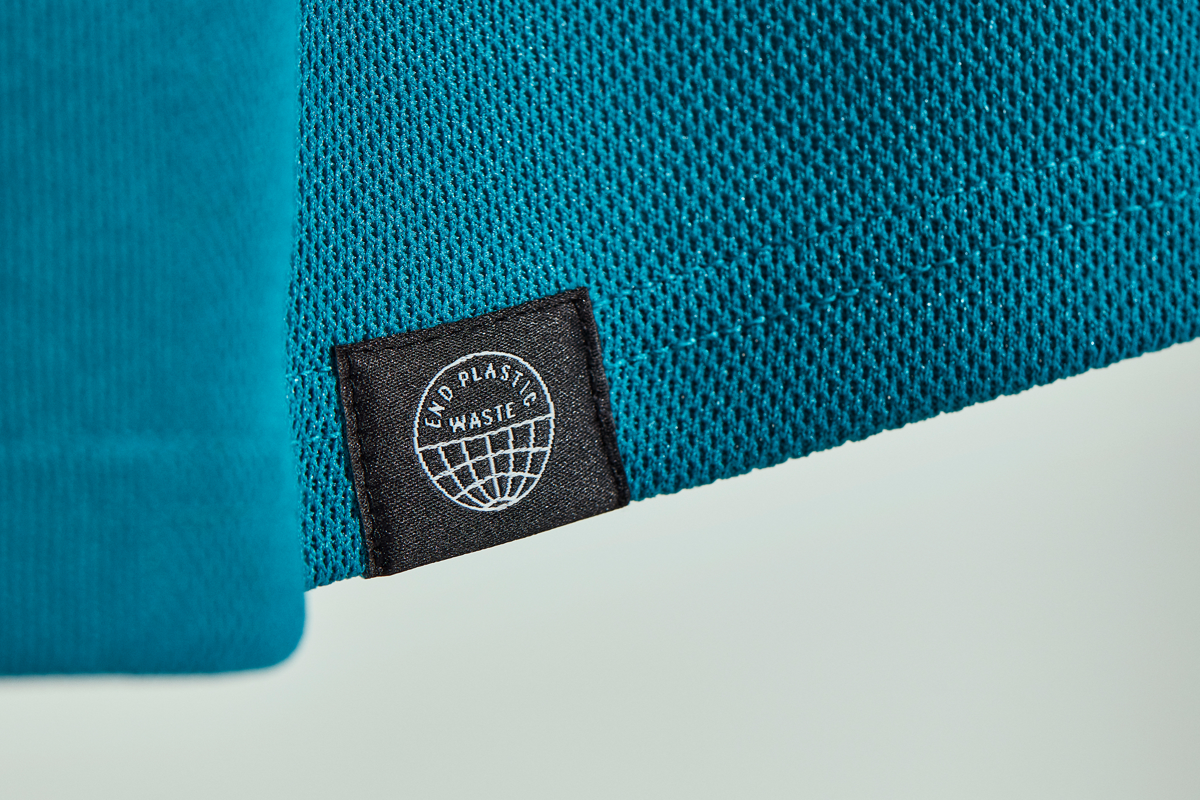
All jerseys will supposedly be carrying the shirttail patch this season, although its presence during preseason games appeared to be inconsistent.
- Remember all the fuss about last year’s Reverse Retro uniforms? That was just a one-and-done program, so none of those designs will be used this season. Word through the grapevine, however, is that a new round of Reverse Retro unis may be rolled out next season.
- Did you know that the NHL is the only major North American pro sports league to have a strict dress code for players traveling to and from games? The suit-and-tie requirement was dropped last season but is technically now back in effect, although some teams are reportedly rethinking it. Full details here.
- This season’s All-Star Game will take place on Feb. 5 in Las Vegas. No word yet on the uniforms, but it seems like a safe bet that they’ll be appropriately Vegas-flashy.
- If you want to delve deeper into NHL design, there are lots of great websites out there: The Faceoff documents the history of center-ice designs; Icethetics covers breaking news about hockey uniform design; the NHL Uniform Database is the definitive resource for NHL uniform history; and SportsLogos.net is the go-to site for NHL logo history.
- Saving the worst for last: NHL teams can start selling ad space on their jerseys next season, so this will be the final season for the beautiful, ad-unblemished NHL jersey. The Capitals have gotten ahead of the pack by already announcing their advertiser, which will be a sportsbook. Sigh.
And there you have it. Did we miss anything? Yeah, probably. If so, you know what to do. Enjoy the season!
Paul Lukas will have his annual NBA Season Preview in a week or so. If you like this article, you’ll probably like his Uni Watch Blog and his weekly column on Bulletin, plus you can follow him on Twitter and Facebook and sign up for his mailing list so you won’t miss any of his future InsideHook articles. Want to learn more about his Uni Watch Membership Program, check out his Uni Watch merchandise, or just ask him a question? Contact him here.
Whether you’re looking to get into shape, or just get out of a funk, The Charge has got you covered. Sign up for our new wellness newsletter today.

